Will the Californian Duck make it to Britain in summer 2015?
Electricity generation in California in spring used to reach a small peak around 1pm and then remain fairly flat until late afternoon. Then it rose to its early evening peak. The growth of solar PV has changed this; demand stops rising about 11am and then falls sharply as solar kicks in, reducing the need for conventional generation. The shape of the electricity demand curve now resembles a bird seen sideways. Unlikely humourists at the state Grid called this the ‘Californian Duck’. In the chart below the projected total generation demand in 2020 rises from 12 GW at 3pm to over twice this amount within a few hours. Not easy for a grid operator to manage.
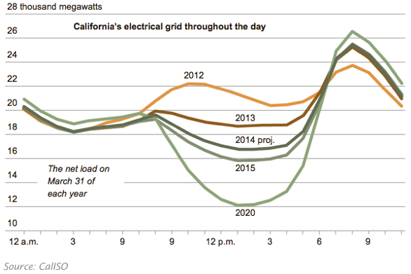
Part of the reason for the Duck is the relative lack of export capacity from the Californian grid. In Germany, the Duck is not as obvious because electricity markets dump the surplus PV power into adjoining markets. Britain is, like California, poorly connected to other countries. As solar grows in the UK, will we see Ducks here?
The analysis
Part 1: how has PV grown in the UK?
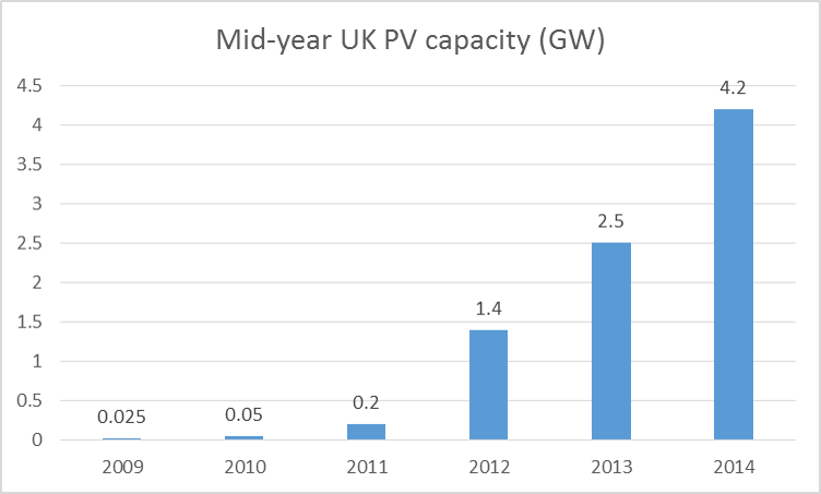
I looked at the reports that give the data on how much PV is installed in the UK. This shows that the total capacity at the end of June 2014 was about 4.2 GW, up from 2.5 GW a year earlier.
Source: DECC Solar Deployment report
By the end of 2014, the UK had about 5.0 GW capacity. The rise is continuing as solar farms race to complete projects before the end of the current subsidy scheme. During the second half of 2014, about 2.6 GW of new large scale PV got planning permission but was not completed by the end of December. However most of this planned capacity will be built before the end of March.
I estimate that we’ll see about another 2 GW of solar farms and a continuing growth in smaller scale PV installed under Feed in Tariffs by mid-year. So by June I think we’ll have about 7.3 GW of PV on roofs and on the ground (about 20% of the German figure, by the way).
Part 2: did we see a Duck in summer 2014?
a. Nobody measures the output of solar PV installations in the UK. Roofs and farms are all sited on branches of the main high voltage electricity grid and not on the trunk network. This means that electricity from PV is not seen by the grid as power generation but as a reduction in demand for electricity from the big power stations (and those big wind farms that are connected to the trunk network).
b. Large amounts of PV capacity on the branches of the UK electricity distribution network will therefore result in lower measured electricity generation on sunny days in summer.
c. By how much does PV reduce generation? I looked at the impact of one week of very sunny days in high summer 2014 and compared it to the same week in 2010, before the PV boom started. How did I work out which 2014 week to use? I looked at the daily outputs for a Newquay PV installation in Cornwall (1) and the publicly available figures for Westmill solar farm in Oxfordshire (2). In both cases this week in mid-June was the sunniest of the summer so I selected this one.
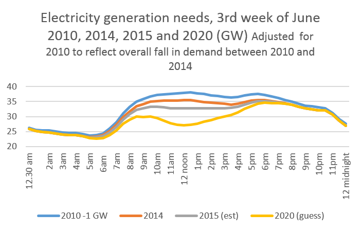
Let your imagination range free and you can see the beginnings of a bird-like shape in the UK data. More of a Heron than a Duck, but the rapid growth of PV is clearly affecting mid-day electricity generation. The picture is complicated by the general fall in overall electricity use – which is typically down about 1 GW across the entire day, but one sunny week in June 2014 saw fossil fuel generation typically fall by over 3.1 GW between 12 and 2pm compared to 2010. On the very sunniest days across the country it would actually have fallen more.
The first chart below is the actual generation required in 2010 and 2014 to meet demand. The 2014 line is lower across the day, partly because of solar and partly because UK demand for power is generally falling.

Source: Elexon
The next chart adjusts 2010 to take 1.0 GW off demand during the whole 24 hours to reflect the fall in overall electricity demand. Now the effect of the PV in 2014 between early morning and late afternoon can be seen much more clearly. There’s a 2.1 GW gap between the lines at around midday.

Part 2: will we see Ducks with a clearer shape in 2015? And beyond?
By June 2015, PV will have grown about 75% compared to the figure a year earlier. And the increase actual in peak generation will be even greater. We know, of course, that all the new big farms turning on at the moment are south facing and in good(ish) locations whereas many domestic PV sites are not optimally aligned, are not always in southerly locations, are sometimes shaded and are often not wired as well as they might be. So the actual increase in real capacity may be 80% or more.
What will the Duck look like in June 2015 if the same amount of sun is recorded as in June 2014? (I’m assuming no further decline in underlying energy consumption although we know that this is still occurring). The chart below adjusts the amount of generation to reflect the higher PV installed capacity. The gap is now estimated at almost 4 GW at midday for the average sunny week in June. Some days it will be more than this.

We don’t know how fast PV will continue to grow. A new Conservative government is likely to severely restrain the growth of ground-mounted in large commercial farms but may continue to accept roof PV and smaller solar farms, particularly if community owned. Solar PV already makes decent financial sense if the owner is thereby reducing purchases of electricity and the advantages will get more obvious as technology improves.
Only about 3% of UK houses will have solar by mid 2015 and the scope for increasing this is obvious. Many local authorities and housing associations now seen the financial logic of putting PV on rented properties. For example, the city of Plymouth is currently raising money from local residents to install PV on its social housing and provided Feed in Tariffs continue, other municipalities will follow.
By 2020, I assume 13.5 GW of solar power, (just over a third of current German capacity). This is what the profile will look like then, assuming no further fall in overall energy consumption. It still looks more like a Heron carefully watching water (and fish) falling over a weir than a Duck. Nevertheless the midday plateau has gone, to be replaced by a steep dent during a typical sunny summer week.
(1) Fans of good data will really cherish and admire the Newquay site at http://www.newquayweather.com/.
(2) Westmill makes its weekly output figures available at http://www.westmillsolar.coop/projects.asp