How fast do solar panels degrade? Evidence from a single house over 15 years
Summary
I have recorded the monthly output from the solar panels on our roof for the fifteen years since they were installed. The records show a very slight decline in the electricity produced of about 0.05% each year. This translates into a fall of just over three quarters of one percent from when the panels were new. A panel producing 100 kilowatt hours in 2005 would typically generate 99.2 kilowatt hours in 2020, if the year sees an average amount of solar radiation.
The rate of decline of the panel outputs has been slower than most forecasts of solar panel degradation. Why? It may be that these panels are sited in a relatively equable climate and therefore are not subject to thermal stresses, which can cause microscopic cracks in solar cells.
Is there any other potential explanation? I investigated whether the intensity of the solar radiation reaching the panels has changed. This might be because of the changing climate, or because of variations in local environmental pollution. I obtained a database of the number of hours of bright sunshine recorded in Oxford, at a point about 1 km from where I live. (Thank you to the Radcliffe Met Station). This dataset – which forms part of the longest-running climate record in the world – shows that Oxford is sunnier than it was. The number of hours of bright sun has risen by an average of almost 3 hours a year or about 0.18% per annum during the period in which the panels have been on the roof. (This continues an upswing since the start of the sun records in the database). So although the solar panels may be degrading faster, the fall is disguised by the rise in bright sunshine.
Using a very imperfect piece of statistical analysis, I estimated what the underlying rate of panel degradation is, adjusting for the disguise of increased hours of bright sun. This suggested a fall in performance of 0.17% per year, approximately the level one might expect for a very good set of panels.
This means that the expected output of our panels over the course of the next year is approximately 2.6% less than it would have been when they were new, 15 years ago, if we take out the effect of increased sun.
Since most financial models have a faster rate of decline, investment in PV in a temperate climate may perform better than expected. (Please note that the regression coefficients in this analysis are low, suggesting considerable statistical uncertainty).
Solar performance
Solar panels degrade slowly when in use. The rate varies partly dependent on the severity of the conditions the panels operate under. Very high temperatures or severe frosts will cause more rapid degradation, partly because thermal stresses induce microscopic cracks that disrupt electricity flows.
Some manufacturers, such as Sunpower, make panels that will tend to decline in performance at a slower rate than those made more cheaply.
Most large producers now offer panels with performance guarantees. The largest, Jinko, offers a warranty of 90% of rated performance after 12 years and 80% after 25 years.
Our installation
15 years ago, PV panels were uncommon in the UK. Fewer than 5,000 domestic buildings had them on their roofs. We struggled to find an installer. Eventually we settled on a company about 150 kilometres away.
The installer told us that to avoid shading we should only put 2 kilowatts on the roof. Similar houses to ours now can cope with 5 kilowatts because of the use of micro-inverters and higher power densities. (Maximum power output per square metre of panel). The house faces east/west, and we have 1 kilowatt of panels on each side. As a result of the orientation, power output in the winter is particularly low. The variation in monthly output between December and June is about ten fold, more than double that of a south facing site.
Our 2 kilowatt of panels produced 1448 kilowatt hours last year. There have been no interruptions to the generation of electricity, with the exception of a two week period almost immediately after installation when one of the two inverters failed. In my calculations, I have estimated how much the inverter would have produced in that short break.
Generating record
I collect generating data each month. Sometimes I am away on the first day of the month and on my return I take the reading and estimate what the number would have been. Any small misestimates will, of course, wash out over the course of the year.
Variations in monthly output change over the course of the year. The standard deviation of output in the summer months is 10% or less. This rises to up to 20% in winter.
The highest output in the December-November years in my record is 1494 kilowatt hours (year2) and the lowest is 1363 (year 13). This year (year 15) was slightly above the mean figure for the whole period of 1434 kilowatt hours.
In the chart below, I show the annual figure for each of the 15 years. A linear regression line shows an estimate of the trend rate of change. This line, calculated by Excel, suggests that the panels have declined from an expected production of 1440.8 kWh in year one to an expected figure of 1428.9 kWh in year 15. This is a 0.8% total change over the period and a yearly 0.05% reduction.
Chart 1

Source: Personal records
Solar data
Two factors affect solar power output. The first, obviously, is the amount of sun.
The second is temperature. High temperatures cause lower output. As expected, the best daily generation on our panels comes on cool days in late spring. I have not calculated the implicit reduction in performance that has arisen because the average temperature today is slightly higher than it was 15 years ago. The amount should be small since, as a rule of thumb, a panel’s performance falls off by about 0.5% for each degree of temperature rise. I haven’t checked the Oxford data but I assume the rise here in the last fifteen years was around 0.2 degrees, meaning a small 0.1% impact on annual output.
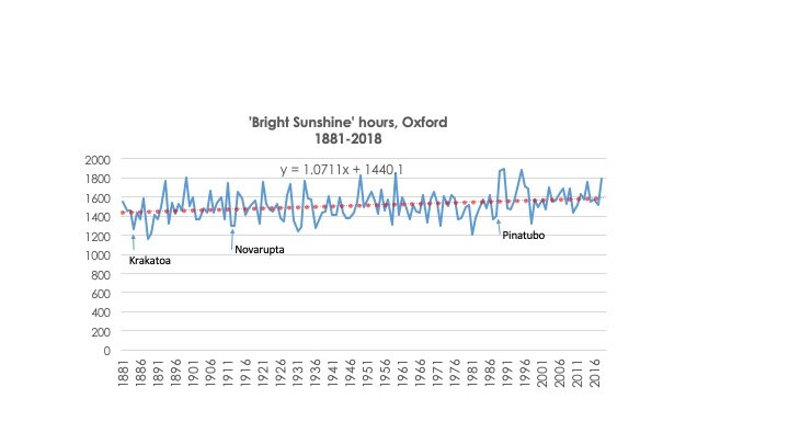
But what about sun, which is far more important? Is there pronounced annual variation in the amount of sun received in Oxford, the site of the panels? The Radcliffe Meteorological Station records a wide variety of weather variables including an estimate of ‘bright sunshine’. (I believe this term refers to whether the sun scorches a piece of paper if focused through a particular type of lens). These estimates go back to 1881. I am very grateful indeed to Thomas at the RMS for providing them so wonderfully efficiently.
The figures show a rising trend in ‘bright sunshine’ over the nearly 140 year period. As an illustration of this, the mean duration of bright sun over the entire history is about 1515 hours per year but only three out of the last twenty years have seen figures lower than this. The average for the last twenty years is about 1600 hours. Typically Oxford has received slightly more than one hour more bright sun for each year that has passed. Those of us who live here haven’t noticed this, even though the increase has sped up in the last decades.
(I never seen any reference to increasing sun hours in the UK in any other source. Is this is a general phenomenon, or specific to central Oxford, where there would have been more frequent fog in the past and possibly smoke from coal fires close to the observation site?).
The eruptions at Krakatoa, Novarupta and Pinatubo appear to cause major declines in the amount of bright sun, often for several years. This will have slightly suppressed the apparent rate of increase in the period up to late 2004 and therefore caused the apparent increase since then to be greater. (There have been no major eruptions in the last fifteen years).
The measure of ‘bright sun’ is an imprecise surrogate for the total amount of solar energy falling on a panel. PV doesn’t need strong sunlight to make electricity. Nevertheless, absence of cloud will result in a very much larger amount of generation so It is a reasonable proxy.
The chart below plots the number of hours of bright sun since 1881. A linear regression line from Excel is imposed, showing a typical increase over the near 140 year period of 1.07 hours per year.
Chart 2
Source: Radcliffe Meteorological Station, re-used with permission
What about the last 15 years? Does the increase persist over this period? The data suggests it sped up. (Please don’t put too much weight on this, but the conclusion is striking). Since the solar panels were installed, the number of hours of bright sun has typically increased by 2.95 hours per year, almost three times the rate of the previous century or so. This is a rise of about 2.7% in total over the 15 years.
Chart 3

Source: Radcliffe Meteorological Station, re-used with permission
The implication of increased levels of bright sunshine is that any underlying decline in the efficiency of the solar panels will be disguised.
Adjusting the PV output data to reflect the increased sunshine
Taking into account the increased levels of sunshine, what is the underlying rate of degradation of the panels on our roof? A first estimate would be to simply deduct the percentage increase in solar hours (-2.7%) from the observed figures for output (-0.8%) over the 15 year period. This subtraction results in an estimated total fall of 3.6% (rounding) in underlying output, or about 0.24% a year.
Increasing the complexity of the calculation
There are statistical problems with the estimate immediately above. The first of these issues is the seasonality of the distribution of increased sunshine. If, for example, most of the increase in sunshine hours occurs in winter, the impact on PV production will be much less evident than if the rise took place in the summer months. An hour of strong sun in December is occurring at a much lower angle than one in June, meaning the energy hitting the panels is less.
And this is indeed what happened. Of the 43 hours of annual bright sun increase between when the panels were installed and today, 28 occurred in the months of October to March. Only 15 were in summer.
How do we adjust for this? It’s problematic, partly because our panels are facing east-west. This means that they are particularly poor at picking up the winter sun. We won’t have seen much of the benefit of increasing solar radiation in the October to March period. In fact, October-March actually saw a bigger percentage fall in our solar panel output than in the summer. The total decline in the winter months over the 15 years was 1.6% of average period output, compared to 0.6% in the summer.
A more precise way of estimating the impact of the increase in sunshine is to look at the performance in individual months. For each of the last 180 months (15 years times 12 month) I adjusted the PV output by an amount that compensates for whether the bright sunshine in that month was above or below average for the fifteen year period. If, for example, the PV output was 100 kWh but the bright sunshine figure was 10% above average for that month then I deflated the 100 kWh figure by 10% to 90 kWh.
This is a statistically dodgy technique but I think it gives roughly correct results.* Plotting the result gives the chart below. It shows that, on average and after adjusting for bright sunshine, the average rate of underlying drop in performance is 0.17% per year. This result is important because it suggests a better longevity of mono crystalline panels than usually predicted. Financial returns will therefore be better than expected.
Chart 4
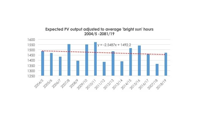
Source: Personal records and data from Radcliffe Meteorological Station
* A statistical artefact means that the expected average annual PV output appears to be higher than it really is. I don’t think this affects the conclusions.
** The regression coefficients in this exercise are low. The results are therefore of dubious statistical significance. But they seem reasonable to me.