At last, a plausible biofuel

Most species of algae contain oil that can be refined to make motor fuel. For ten years or more, entrepreneurs have been looking at ways of growing algae quickly, harvesting the product and then crushing it to create ‘green crude’ oil. What is probably the first commercial scale algae production plant has just opened in New Mexico. Does it look as though algae-to-fuel will be commercially viable? It is certainly a vastly better biofuel than corn ethanol but doesn’t yet appear to compete with solar PV as a source of low-carbon motor fuel. (I’m classing electricity as a fuel for cars). Using photosynthesis, almost all algae capture CO2 from the air as their source of growth. They produce oil and when this oil is burnt, the CO2 returns to the air. Motor fuel made from algae can thus claim to be close to carbon neutral. Most algae grow best in warmth and strong sunlight, meaning that the product is potentially well suited to sunny deserts where the land has few alternative uses.

The Sapphire Energy bio-refinery in Columbus, New Mexico is an extraordinary new venture that demonstrates the viability of commercial algae cultivation. Make no mistake, this seems to be a huge technical success. Huge ponds 200 metres long grow different species of algae depending on the time of year. The refinery extends over 120 hectares (300 acres). All the processing is done on site. It doesn’t use potable water.

By most metrics, Sapphire’s plant isn’t yet competitive with solar PV. And since most places (hot deserts) that are suited to algae are also suited to PV, the long-term future of algae refineries isn't immediately clear. Nevertheless, my quick calculations suggest that the plant produces about five watts of power for each square metre of space.  (The numbers to support this assertion are appended at the bottom – if you find a mistake, please tell me). By contrast, a big solar farm in sunny New Mexico may achieve 15 watts/sq metre, about three times greater.

(Is there a logic to this difference? Yes, PV cells turn about 15% of the energy falling on them into electricity, although not all space is used because of the gaps between rows in solar farms. Photosynthesis is much less efficient, averaging less than 2% in most circumstances. So PV will always tend to be more efficient in terms of energy conversion per unit area.)

Although algae cannot easily compete with PV at generating power, they are far better than corn ethanol, a petrol substitute made from corn cobs. My calculations suggest that land growing corn/maize produces about 0.2 watts per square metre, less than a twentieth of the figure for algae. So the mad and immoral policy of mandating that almost half the US corn crop is converted into motor fuel is clearly an extremely inefficient way of generating biofuels. Algae production is a much, much better tool for the decarbonisation of oil.

So does it matter that PV is better at converting light into fuel than algae? In the US, with its huge resources of unused desert, probably not. Sapphire has produced some estimates of what its new bio-refinery will produce and my quick calculations suggest that the entire crude oil need of the country could be grown on about 3% of the area of the continental US. This is a huge expanse of land, but slightly less than the approximately 3.5% given over to growing corn.

But more important than the land taken up by algae is the capital and operating costs of a biorefinery. The company’s press releases suggest that the cost of constructing the algae farm exceeded £135m. Dividing this by the energy value of the output of oil suggests a capital cost of about $2.40 for every yearly kilowatt hour. In the same sun-drenched location, PV would cost around a third as much. Of course, the cost of the refinery reflects that it is an ambitious prototype. Perhaps the cost will halve by the time the tenth bio-refinery is constructed? But it will still be more expensive than PV today.

The much higher operating costs of the algae farm also weight the economics in favour of PV, which needs no permanent workforce once it is constructed. But all these disadvantages are comprehensively outweighed, you might say, by the fact that Sapphire Energy delivers liquid energy, able to be poured into cars and planes as a direct replacement for refined oils. Algae may well turn out to be the most efficient way of generating low-carbon liquid fuels outside those areas lucky enough to be able to grow sugar cane. It is difficult to see any other way of replacing aviation fuel at reasonable cost to people and to planet.

Nevertheless, the better overall performance of PV should cause us to hesitate before backing algae for petrol replacement for land-based vehicles. And there’s one crushing final argument in favour of using electricity for powering cars. The energy coming from a PV panel flows into the grid and is extracted to charge a battery in an electric car. The car then uses this electricity with about 80% efficiency (the ratio of useful power delivered to the wheels as a percentage of the energy value of the electricity taken from the grid). By contrast, even efficient modern internal combustion engines only deliver about 25% conversion. Not only are algae plants probably more costly, far more space-using and have higher operating costs, they also produce a fuel with a third the value of electricity when converted to the energy of motion. Fantastic achievements Sapphire Energy, but we still should be pushing for electric cars.


Energy performances per square metre – back of the envelope numbers drawn from Sapphire Energy’s press releases

Expected eventual oil output per day – 100 barrels

Energy value barrel of oil - 1,600 kWh

Daily energy value of algae oil – 160,000 kWh or 160 MWh

Yearly energy ouput – 58,400 MWh

Space used – 120 hectares

Energy output per hectare – about 487 MWh

Square metres per hectare – 10,000

Annual output per sq metre – about 48.7 kWh

Hourly output per sq metre – about 5.5 watts compared with substantially less than 1 for other biofuels.


No rationale for Heathrow expansion

A growing number of influential people are saying that Heathrow needs a third runway. The main arguments being voiced are

a)      There’s a crushing shortage of airport capacity in the South East of England.

b)      Heathrow’s status as a business airport  is threatened by congestion

c)       The shortage of runway slots means that flights to China and other important business destinations are unavailable.

The numbers don’t support any of these conclusions.

a)      Shortage of airport capacity in the South East

The number of flights handled by London airports in the year to the first quarter of 2008 was about 975,000. This was down just over 9% from the same figure 4 years earlier, when the figure was 1,073,000. In other words, we know that London can handle at least 98,000 flights than it does at the moment. There’s no shortage of capacity.

b)      Heathrow’s status as a business airport is threatened by congestion

Only 37% of Heathrow passengers were business users in 2011. 63% were leisure fliers. Any problem is caused by holiday passengers.

c)       Flights to China and other boom economies are too few in number

The number of passengers flying to and from the Far East, including China, fell about 2.5% between 2007 and 2011. Only about 3% of UK passengers were going to the Far East. More went to Switzerland.

More details about the abundance of UK flights to China can be found in an earlier post on this web site.


Business air travel is not rising. This may be a function of the state of the world economy or it might reflect a decreasing need for people to get into aeroplanes to do business with each other. The arguments of politicians and journalists that suggest that UK exports are being held back by the lack of Heathrow capacity are palpably weak.

After a ruling from the Competition Commission, Heathrow's owners have sold Gatwick and have recently reluctantly agreed to dispose of Stansted. Is it unfair to suggest that the public relations campaign to try to convince us that UK plc is being held back by the lack of a third runway at Heathrow is driven simply by a desire to win back business from the newly competitive Gatwick and the threat from Stansted?

Matt Ridley says we are apocalypse junkies

The ever-stimulating science writer Matt Ridley has just published another of his doom-laden warnings about human susceptibility to doom-laden warnings. He tells us that the history of the last fifty years shows that when policy makers are goaded into action by naïve environmentalists, they invariably make things worse.  Scientists exaggerate the potency of ecological threats and their expensive cures often achieve nothing. His closing theme is an increasingly common one: ‘why should we trust the scientists on climate change, when they have been wrong about every single environmental issue of the last half century?’ Fifteen years ago, the Economist published a very similar article to Ridley’s in an attempt to get us to stop worrying about global warming. The examples of false catastrophe were strikingly similar to those that Ridley uses this week: the population explosion, the depletion of oil and gas, acid rain, cancer causing chemicals, exhaustion of metal supplies, food production, Ebola virus and so on. In both cases, the writers are eager to tell us that things are actually getting better every day and ecologists should button their lips. Time for a quick retrospective check: how well has the Economist’s Panglossian optimism about the next decades been matched by reality? Very badly indeed, it turns out.

The price of metals

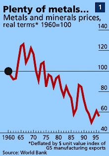
The Economist article started with the conventional attack on Malthus (also a target for Ridley, of course) for suggesting that population growth would outstrip food supply. But it rapidly switched to the 1972 Club of Rome report (Ridley goes for this as well) which projected a rapid exhaustion of available resources of important minerals, such metal ores. Prices would rise rapidly, said the Club.

What foolishness, exclaimed the Economist in 1997, as it displayed a chart showing metal prices falling by nearly 50% since the apocalyptic report. There is no shortage of ores and no reason for concern.

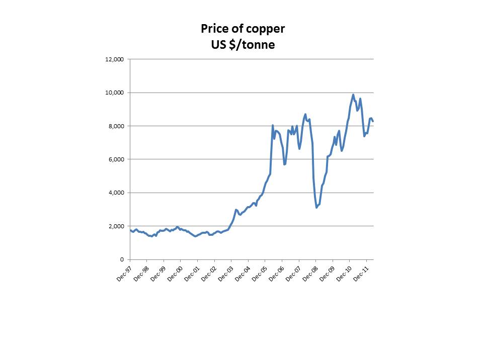
How have things changed since 1997? Below is a chart showing the price of probably the important metal, copper. (US $ per tonne). The cost has more than quadrupled since the Economist article. Other metals have also substantially increased in price.

The magazine went on to make the obligatory reference to the bet between Paul Erlich and Julian Simon. Erlich, a deep environmental pessimist, lost money to Simon who had correctly predicted that metal prices would fall.

Ridley also covers the wager in detail. Surprisingly, he makes no mention at all of the sharp rise in the price of most commodities since 1997. Instead, he says, ‘they grew cheaper’, a comment that will surprise anyone buying any industrial commodity in 2012t. The Economist made light hearted fun of the school textbooks that said that minerals would run out. Ridley does the same.


Food

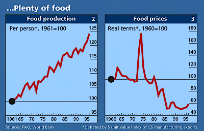
In 1997, The Economist showed that food prices had fallen significantly since 1960. The prevailing pessimism about agricultural yields was unwarranted.

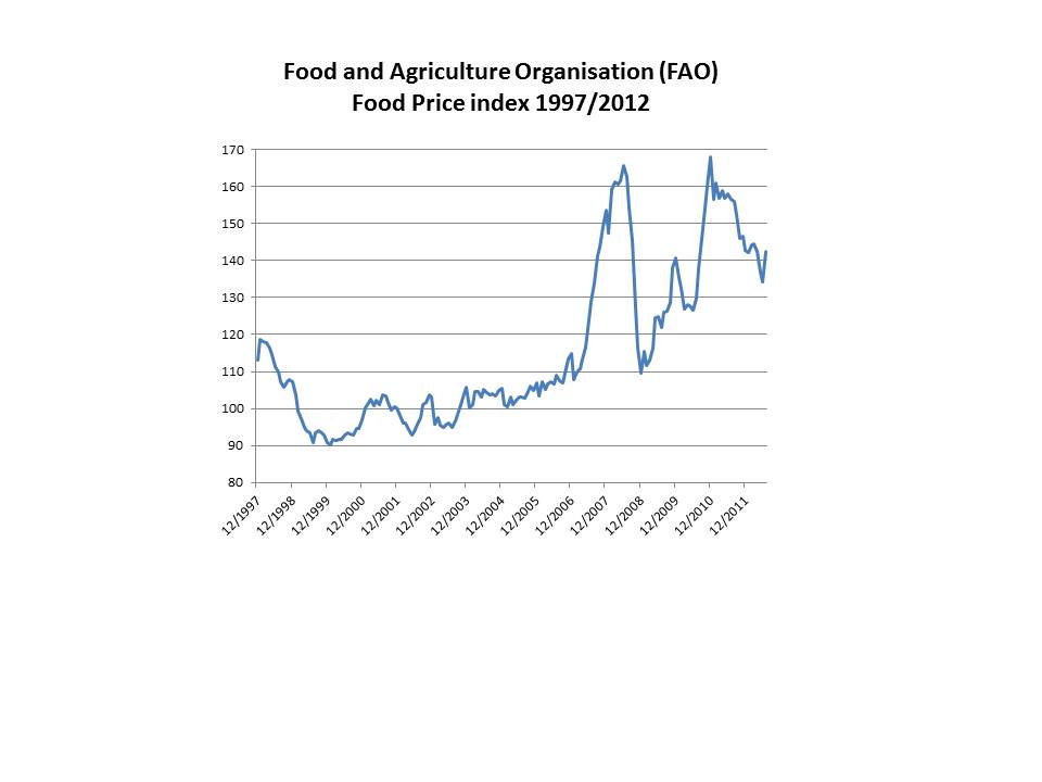
Was its rosy view of the future correct, or would food prices start to rise again? Unfortunately for the world, food prices have become much more volatile and typically much higher than they were. How does Matt Ridley deal with this inconvenient fact? He says that ‘food prices fell to record lows in the early 2000s’…but ‘a policy of turning some of the world’s grain into motor fuel has reversed some of that decline.’ Not quite correct – current world food prices in the last five years are substantially higher in real terms than at any time since 1990.


Cancer

In 1997, the Economist said that mortality from cancers not related to smoking ‘is falling steadily’ in the age group 35-69. Ridley repeated the claim last week saying that ‘in general, cancer incidence and death rates, when corrected for the average age of the population have been falling now for 20 years’.

Not strictly true: according to research from Cancer Research UK, 61,000 people in the 40-59 group were diagnosed in 2008 compared to 48,000 in 1978, a substantial rise even after taking into increased population numbers. Part of this increase is due to better screening and earlier diagnosis, but Ridley is choosing to ignore the many troubling signs that cancer rates may well now be rising. The Economist of 1997 and Ridley of 2012 pour ridicule on the idea that ‘chemicals’ have much to do with cancer incidence - and they are probably right – but any complacency over the number of cases is severely  misguided.

Amazonian deforestation and deserts

The Economist said that the problem was exaggerated and the area logged each year was falling. True: 1997 saw a figure of only 13m hectares (about 5% of the area of Great Britain). But by 2004, Amazonian deforestation had risen sharply again, to a level over double the earlier figure. After sustained action from the Brazilian government, the rate of loss has fallen but almost 20% of the total forest has now been lost.

Even more surprisingly, the Economist felt able to assert that in dry areas there had been ‘no net advance of the desert at all’. The UN thinks differently today, suggesting that 23 hectares are lost to the desert every minute. Unusually, Ridley doesn’t mention this theme at all, probably acknowledging the overwhelming evidence that fragile drylands are turning into deserts at uncomfortably rapid rates.

Acid rain

It’s on acid rain caused by power station emissions that the Economist of 1997 and Ridley of 2012 are most at one. They even use the same quotation from a 1990 US government report. Ridley calls acid rain ‘a minor environmental nuisance’ and both authors point to 1980s opinions that acidification didn’t affect the total volume of standing wood, once thought to be a severe threat. Ridley asserts that there is little evidence of any connection between acid deposition and increasing acidity of streams and lakes. (He is in a very small minority in his scepticism on this).

Both the Economist and Ridley imply that the environmentalists who demanded restrictions on the pollution from coal-fired power plants had needlessly panicked. Woodlands ‘thrived’ in a more acidic environment said the Economist. Not so, says the US government in its latest (2011) report on the impact of acid rain. ‘Despite the environmental improvements reported here, research over the past few years indicates that recovery from the effects of acidification is not likely for many sensitive areas without additional decreases in acid deposition’. Even now, the acidification of land and rivers remains a serious problem.

****

To both these two authors, separated by fifteen years, environmentalists constantly over-estimate the impact of humankind  on the world’s ecological systems. The globe, they say, is a much more robust organism than we think and can withstand our meddling. We should look to find technological solutions to ecological problems and not needlessly impose costly  regulation.

Most sceptics have the intellectual honesty to stop at this point and admit that the degradation of stratospheric ozone is a good counter-example. If the planet’s governments hadn’t introduced a restriction on ozone-depleting chemicals such as CFCs in the late 1980s and early 1990s, the ozone hole would still be rapidly increasing and letting in increasing quantities of dangerous UV-B radiation. (Too much UV-B causes skin cancer in humans and some animals and affects plant growth).

Matt Ridley won't have any of this nonsense. In a jaw-dropping series of paragraphs, he asserts that the connection between CFCs and other chemicals known to react with ozone and the decreases in ozone levels is unproven. The careful work by Paul Crutzen and others that won a Nobel Prize for showing how a single atom of chlorine can unbind many molecules of ozone is not good enough. Nor is the evidence of the impact of the ozone hole on skin cancer. Ridley says that the ‘the mortality rate from melanoma actually levelled off during the growth of the ozone hole’. It’s not unfair to describe this conclusion as utter nonsense: increasing skin cancer incidence has been linked to rising UV-B radiation for several decades.

But to Matt Ridley it seems more important not to allow the environmentalists to be right about anything. He appears to be worried that his readers might believe if scientists were right – just once in the 1970s - to link man-made chemicals to the extreme dangers of rapid ozone destruction, they might also be correct to say that global warming threatens mankind’s future. I really think we could have expected more from one of Britain’s best writers on science.


James Hansen on extreme weather events

James Hansen’s recent paper uses detailed temperature records to demonstrate that the chance of an area experiencing extremely hot summer weather has increased dramatically in recent years. Several similar publications have shown recently how climate change has increased the likelihood of very adverse weather. Scientists like Hansen do this work because they are wrestling with the need to communicate to the general public that global temperatures won’t increase every year but that the chance of extreme events in the form of ferocious heat or catastrophic rainfall is rising rapidly. Hansen’s conclusions are important in that they are the first attempt to show how the frequency of very high land temperatures has risen. But the second major finding of his paper has not been noted by the scientific press: temperature variability has increased. Not only has the average temperature risen but the distribution of temperature has widened, meaning that extremes are more likely. We didn’t know this, and the finding is deeply worrying.

The ‘bell curve

Many natural phenomena demonstrate a pattern called the ‘normal distribution’ or ‘bell curve’. Measure the height of Finnish women or the IQ of Singaporean children and the results will follow a predictable form that resembles the shape of a bell. Most observations are clustered around the mean with increasingly small numbers of results away from the central peak.

Temperatures follow this pattern. If I logged the average noon temperature for August days in London each year, I would find that the observations followed a bell curve pattern. Findings would be grouped around a central (mean) figure. The number of years above this level would be approximately equal to the numbers below it. The shape of the observations would be roughly symmetrical above and below the mean.

The bell curve is reassuringly familiar. In fact, it seems to me that humankind naturally assumes that most natural phenomena follow this pattern. This ‘normal distribution’ follows a clear statistical pattern. A calculation called the standard deviation predicts the width of the curve. Some distributions are quite tight, meaning that the curve has a small standard deviation and the curve falls sharply away from the mean. Others are fatter, with a high standard deviation. Whatever the size of the standard deviation, a proper bell curve has about 68% of all observations within one deviation of the mean. This percentage is almost universal.

Hansen’s paper calculates the standard deviation of summer temperatures (June-July- August) over land in the northern hemisphere. He shows the standard deviation was about 0.5 degrees C in the period 1950-1980. This number tells us that about 68% of all average 24 hour temperatures over the three month period for a particular spot will fall within the range +0.5 degrees to -0.5 degrees of the average. So if London’s average (24 hour) temperature is 16 degrees in the summer, it will be within the range 15.5 to 16.5 degreees just over two thirds of all years. This is quite a tight curve. Extreme variations of, say, +2.0 degrees are therefore very rare indeed.

Most models assume that the impact of climate change will be to shift the bell curve upwards. So if land temperatures rise by an average of 1 degree C, then London’s summer warmth will also rise by 1 degree, and the standard deviation will stay the same. One standard deviation (68% of observations are within this figure) will remain 0.5 degrees C. This is a convenient assumption: it implies that the effects of climate change are predictable and smooth. All that happens as the world warms is that the curve of likely future summer temperatures rises but the shape of the curve remains the same.

Hansen and his colleagues show that this is probably an incorrect assumption. They demonstrate that the curves of temperature are widening. The mean temperature is rising but the probability of extremely warm periods is increasing as well. The change isn’t massive. Hansen says that for the average spot in the northern hemisphere the standard deviation was 0.5 degrees in the period 1950 to 1980 but had risen to 0.54 or so in the period 1981 to 2010.

Also, the curve of possible outcomes is no longer symmetrical. Assessed against the average, the chance of very warm summers has increased sharply but the likelihood of colder summers has risen much less. (This means that the curve of temperatures doesn’t resemble a true bell curve any more – there’s a bulge on the higher side). All-in-all, the chance of really hot summers has increased quite sharply, even when assessed against a rising average global temperature. Global warming is significantly raising the chance of really extreme hot periods.

Until now, most climate scientists have assumed that bell curve will stay in shape. If Hansen’s research is correct and rising greenhouse gas concentration are producing a sharper increase in extreme hot events than predicted, we have yet another reason to worry. Adapting to a changing climate is more difficult if the extremes of hot weather or major rainfalls are more severe. (As we see in the American corn belt or the rain-hit north-west of England this summer.)

Even more fundamentally, some scientists have wondered whether the earth’s response to rising greenhouse gas concentrations would follow a bell curve type pattern or not. A doubling of pre-industrial greenhouse gas concentrations, which seems an increasingly likely outcome by 2050, was predicted to increase temperatures by between 2 degrees and 4.5 degrees with probability  distributions within this range that resemble a traditional bell curve. Marty Weitzman at Harvard has led the questioning of whether this is a reasonable assumption. He suggests that the right hand side of the probability curve may be much ‘fatter’ than the left (and therefore resembling what is known as a Pareto distribution rather than a normal curve - think of the shape of a beached whale). Hansen’s latest gloomy paper gives some important support to Weitzman’s hypothesis of the fat rightward tail.

This may seem abstruse and academic statistical worrying. It is not. Humans are brought up to expect the normal distribution in natural phenomena. Measure the height of your colleagues at work, or the time they take to drink a cup of coffee and you will find an approximately standard bell curve. We have instinctively assumed that temperature changes will continue to exhibit the same probability distribution as they have in the past. Remove that comfortable assumption and we have another major uncertainty to worry about.


Two reverse ferrets on energy policy

British journalists use the expression ‘reverse ferret’ when identifying changes in an organisation’s stance on an important issue. An important feature of a good reverse ferret is that the abrupt switch must never be acknowledged. In the last week the Department of Energy (DECC) reversed five years of British policy in two crucial ways. First, it has abandoned any pretence of technology neutrality in sponsoring additions to electricity generation capacity and now supports nuclear and gas in preference to renewables. Second, it has indicated that gas powered generation is no longer assumed to be accompanied by Carbon Capture (CCS) by 2030.

A successful reverse ferret is usually accompanied by a decoy: a story that distracts journalists attention while the U-turn is carried out. In this case DECC allowed a minor competing story about the rate of change in wind subsidies to attract press coverage. Masterly work, at least if you don’t worry too much about climate change.

The end of the orthodoxy of technology neutrality.

In its Carbon Plan of December 2011, published less than eight months ago, DECC wrote ‘In the 2020s, the government wants to see nuclear, renewables and CCS competing to deliver energy (meaning electricity) at the lowest possible cost. As we do not know how costs will change over time, we are not setting targets for each technology..’.

This summarised the energy policy of the UK government. It would set not targets but treat each potential source of low carbon electricity equally. Whichever technology forced down costs fastest would end up as the dominant provider of electricity. That’s all changed. The ministerial announcement on support for renewables on 25th July reduced support (as expected) for wind and for large scale solar PV.  Onshore wind now gets 0.9 Renewable Obligation Certificates (ROCs) worth about £40 a megawatt hour. PV will no longer be eligible for ROCs and will have to rely on the feed-in tariff of about £68 a megawatt hour, a figure which will be cut to about  £41 by  2015. (In both cases, these subsidies will be supplemented by payment for electricity, probably at about £45 per MWh.)

Where does this leave onshore renewables compared to nuclear? Nuclear will benefit from a different form of subsidy, the so-called ‘contract for difference’. In all important respects this is a feed-in tariff disguised to enable government ministers to be able to claim that nuclear receives no direct subsidy. The Times recently reported that the nuclear industry was demanding feed-in tariffs of £165/MWh. Denials rapidly followed from both government and electricity generator and the level at which the tariff will be set will probably be around £130/MWh. This support will continue for several decades.

Total payments for low-carbon electricity

Onshore wind £95/MWh
Solar farms £123/MWh (falling sharply to around £96 by 2015)
Nuclear £130/MWh


Nuclear power is going to be subsidised far more heavily than low-cost renewables.. This may well be a logical decision by government. Without baseload nuclear power, guaranteeing electricity supply is going to be very tricky. But let’s be clear: nuclear is going to receive a higher rate of financial support, guaranteed for longer, than the currently lowest cost renewables. In order to make the nuclear renaissance happen, we now see huge subsidies to draw in EdF and Chinese money. Financial neutrality has gone. We now have an industrial policy that incentivises one technology against another.

Support for gas

Until a few months ago, government policy documents routinely asserted that almost all electricity production would be low-carbon by 2030. The amount of CO2 emitted from power stations would have to fall to an average of a fifth or even a tenth of current levels. If gas or coal were used, they would have to be accompanied by CCS. The December 2011 Carbon Plan said ‘Fossil fuels without CCS will only be used as back-up electricity capacity at times of very high demand’.

That commitment has gone. The 25th July ministerial statement said ‘We do not expect gas to be restricted to providing back up to renewables’. If gas remains cheap ‘we expect it to continue to play a key role ensuring that we have sufficient capacity to meet everyday demand and complementing relatively intermittent and inflexible generation’.  It is only ‘in the longer term (that) we see an important role for gas with CCS’. The statement didn’t admit this, but the carbon targets for 2030 have in consequence been abandoned.

Accompanying the new explicit support for gas was a nice sweetener for the offshore exploration industry. A fund of £500m was announced to back investment in less financially attractive gas fields. We should put that in context. The current support regime for marine renewables is expected to provide £50m for wave, tidal and offshore wind R+D over the next four years. In other words, offshore renewables will get one tenth the help given to offshore gas.

That’s how it stands – high and guaranteed support for nuclear and subsidy for gas. Renewables are to have financial help withdrawn. These extraordinary reverse ferrets were largely ignored by the press, which focused on whether the UK Treasury or DECC ‘won the battle’ over the precise level of support for onshore wind. Did Chancellor Osborne or Energy Secretary Davey beat the other into pulp? A great tactic from the DECC press office, ensuring that a minor skirmish attracted attention while huge policy changes were left unnoticed.


The world’s largest community owned PV farm achieves minimum fund raising target

Westmill Solar, a 5 megawatt PV farm sited between Swindon and Oxford, is one of the largest arrays in the UK. It was built a year ago to profit from the high feed-in tariffs then available to large PV installations. Adam Twine, the farmer on whose land the 21,000 panels were sited, kept a right to buy back the solar farm from its original financiers. Twine is an enthusiast for community ownership and recently set up a cooperative to purchase the whole array. Small investors can apply to buy shares now, with local residents given priority. If successful, the new cooperative will be the biggest community owned solar farm in the world. The new business announced yesterday that it has raised the minimum £2.5m necessary to take the deal forward to the next stage. Other community should copy Twine’s scheme: the UK needs thousands of renewable energy projects like this one, giving decent returns to local people. (NOTE - on August 1st, Westmill announced it had exceeded its £4m total target and applications are now closed).

The investment opportunity

Westmill Solar is seeking to raise £16.5m to buy the PV farm. The business is looks to finance up to about a quarter of this (£2.5m  to £4m) from individual investors. The remainder (from £12.5m to £14m) is being sought from institutional bond holders at an interest rate of about 3.5% above retail price inflation (RPI).

The proposed financing has several unusual features. These make the investment opportunity more difficult to explain than comparable projects. Nevertheless, the innovations should form a model for future renewable energy fundraisings from communities because they improve the returns to small investors.

  • The business will buy back 5% of its years each year from year 2 to year 10. This is a tax efficient way of returning capital to shareholders.
  • The dividends[1] paid shareholders (as opposed to bond investors) will start low and gradually rise as the bond holders are paid off. By the end of year 24 - when the business is expected to be wound up as the Feed-in Tariffs cease - the returns illustrated in the prospectus appear to be over 50% a year on the shareholder capital remaining in the business.
  • The index-linked returns paid on solar PV investments create a very high degree of reliability of cash flow. Compared to wind, PV output is also far more stable from year to year. This means that businesses like Westmill Solar can run themselves with only a thin layer of shareholder capital, enhancing percentage returns on their cash.

The Feed-in Tariffs and revenue from exported electricity will produce a gross income of about £1.7m a year, rising with inflation. At today’s inflation rate, the bondholders will take interest in the first full year of about £0.8m. Running costs are approximately £200,000, leaving about £0.7m to begin to pay back some of the debt and provide a return to the small investors. As bond holders are paid back, an increasing fraction of the total income can be diverted to the shareholders enhancing returns. This isn’t likely to be a particularly  good investment for those seeking high dividends in early years but it could be an exceptional opportunity  for those seeking to make savings for financial needs in ten to twenty  years’ time, such as people wanting to improve their pension plans.

What are the risks?

By 18th July, 660 investors had committed £2.5m (an average of just under £4,000). This means that the equity fund raising has achieved its minimum target. The key remaining risk is that the investment bank seeking to raise the bond finance from institutional investors is unsuccessful in raising this money. If this happens, Westmill  Solar’s purchase of the PV farm will not proceed and the private investor money will have to be returned. The prospectus notes that the company will deduct up to 5% of investors’ money  to pay  for the costs of organising the offer to shareholders.

The other main risk is probably very high levels of inflation in the next few years. The bond holders’ return will be set as a percentage over RPI inflation. If, for example, 2015 RPI inflation is 7%, the interest payable to bond holders will use up almost all the cash coming into the business. Although the income from Feed in Tariffs will also rise, this will only partially compensate for the high interest costs. Until the company has paid back a large fraction of the £12.5-£14m debt to bondholders, very high inflation could represent a serious threat to the viability of the business. How likely is that we will see inflation rates well above today’s levels within the next fifteen years? Who knows, but  there is clearly a risk.

The other main risk is much more manageable. Levels of sunshine could be lower than projected. Levels of solar radiation hitting the UK don’t vary much from year to year but there is an obvious concern that the poor summer seasons of recent years might be a long-term pattern. Or a big volcanic eruption might affect sunshine levels for a year or so.

The wider importance of this fund raising

Communities around the UK can copy this scheme. Although the cuts in the Tariffs temporarily destroyed the viability of large scale PV, cost reductions now mean that big solar farms are financeable again. Westmill is financing a total of £16.5m to buy the PV farm but a new venture might well be able to build a similar array for less than £7m. Many prospective solar farms of this size are now in the planning approval process in the south west of England.

Many congratulations to the directors of Westmill, who have done an exceptional job in getting the project to this stage of development. My colleagues at Ebico and I remain keen to work with other communities to develop locally-owned renewable energy projects, providing good returns to smaller investors.

Owned by Eden Project employees, the much smaller PV array we developed in late 2011 was recently made runner-up in the Renewable Energy Association project of the year awards. Either using our model, or copying Westmill’s innovations, every town and village in the UK can now have its own wind, biogas or PV farm.

(Full disclosure: I myself haven’t yet applied for shares in Westmill but will probably do so over the next few days).


[1] Because the Westmill Solar business is what  is known as an ‘Industrial and Provident Society’ the dividends are paid as untaxed interest.

World land temperatures for June hit record high

You wouldn’t guess this from the UK’s weather, but world temperatures on land were the highest ever recorded for June. May was similarly record-breaking. The April to June quarter exceeded historic records for northern hemisphere land temperatures. Combined land and ocean figures make June the fourth hottest ever across the globe as a whole. As the cool water phase (El Nina) of the eastern Pacific drew to a close, world land temperatures have risen as expected in the last few months. The hot weather continues in July while Britain waits for a sight of the sun.

Many of us trying to communicate climate change issues have been approached by news media over the past few weeks asking whether the UK abysmal summer weather indicates that ‘the global warming scare’ is over. No, I say, the science remains exactly the same. In a warmer world weather may well become more erratic, more unusual. We should not pay much attention to episodes of unusual cold in Britain or elsewhere but focus on global averages. The last few months have been as warm, or warmer, than the past few years. Many places – on all continents -  are experiencing record temperatures.

Somehow, this response simply doesn’t work. Journalists are not interested in extreme temperatures 1000 km away in Austria (highest ever June temperatures) or the US (records broken across most of the country). The only thing worth commenting on is that the UK has had the wettest June since record-keeping began and the coldest midsummer month since 1991. Humankind finds its very difficult  to comprehend a global mean or a new record set in a strange and unknown part of the world.

A poll this week shows that Americans (experiencing hot weather on their continent) are agreeing with the climate change hypothesis in increasing numbers. But Britons drying their houses after repeated inundations understandably show no such belief. Truly it is going to be difficult to get any substantial global response to the climate change challenge.


DECC numbers on energy efficiency need checking

Today’s presentation on electricity efficiency opportunities from the Department of Energy (DECC) makes a series of important errors in its estimates of the savings that can be made in domestic homes.[1] For example DECC overstates the amount of power used in domestic lighting by almost a factor of three. Its projected efficiency savings are almost twice as great as today’s total use of electricity for this purpose. By contrast, DECC substantially underestimates the use of power for space and water heating. What is most surprising is the clear conflict between many of the figures presented and other recently published DECC data. Today’s document was supposed to show the large possibilities for improvements in the efficiency of electricity use. What seem to be simple mistakes completely undermine its credibility. More fact checking, please. Domestic homes consume about a third of all UK electricity. This figure is tending to rise both because of de-industrialisation and because of the relatively slow progress at reducing electricity use in households. It is only recently that home use has fallen substantially whereas industrial and commercial consumption has been falling for most of the last decade.

Efficiency matters. As DECC said on its web site when it released the presentation today.

Encouraging greater efficiency in the use of electricity is potentially very valuable to all of us. It can reduce electricity bills both directly and also indirectly through limiting the overall cost of the electricity system in terms of funding for new generation, transmission and distribution infrastructure.

Lighting

This DECC report suggest that domestic homes use 42 terawatt hours (TWh, over 10% of total UK electricity demand). In the magisterial GB Housing Energy Fact File, published by DECC in September 2011, this figure is estimated at only 16.5 TWh.[2] This second figure is widely used and is assumed to be approximately accurate. The recent Energy Savings Trust report suggests an even lower figure of about 540 kWh a year per house, equivalent to about 14 TWh for all UK homes.

Today’s  DECC document estimates that efficiency savings of 26 TWh can be made, largely by the replacement of old-fashioned light bulbs (‘incandescents’) by compact fluorescent lamps(CFLs). So the total savings claimed to be available are far greater than total domestic use. Not only is the number wrong, but the efficiency improvements from the switch to CFLs have already been partly made. The remaining gain will come from moving from comparatively wasteful CFLs to high efficiency LEDs. The savings from this switch might be about 10 TWh but are unlikely to be more.

Appliances and electronics

The new DECC document says that appliances and electronics in homes consume about 47 TWh but its own September 2011 report suggested a figure of 58.4 TWH, a figure almost 25% higher and in rough agreement with the EST June analysis.

In the case of home electronics, efficiency savings of 38% are said to come from a reduction in standby losses. (I could find no source provided for this estimate).This is not a credible figure. No modern consumer electronics now have significant power consumption when not in use and efficiency saving will be much lower than 38%

Heating use

The new report suggests that household electricity use can be reduced by building improvements such as installing ‘high efficiency windows’. The total potential saving identified is almost 15 TWh. But in another DECC document, this time from 2010, the total amount of electricity used to heat UK homes is estimated at 17 TWh.[3] Therefore the new estimate is that almost 90% of electricity consumption to heat homes can be avoided by retrofitting insulation and other improvements. This is not a supportable assumption.


Reducing electricity demand in the UK is an important objective. I have only researched the section on domestic use but this portion is said to offer almost half the possible efficiency savings.  Furthermore, the costs of efficiency improvements are stated to be less than the financial gains to the householder from using electricity. This assumption, which in my experience is rarely true, is never examined. It seems to me that the DECC report does not meet reasonable expectations for policy proposals from a government department, even in the draft form in which it is currently presented.


Can you predict someone's carbon footprint by knowing how much money they have

(This article was written in 2009 and uses data from previous years. Expenditure patterns change slowly and the conclusions are likely to be broadly  accurate today. I am posting it now because the data is referred to in an magazine article to be published in the next few weeks.) If we include the full impact of flying, the average person in the UK is responsible for about twelve and a half tonnes of greenhouse gases each year. About half of this total comes directly from running our homes and from personal travel. The rest comes from the things we buy, our carbon dioxide output at work and from manufacturing industry.

In mid November the Prime Minister gave his first speech on climate change. He said that emissions may have to fall by 80% by 2050. This means moving from twelve and a half tonnes per person down to two and a half. Many scientists say that even this is too much and we may eventually have to cut our average emissions to no more than one tonne. This is less than 10% of today's level.

Who is going to find it most difficult to reduce their emissions? What types of families are going to have to make the steepest cuts? We did some work to examine how much carbon dioxide the rich generate compared to the less well-off. The results show that if all of us are going to have to live within a small allowance, the better-off are going to have to really cut back. The richer you are, the more you spend on goods and services that produce carbon dioxide emissions. So, for example, people who don’t have much money don’t fly away on holidays very much. But some people travel by air ten times a year. The wealthiest ten per cent of the country have a carbon dioxide footprint just from motoring of almost two tonnes, enough to use up most of an individual's allowance for 2050. This is over four times the level of the least well-off. When we added up the sums, we found that the richest ten per cent have emissions almost two and a half times as great as people at the other end of the income range.

Our technique.

We used a very good source of government data, the annual Family Spending survey. The information in this huge report is taken from a large number of detailed questionnaires that were completed in 2005 and 2006, the latest year for which data is available. For each group of one tenth ofUKhouseholds, moving from poorest to richest, the survey says what they typically spend on hundreds of different items. For example, you can find out what people in various income groups spend in ice cream, alcopops, children's clothing or even reading glasses. Thousands of people fill in the questionnaire and the numbers are thought to be very accurate.

In the latest report, the top ten per cent of households have an average spending, across all family members, of almost £1,300 a week. The middle-ranked households had an expenditure of about £500, and the people at the lowest income level were spending less than £135 a week.

How did we calculate a carbon footprint?

We looked at the main different types of household expenditure that involve burning fossil fuels. For example, we noted spending of gas and electricity. When you heat your house, the boiler is emitting carbon dioxide to the outside world. Slightly differently, when you turn on the lights, a power station has to burn just a bit more fuel. This means more CO2 up the power station chimney. We also looked at how much people spend on petrol and diesel. If they spend money, it means they bought litres of fuel which are burnt in the engine and carbon dioxide comes out of the exhaust. We also examined the money spent on public transport and flying, though the numbers are slightly less good for aviation than we'd like. Information about foreign holidays is there and, finally, we looked at money spent on meat. Meat is important because animals emit greenhouse gases such as methane and because they eat grains, which have generally required artificial fertiliser to grow. Fertilisers take a lot of fossil fuel to make.

Let's look at the main categories in turn.

Heat and power for the home

People in the top income groups spend a lot more on gas and electricity. The latest data shows the richest 20% of households spending £17 a week on domestic power and heat, while the bills of the poorest 20% were only £9 a week. But richer families have much larger households. Many of the poorest people in theUKlive alone but the top 20% of families have an average of over 3 people in the house. So when we look at spending per person on gas and electricity, we find that it doesn’t vary much across the income groups.  The richest people actually have a slightly lower carbon footprint than the less well-off. But there isn’t a big difference between the various groups. This was surprising. Because rich people generally have much bigger houses and more space per person, we thought that they would spend more on fuel per person. This isn’t the case, suggesting that less well-off people may live in houses that are not particularly well insulated.

Interestingly, we also made a calculation about the carbon footprint of the electricity we use. We used standard government numbers to work out what the average emissions are per person. Very roughly, it is just under a tonne each for electricity, and between one and a half and two tonnes for gas.  If nothing else, this does show how far we have to go to meet the latest targets set by Gordon Brown.

Petrol and diesel for the car

Whereas there isn’t much difference between income groups when it comes to heat and power, we do see large disparities in fuel use for cars. The richest people spend over four times as much per person as the least well-off. Richer people generally have bigger cars and drive them longer distances. Very roughly, people in the least well-off portion of theUKpopulation have a carbon footprint of less than half a tonne from driving, compared to almost two tonnes among the wealthiest.

Public transport

Public transport expenditure is very interesting. Rail use goes up dramatically as people get wealthier. It is almost ten times as much among the richest as among the people at the bottom end of the spectrum. On the other hand, households with less money actually spend more on bus and coach fares. As we know, most people don’t travel much by public transport, so the impact on total carbon dioxide emissions is not that great.

Air travel

It's here that we see the most striking differences. The numbers are less precise than for car travel, but the richest groups spend over ten times as much on foreign holidays (usually taken by air) and perhaps five times as much on flights. This almost certainly  means that the top 10% have a footprint of more than four tonnes from flying compared to well under half a tonne for the least well off group. In a future world in which carbon dioxide is much more carefully controlled, many people's flying habits are going to have to change, or the airlines are going to have to have to find a way of burning less fossil fuel.

Meat

At about £4 per person per week, this doesn’t vary much between income groups, though high income homes do spend a little more. Household diets vary enormously and there isn’t any obvious evidence that the most carbon-intensive food are disproportionately eaten by any one income group.

What does it all add up to?

We have looked briefly at the main carbon culprits – the things which have the greatest impact on your personal responsibility for climate changing gases. We can summarise roughly how emissions vary by income group.


Approximate greenhouse gas emissions per person

(tonnes per year)


Bottom 10% Average income Top 10%
Electricity 0.9 0.8 0.9
Gas 1.7 1.6 1.7
Motor fuels 0.4 1.1 1.8
Public transport 0.1 0.1 0.2
Air travel 0.4 1.5 4.0
Meat 0.3 0.3 0.4
TOTAL 3.8 5.4 9.0
 
Approximate expenditure per person per week £80 £200 £450


Almost all of the difference is driven by the much higher figures for air and car travel in the highest income groups. The most prosperous people have carbon emissions from these sources of almost two and a half times the least well-off. Add all these numbers up, and the climate emissions vary by almost two and a half times across the income range.


Dutch trial of domestic fuel cells for grid balancing

In late May, Germany met more than 50% of its power needs from solar PV at midday on two successive days. This astounding success brings a problem with it. How does the country manage to balance its electricity grid as solar electricity ramps up towards noon and then falls away later in the afternoon? Most analysts assume that large-scale natural gas power stations are the logical complement to intermittent renewables. An announcement today (June 19th 2012) from a small Australian company should make us question this assumption. It has just announced a trial of its domestic-scale fuel cell power plants for grid balancing in the Netherlands. These tiny fuel cells are highly flexible, powering up and down in a matter of seconds. In theory this technology could be the cheapest way of matching supply and demand in a renewables-dominated world. But they need to be in millions of homes to create a large enough buffer and to push the capital costs down to competitive levels.

I wrote the first edition of Ten Technologies to Fix Energy and Climate four years ago. Each of the ten chapters focuses on one or two companies that looked as though they had the technical edge to prosper in a world in which low carbon energy sources take a larger role. The good news is that almost of these businesses are still in existence. The bad news is that most of them haven’t broken through to commercial viability. This probably tells us a great deal about the state of the battle against carbon emissions: even the best technologies have yet to take off because of the difficulties of getting to competitiveness against fossil fuel power stations that have had a century to reduce their costs.

One of the most interesting companies I wrote about was Australia’s Ceramic Fuel Cells. Ceramic, as it seems to be known in its home country, is the owner of the grid balancing technology now on trial in the Netherlands. Ceramic makes what are in effect small domestic electric power plants. These refrigerator-sized devices sit in the kitchen or boiler room generating about one and half kilowatts of power, about three times the average domestic consumption, by splitting natural gas (mostly methane or CH4) into hydrogen and carbon dioxide. The hydrogen then combines with oxygen in air in an electric circuit creating water, an electric current and some heat. Most of the time these units are exporting their power into the local grid and they  do so at about 60% fuel efficiency, at least as good as the best full-sized power station. Moreover, the waste they generate can be captured to provide 100 litres a day of hot water, enough for most homes.

The Ceremic technology is still expensive – almost £20,000 to install a device that generates electricity worth (at retail prices) no more than £1,200 a year. (For comparison, a modern gas turbine plant might have a capital cost of about £1,500 per 1.5 kilowatts of peak output). The value of the hot water might be another £3000 at most. Even with hefty feed-in tariffs, the homeowner is unlikely to see a high return. As with many clean technology companies, Ceramic is stuck making small volumes of its products at a high unit cost. To get down to £4-5,000 per installation, the company needs to make several thousand units a year, not the hundreds it is making at the moment. Although many people say that its technology is further advanced than other small fuel cell company in the world, it still has to fight for every sale and is reliant on the support from big utilities around the world which are charmed by the technology.

Fuel cell technologies are not carbon neutral if they use natural gas. But if the gas comes from biological sources, such as anaerobic digestion of agricultural wastes, it can provide genuinely renewable electricity. In addition, the ability of Ceramic’s products to turn up and down at a few seconds notice can provide very valuable grid balancing. At the moment of writing, wind is barely providing any of the UK’s electricity but is expected to generate almost two gigawatts by this time tomorrow. As the wind turbines ramp up, small deviations from the expected increase could be evened out by tens of thousands of Ceramic fuel cells adjusting their output to smooth the power from wind. This service can be worth much more than the standard wholesale price of power and may be the most important single source of income for the owner of a small fuel cell power plant.

Of course the critical thing is to get thousands of fuel cells spread around a country to all respond quickly to a signal to increase or decrease their power output. This is purpose of Ceramic’s trial in the Netherlands with its partners, the utility Liander and IBM. A number of its Blue Gen products will be controlled remotely by ‘smart grid’ software to see how effectively they can be combined to rapidly ramp output up or down to match minute by minute variations in the power from wind and solar.

Whether you believe that the carbon-free future for electricity generation should be based on nuclear or renewables, we all have to face the difficulty of ensuring that the electricity system can match supply  and demand minute by minute. Nuclear power stations have to be run at peak power or not at all and wind and solar production can neither be accurately predicted nor managed. We will either need huge amounts of storage (perhaps hydrogen or pumped water or compressed air) or highly flexible generators. As things stand today, Ceramic’s products are the most easily adjustable generators on the market. The company may need another £200m of capital to get its products down to reasonable production costs, but its twenty year old technology is one of the most interesting parts of the low carbon future.

The Rothamsted battle

Eight small plots of wheat at Rothamsted research centre are the focus of an increasingly bitter dispute. These 6 metre by 6 metre squares of genetically modified cereals are threatened with destruction by one group of determined environmental campaigners this weekend (27th May 2012). Other equally committed environmentalists fiercely defend the importance of the science. If successful, the Rothmasted GM wheat will reduce the need for the use of insecticides, particularly the group called pyrethroids that kill aphids and other pests as well as beneficial insects. Since pyrethroids may be implicated in the collapse in pollinating bee numbers, GM wheat might have major beneficial impacts.

Wheat is the single most important source of human nutrition. About 20% of the world’s calories come from this crop. Increasing the yield from this cereal is therefore a crucial part of the world’s route towards securing food for three billion more people by 2050. Aphid infestation can cause significant losses to the tonnage of wheat taken from a field. One pest – wheat midge – can reduce yields by 50% or more in the most affected fields. Reducing losses to wheat crops caused by aphids is a vital part of improving global food availability.

The Rothamsted GM wheat incorporates a gene that helps create a substance called (E) beta farnesene. The chemical is what is known as an ‘alarm pheromone’ produced by aphids.  It signals danger to other aphids, which therefore tend to avoid it. By contrast, the predators of aphids seem to be attracted to it, perhaps because it identifies where large concentrations of their prey might be found.

( E) beta farnesene is found in several common plants, such as peppermint, and the Rothamsted researchers have added the genes that create this substance to the genome of wheat. (Anyone with mint in the garden knows that it is rarely damaged by insects – so at least in the UK the omens are good). This genetic modification is building on a recent series of papers suggesting that directly applying  E beta farnesene to wheat may reduce aphid numbers on the crop. Incorporating the production of farnesene into the wheat itself may be an even better way of reducing aphid damage.

The main benefit from the genetic modification may be the reduction in the need to use synthetic insecticides. In the UK about three quarters of all wheat has an insecticide applied, according to the last government survey. Most of these fields have synthetic pyrethroids sprayed onto the crop. Artificial pyrethoids are similar to the natural insect repellent in plants such as chrysanthemums. These insecticides work by affecting the sodium ‘gates’ in organisms and are particularly destructive to insects and to aquatic animals. These insecticides are only toxic to mammals in extremely high doses and their short life means that they are regarded as relatively safe. But they destroy all insects, including the predators of wheat-destroying aphids and so tend to diminish biodiversity.

There is some evidence that sub-lethal doses of pyrethroids, perhaps in combination with other insecticides such as neonictiniods, affect many higher functions of creatures such as bees. By ‘higher functions’, I mean such things as memory (for example, where the home hive is) and ability to communicate the direction of pollen through the bee dance to other hive residents.

Vital though they are to crop protection, pyrethroids may therefore also cause some of the problems we now see in bee survival. Wheat itself does not require bees for pollination but the doses of insecticides are possibly reducing the number of bees in the wild, with severe consequences for the future pollination of many other crops.

The argument in favour of the Rothamsted GM experiment is that – if successful – it will help to reduce the insecticide load experienced by bees during their foraging. The world needs Rothamsted to succeed if it is to produce more food at a lower environmental cost. Many of the complaints about the experiment, such as the risk of contamination of locally grown wheat, are almost certainly wrong, simply because the E beta farnesene gene introduced into the Rothamsted wheat is extremely unlikely to be able to be transmitted to non-GM crops. In particular, wheat pollen does not travel more than a few metres and even if does merge with non GM wheat almost certainly cannot transmit the E beta farnesene gene.

Rothamsted research centre is probably the oldest plant breeding laboratory in the world. Not only has it assisted in the development of new agricultural technologies, it also claims with much justification to be the ‘birthplace of modern statistical theory and practice’. The new GM wheat trial, properly approved by regulatory authorities, is a worthy and scientifically robust attempt to see if techniques can be developed to reduce the use of chemicals, particularly pyrethroids, in the field. Unfortunately, it is a wonderful irony that the lab that initially developed pyrethroids in the 1960’s was none other than Rothamsted itself. The major improvements in insect control that the laboratory developed to the benefit of people around the world may just have helped trigger part of the collapse of bee populations. Perhaps GM wheat will have the same short term benefits as pyrethroids but then cause further problems in ecological stability.


Food versus fuel: a debate that has only one possible conclusion

Ben Caldecott of Climate Change Capital argues in the Guardian that ‘sustainable’ aviation requires the use of biofuels. He suggests a target of about 60% bio-based ingredients in the fuel that powers planes at UK airports . He doesn’t begin to address the implications for food supply, or show how biofuels will reduce global emissions. My calculations suggest replacing 60% of the UK’s aviation kerosene with fuels of biological origin would use all of the UK’s home produced cereal and oil seeds crops and substantially increase food imports. Furthermore, to replace the food used to make aviation fuel on farmland elsewhere in the world would result in a net increase in greenhouse gas emissions. The inconvenient truth is that biofuels are never an answer to climate change problems. Put crudely, photosynthesis in growing plants captures energy provided by the sun. This energy can either be used to fuel human beings, providing them with the two or three kilowatt hours a day they need to function, or it can be used to create power for other purposes. For example, the energy in corn (maize) can be turned into alcohol that replaces petrol in a car. Or it can provide food for human beings or cattle.

A kilogramme of wheat contains about 3,000 (kilo) calories, equivalent to about three and a half kilowatt hours. Biofuel processing plants use the energy in foods to create liquids that can power engines and jet turbines. Ben Caldecott wants us to switch to 60% biofuels in aviation fuel. How much food would that require?

In 2011, the UK used about 11.4 million tonnes of aviation fuel. The total energy value in this kerosene was about 133 terawatt hours. (Contrast this with the UK’s total electricity use of about 350 TWh, about three times as much).

Britain produced about 24 million tonnes of grain and oil seeds. This was mostly wheat but also included barley, oats and oil seed rape. The energy value of this was about 84 terawatt hours. So if every single food grain produced in Britain this year was turned into liquid fuel at 100% energy efficiency, we’d only cover about 60% of our needs for aviation fuel. But even in the most efficient conversion process, only about half of the energy value in grains can be turned into fuel. Even if Britain turned every single grain produced this year into kerosene, the country would barely meet a third of its need for aviation fuel.

No problem, Ben Caldecott and other biofuel fans might say: we simply need to import more food. The question that arises is whether growing more food elsewhere would increase greenhouse gas emissions to a greater or lesser extent than the savings from reduced oil use in airplanes. Unfortunately, even simple calculations show that conventional agriculture produces more emissions than aviation per unit of energy. Growing food using conventional agriculture uses large amounts of energy to produce nitrogen and phosphorus fertilisers. More importantly, nitrogen applications to fields increases the emissions from soils and watercourses of nitrous oxide, a far worse global warming gas than CO2. The net impact on global emissions of producing an extra tonne of food is probably at least 550 kilogrammes of carbon dioxide equivalent. (Much, much more if it is new land converted from forest or grassland to arable). And unfortunately the saving of CO2 from replacing kerosene with oil seeds is far less than 550 kg per tonne of food.

As study after study has shown around the world, biofuels don’t save emissions. As importantly,  every tonne of food that is converted to liquid fuel increases the price of basic foodstuffs for poor people. Ben Caldecott's article welcomes increased air travel. He and his colleagues at Climate Change Capital should ask themselves whether feeding the aviation industry is more important than avoiding hunger and starvation. The numbers simply don’t support the view that aviation can become more ‘sustainable’ by switching from fossil fuels to biologically sourced equivalents.

Rubbish

In a report published this week (1st May 2012), the UK’s Royal Society asserted (p68) that the accumulation of waste products in a modern society is strongly linked to the size of GDP. In simple terms, more growth equals more rubbish.  Similar jeremiads about the severe impact of economic growth on global ecologies pervade the report. So the authors might be slightly embarrassed to see the latest data on household rubbish published a couple of days later by the UK government. These numbers show that the average person now produces less waste than fifteen years ago. Let’s get the facts right, please: economic progress is not necessarily bad for the environment. The volume of waste produced by an economy is a good index of its impact on the natural world. Everything we consume starts by being extracted from the earth’s crust or soil, is then processed to make it useful to us and eventually turns into waste. Whether it is an iPad, a hamburger or a Volkwagen Golf, our goods all ultimately come from the ground. After delivery a service to us, everything is discarded and becomes rubbish, collected by the local council every week or so.

The conventional view of the world is that growth in GDP always takes the form of increased consumption of physical goods. As we get richer, we’re told,  we buy more stuff. For a long while this simplification was broadly correct. A large fraction of the extra income that households gained in wealthy countries between 1960 and about 2000 was spent on things you could touch. We bought cars, washing machines, more clothes, TVs and garden furniture. As the Oxford sociologist Jonathan Gershuny points out, the second half of the 20th century is often portrayed as the beginning of the ‘service’ economy but it is characterised more accurately as the period when household life became mechanised. Households acquired a large number of heavy machines.

That era ended in advanced economies a decade or so ago. In the UK, most indices of physical consumption show a decline from around 2002, a point I have called ‘peak stuff’. That decline will continue. We have the machines we need and the ones we have last longer (compare the lifespan of a car today with one a generation ago for example), and are generally lighter and easier to recycle. I know it is difficult to believe, but we eat less, use less water and travel fewer kilometres each year. Broadly speaking, we are slowly replacing the consumption of physical goods with the pursuit of pleasurable experiences. Each year, a larger fraction of our income goes on visiting the David Hockney exhibition, attending a Manchester United football match or paying for out Netflix subscription.

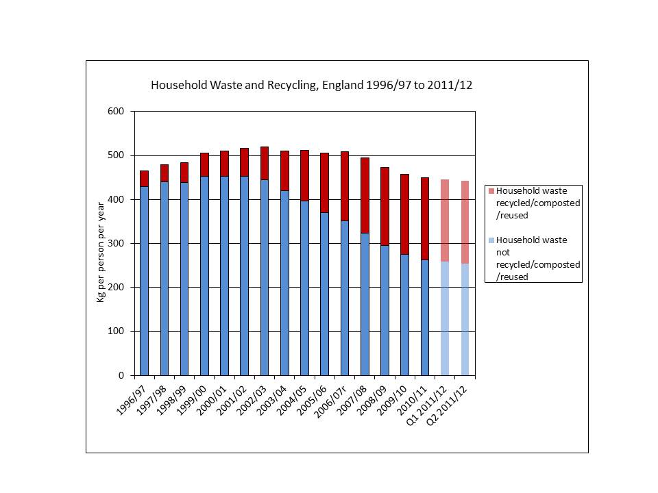
We see this in the amount of waste we throw away. Waste production per person in the UK peaked at around 520 kg a year in the year to March 2002. The latest two quarters figures are fifteen per cent below that level. The lastest quarterly figures suggest a figure of about 443 kg. The decline from year to year isn’t smooth but is probably getting steeper. (Please note that the last two columns in the chart below are for the most recent quarters. The apparent slackening in the rate of decline is an artefact of the way DEFRA draws the chart). Today’s waste levels are well below the levels of 1996/7. By contrast, in the period from 1997 to today, inflation-adjusted GDP has risen by over a third. (This isn’t quite a fair comparison since the UK population has also increased during the last fifteen years). Household rubbish is actually a small fraction of the total flow of waste out of the economy. Construction waste is far more important but this is also falling sharply. All in all, we produce far less rubbish than we did a couple of decades ago.

The probable implication? In contrast to what the Royal Society says, growth may be good for the environment. We waste less and are prepared to devote more cash to ecological protection. Technology improvements mean things last longer and use fewer physical resources to make.  Regretfully, I have to say that the world’s most prestigious scientific institution should spend more time checking its facts. As people get richer, they don’t buy, and then dispose of,  more goods. As England shows, more GDP doesn't mean more waste.


Source: DEFRA, Local Authority Collected Waste for England, May 2012

(http://www.defra.gov.uk/statistics/environment/waste/wrfg22-wrmswqtr/)

The cost of our dietary habits

The world produces plenty of food – over 5,000 calories a day per person. Nevertheless, the sustainability of our food supply is one of the central problems facing the world. As countries become wealthier an increasing fraction of the world’s agricultural output is fed to animals, which typically turn eight calories of food into only one calorie of meat. Can the world’s total food supply expand fast enough to accommodate the increasing percentage of calories going to feed animals? A new paper suggests that a 2050 world that has global agricultural productivity as good as the US today, but also copies the US’s dietary patterns, would need nearly double the global land area devoted to arable crops in 2050. This is impossible to achieve without large scale further destruction of vital forests.[1] Over the past four decades, a growing fraction of world food supply has been diverted to meat animals. Nevertheless, the typical person has access to about 2,750 calories today, up from 2,250 forty years ago. This increase has occurred as a result combination of four interlinked factors.

1)      The amount of land used for growing food has increased by about 35%. This increase has, of course, partly come from the destruction of forests, pushing many gigatonnes of carbon into the atmosphere.

2)      Yields per hectare have risen, and are still rising, at  between 1 and 2% per year.

3)      The population has grown sharply

4)      Lastly, diets have changed, implying a need to produce more primary calories in the form of crops for use by animals.

The paper has a very interesting and elegant way of expressing the impact of each of these forces. It estimates the impact on agricultural land area of each factor, showing how the extra cropland was used. Total land area devoted to arable crops rose by nearly 270 million hectares from 840 to about 1,110 million hectares.

Force at work Impact on global arable land area
   
Increase in population +682 million hectares
Increase in animal products in human diet +239 million hectares
Improved agricultural technology, including irrigation -654 million hectares
Net land extra land area devoted to arable crops +267 million hectares


We know that global population is likely to increase sharply between now and 2050. The paper assumes that the number rises by about 2bn to around 9bn. (Many people will regard this as improbable, seeing a figure of around 10bn as more likely.) If the rest of world ends up with US style dietary habits, expressed in terms of animal products consumption and overall calorie intake, but also is as good as the US is today at  producing food, then 9bn people of 2050 will need almost double today’s arable land area. If the global patterns are of Western European dietary and agricultural productivity, then the increase is about 70%.

The FAO says that arable land area can be increased by 5% from today’s levels without further loss of forest. The implication is therefore that the world is set on a collision course as rising prosperity meets insufficient land area to meet demand for animal products. The price of food will continue to rise sharply, probably pushing large numbers back into malnutrition. Or the world continues to cut down its forests, increasing carbon losses and also affecting local and regional rainfall patterns. Both routes are terrifying.


[1] Global changes in diets and the consequences for land requirements for food. Thomas Kastner et al, Proceedings of the National Academy of Sciences, April 2012

GM cotton: an expensive mirage for Indian farmers

India first allowed the use of GM cotton seeds in 2002. Only ten years later, almost the country’s entire crop is grown using genetically engineered seed. This remarkably fast transition was driven by small farmers deciding that GM seed would improve profitability and reduce insecticide use. Scientists and agronomists initially agreed, producing evidence that the insertion of a natural insecticide (Bt or Bacillus Thuringiensis) into the genes of the plant was the best way of improving India’s historically low cotton yields per hectare. But the last few years have seen optimism fade rapidly as yields have stabilised or fallen and insect resistance has increased.  An Indian anti-GM pressure group produced research this week showing that Bt cotton productivity now appears to be falling. (1) As global population increases to about 10 billion in 2050, the world must find ways of increasing the productivity of the limited reserves of usable cropland. Little land is available for conversion from other uses so yields per cropped hectare must grow at close to the rate of population increase. In the past this has proved possible, partly as a result of improved agronomic techniques and hybrid seeds and partly from greater irrigation. Does genetic modification offer a means of continuing the increase as fresh water supplies become stretched? The evidence has been mixed across the world but the Indian experience with cotton is a powerful indication of the issues that can result from GM introduction.

Cotton cultivation in many countries requires huge inputs of pesticide to counter the threat of multiple pests that can reduce yields to virtually nothing. Monsanto’s GM cotton contains one or more genes that produce large concentrations of the natural Bt insecticide in the plant’s leaves. The purpose of the genetic change is to reduce the need for the farmer to spray expensive insecticides which can also severely affect human health.

India has often been touted as strong evidence for the success of Bt cotton, perhaps the country’s most important cash crop. The chart below shows why. Until the turn of the millennium, yields of cotton lint had stagnated at around 300 kilogrammes per hectare of cultivated land. Bt cotton was first officially planted in 2002, though black market seeds were probably in the soil a year earlier. National cotton yields then climbed sharply to levels well over 50% higher. At first sight, the coincident increase in GM plantings and yield increases seems strong evidence for the success of GM.

(Source: Cotton Advisory Board of India for yield figures, SAGE for percentage of GM plantings)

The Indian NGO group, Southern Action on Genetic Engineering (SAGE) points to the possible error in this conclusion. The large part of the yield jump occurred in the first two years after GM introduction. But by that stage only 6% of the cotton planted was Monsanto’s Bt variety. It couldn’t have been the introduction on GM on little more than one twentieth of the land that caused the national increase. Other factors must have played an important role.

The peak year for production per hectare was 2007/08 when yields hit 554 kg per hectare. At this time, 62% of plantings were GM. Since then, the yield has fallen in most years, and is forecast to be 481 kg per hectare in the period to September 2012. SAGE points out that although almost all cotton land in India is now GM, the average yield per hectare will be about the same this year as in 2007/08, when only 6% was planted with GM.

They conclude that GM isn’t helping cotton yields and they are now not alone in their argument. Other NGOs have joined in, railing at the government for encouraging the adaption of Bt cotton a decade ago. But despite the stagnant yields has GM helped in other ways, such as by decreasing the cost of insecticides? The SAGE report says that farmers are now spending 50% more on their agricultural inputs. The seed is more expensive and pesticide use has risen.

So what did cause the sharp rise in yields in the early part of the last decade if it was not the use of GM seeds? One candidate is the increased use of irrigation in Gujarat state. In 2001/02, Gujarat produced 20% of Indian cotton at a yield of 327 kg per hectare, barely above the national average. By 2011/12 projections are for Gujarat yields to be 660 kg per hectare, with the state accounting for 33% of national output. Irrigation seems to have had more impact than GM.

SAGE and other groups have identified several reasons for the apparent failure of GM cotton. First, the insects targeted by the Bt genes have already developed resistance in some parts of India. Other GM crops tagged with Bt genes, such as maize, have begun to see similar problems and so the adaptability of cotton pests should not be a surprise. Second, other pests have moved in to take over. Indian agronomists report increasing problems with pink bollworm, jassids and leaf curl. (As one commentator pointed out ‘in a contest between Monsanto and Darwin, Darwin will always win). Third, GM may have induced a short period of increased yield  but this came at the price of decreasing fertility as soil nutrients were drained by the faster growth. To remedy the deficiency farmers will need to increase the use of artificial fertilisers in the future.

We cannot rule out GM on the basis of a poor history for one crop in one country. But the evidence that GM can sustainably increase agricultural yields is still strikingly inconclusive.

(This is part of Chris Goodall’s forthcoming book, Sustainability: All That Matters, to be published by Hodder later this year).

Heathrow expansion: the lack of flights to Chinese cities is not a good argument

The owners of Heathrow want to expand the airport and have started another campaign to get a third runway built. (The impact on carbon emissions is calculated here.) Sensing that senior politicians are increasingly susceptible to their blandishments, BAA commissioned yet another piece of analysis to show expansion would help the UK’s economy. It takes about five minutes to demolish the arguments that they put forward. 1)      The UK needs more connections to emerging markets, China in particular. The lack of capacity at Heathrow is choking off UK exports because people cannot get to large Chinese cities.

Here’s a quote from BAA’s recent press release

Colin Matthews, CEO, BAA, said: “The centre of gravity in the world economy is shifting and we need to forge new links with emerging markets. Instead, we are edging towards a future cut off from some of the world’s most important markets, with Paris and Frankfurt already boasting more flights to the three largest cities in China than Heathrow, our only hub airport.

BAA has made great play of this point over the last year. First, a September 2011 report from Frontier Economics and now a similar document from Oxford Economics tell us that the UK connects to fewer cities in China than Frankfurt does. (Why BAA has to use two   consulting firms to make this point is unclear).

Look carefully below at the data that backs this assertion up, published by BAA itself. Yes, you can get directly from Frankfurt to Guangzhou and Shenyang as well as the cities to which London connects. But please also note that the yearly flights from Heathrow to Hong Kong are almost three times as frequent as the most connected other link (Shanghai –Paris).

Airlines operating into London have worked out where the demand lies and have voluntarily chosen to go to Hong Kong and not to other Chinese cities. It isn’t a shortage of capacity at Heathrow that is stopping connections to Chinese cities, it is a lack of potential passengers. Airlines have decided that it makes more commercial sense to fly to Hong Kong than to Shenzhen.

There are over five thousand flights a year from Heathrow to China compared to less than three and a half thousand from Frankfurt. Any one  of these flights could switch from Hong Kong to elsewhere but the airlines choose not to. To put at its simplest, it is not the lack of a third runway that stops the UK having connections to more Chinese cities.

City Population (millions) Connectivity (flights per year)
2007 2025 LHR AMS FRA CDG MAD
 Shanghai
15 19.4 621 589 1110 1323
 Beijing 11.1 14.5 698 658 1032 964 104
 Guangzhou 8.8 11.8 311 211 290
 Shenzhen 7.6 10.2
 Wuhan 7.2 9.3
 Tianjin 7.2 9.2
 Hong Kong 7.2 8.3 3,539 720 778 1145
 Chongqing 6.5 8.3
 Shenyang 4.8 6.2 364
 Dongguan 4.5 6.2


Source: Frontier Economics, http://www.frontier-economics.com/_library/publications/Connecting%20for%20growth.pdf. LHR = Heathrow, AMS Amsterdam, FRA Frankfurt, CDG Paris, MAD Madrid.

2)      The lack of connections is stunting economic activity because Heathrow is of reducing importance as a hub airport.

Air Malta flies twice a day from Heathrow to Valetta, the main city in Malta. Malta has about 0.4 million people, less than a thousandth of China and its GNP is commensurately small. Air Malta has access to these slots because of ‘grandfather’ rights acquired generations ago. In a rational world, Air Malta would be priced out of its Heathrow slots and would transfer to Stansted, which nobody says is full. But it sticks at Heathrow, blocking the flights that the airport wants to go to Rio or Dallas or Delhi. Yes, of course Heathrow is at bursting. It has been for decades. But the reason isn’t shortage of capacity but because of the ludicrously inefficient failure to auction takeoff slots leaving a number of operators such as Air Malta using up the most valuable landing rights in the world.

3)      More widely, lack of capacity is constraining business.

By ceaseless repetition, BAA hopes to convince us that business travel is growing and the constraints on Heathrow represent a major impediment to economic growth. It doesn’t tell us the uncomfortable fact that flying for business purposes is down about 25% since the turn of the century. UK residents made 8.9 million business trips abroad by air in 2000 and 6.6m  in 2010.[1] It is leisure travel that keeps airports busy, not harried business travellers. Business air travel is falling fast and will probably continue to do so.

4)      Tourism is affected by Heathrow’s shortage of space.

Maybe. But Heathrow isn’t a tourist airport. There’s no reason why visitors cannot comfortably fly into the other London airports. There is space elsewhere, not least because total passenger numbers are down over 10% since 2007. In Q4 2011, UK airports handled a total of 49.1 million passengers compared to 54.7 million in Q4 2007.


We expect commercial companies to argue their case and Heathrow’s operators have every reason to want to get more revenue from airlines flying out of the airport. The disturbing thing is that reputable economics consulting firms are prepared to act as highly paid lobbyists for businesses such as BAA. And, even more unfortunately governments haven’t the courage to contest the lamentably weak points made by these lobbyists.

Another series of misquotes from Bjorn Lomborg

Articles by Bjorn Lomborg usually include more than a grain of truth. They also contain a mass of gross inaccuracies and misstatements of what others say. His recent article on the economics of wind power is entirely typical. I have tried to locate the sources for each of his assertions in this piece, focusing on those points at which he used a figure or a range of numbers. I found that in only one paragraph was his source material correctly quoted: the paragraph on the Gordon Hughes paper for the Global Warming Policy Foundation. In all other cases, his statements were not an accurate representation of what the original author(s) said. In some cases the inaccuracies and misstatements were not important. But in others he substantially altered the meaning of the original author or misquoted the text.

There is an almost pathological problem with Lomborg's writing. He simply doesn't seem to care about accuracy in the use of data or  fair representation of quotations from sources. I have tried to briefly summarise his errors below. His text is in bold. Where I have extracted material directly from his source the words are in italics. My comments are in standard font.

  1. 1.       Using the UK Electricity Generation Costs 2010 update and measuring in cost per produced kilowatt-hour, wind is still 20-200% more expensive than the cheapest fossil-fuel options. And even this is a significant underestimate.’

 Contrast this with a direct quote from the source that Lomborg says he has used ‘Onshore wind is the current least cost zero carbon option with a total cost of £94/MWh, which puts it between CCGT and coal. A modest real cost reduction over the next decade means that it is projected to undercut CCGT to be the least cost substantive renewable option.

Source: http://www.decc.gov.uk/assets/decc/statistics/projections/71-uk-electricity-generation-costs-update-.pdf

Bjorn Lomborg is not properly stating the current consensus on the costs of onshore wind in the UK. Sea-based or offshore wind is more expensive than gas or coal but land-based turbines are now only slightly more expensive that fossil fuels plants and the study to which Lomborg refers actually says that wind will become cheaper than (gas) CCGT power stations, usually regarded as the ‘cheapest fossil-fuel option’.

  1. 2.    ‘At the same time, people increasingly protest against the wind farms in their backyards. Local opposition has tripled over the past three years……’

Mr Lomborg’s conclusion mirrors the first sentence in a Guardian article. But the Guardian was mis-stating the results of its research. The percentage of people ‘strongly opposing’ the idea of a local windfarm has risen from 7% to 21%, but the number of people ‘tending to oppose’ has fallen from 9% to 6%, implying that the percentage opposed has risen from 16% to 27%.

Local opposition to onshore windfarms has tripled since 2010, a new Guardian poll reveals, following a series of political and media attacks on the renewable technology. However, a large majority of the British public (60%) remains firmly in favour of wind power, while also opposing the building of new nuclear or coal power plants in their local area. The poll shows that the national debate over wind energy is becoming sharply polarised, with the percentage of Britons strongly supporting the building of a new windfarm in their area going up by 5%, and the percentage strongly against rising by 14%.

Source: http://www.guardian.co.uk/environment/2012/mar/01/local-opposition-onshore-windfarms-tripled

  1. ……and local approval rates for new wind farms have sunk to an all-time low.

This is almost true. Planning permission rejections are on an increasing trend. But last year saw a small rise in the percentage of UK schemes approved from 49% to 54%.  (However measured by the amount of capacity, measured in megawatts, Lomborg is right) See Table 4 in

http://www.bwea.com/pdf/publications/SOI_2011.pdf

  1. 4.    ‘The UK Carbon Trust estimates that the cost of expanding wind turbines to 40 gigawatts, in order to provide 31% of electricity by 2020, could run as high as £75 billion ($120 billion). And the benefits, in terms of tackling global warming, would be measly: a reduction of just 86 megatons of CO2 per year for two decades.’

Only three mistakes here. One, the Carbon Trust report is only about *offshore* wind not about wind in general. Two, it deals with an estimated need of 29 GW of offshore wind, not 40. Three, 86 million tonnes a year (‘megatons’ in Lomborg’s language) is 17% of the UK’s entire CO2 output, an amount which cannot remotely be described as ‘measly’. (Additionally, the figure of 86 million tonnes a year does not actually appear to be included in the Carbon Trust report).

More important, the Carbon Trust’s report was designed to show how the high cost of offshore wind could be reduced . It says, for example,

The investment required to deliver 29GW of offshore wind can be reduced by 40% – from £75bn to £45bn.

 Source: http://www.carbontrust.co.uk/Publications/pages/PublicationDetail.aspx?id=CTC743

  1. 5.    ‘Whereas wind power, on average, supplies 5% of the UK’s electricity, its share fell to just 0.04% that day.’

Wind power currently supplies much less of the UK’s electricity than Lomborg states. In the very windy month of December 2011, it reached over 5% but typical figures are perhaps half this.

  1. 6.    ‘This is also why simple calculations based on costs per kWh are often grossly misleading, helping to make wind and other intermittent renewables appear to be cheaper than they are. This has been shown in recent reports by KPMG/Mercados and Civitas, an independent think tank.’

(I have removed brackets and a paragraph break).

The Mercados report was disowned by KPMG. Please see http://www.carbonbrief.org/blog/2012/03/not-the-kpmg-report-a-tale-of-two-consultancies for Carbon Brief’s analysis of the position.

The Civitas report was written by Ruth Lea and used figures produced by a single individual who used to work for National Grid. I wrote about the problems with Ruth Lea’s analysis here: http://www.carboncommentary.com/2012/01

  1. 7.    ‘Contrary to what many think, the cost of both onshore and offshore wind power has not been coming down. On the contrary, it has been going up over the past decade. The United Nations Intergovernmental Panel on Climate Change acknowledged this in its most recent renewable-energy report.’

The IPCC actually says that wind power costs went up from 2004 to 2009 not that they has increased over the past decade. The rises from 2004to 2009 were largely driven by a mismatch between supply and demand as the rate of wind power installation increased sharply. Since 2009, costs have fallen sharply for the countervailing reason. Moreover, the IPCC report mentioned by Lomborg says that:

Recognizing that the starting year of the forecasts, the methodological approaches used, and the assumed deployment levels vary, these recent studies nonetheless support a range of levelized cost of energy reductions for onshore wind of 10 to 30% by 2020, and for offshore wind of 10 to 40% by 2020.

http://srren.ipcc-wg3.de/report/IPCC_SRREN_Full_Report.pdf page 590

  1. Likewise, the UK Energy Research Center laments that wind-power costs have “risen significantly since the mid-2000’s.

The text from the ERC referred to is solely concerned with *offshore* wind, not onshore. The ERC does not say wind power costs have risen overall. The focus on offshore is clear from the title of the report:  ‘Great Expectations: the cost of offshore wind in UK waters – understanding the past and projecting the future’,

Moreover the report is optimistic about future trends in offshore costs, saying that the ‘deployment of offshore wind is more advanced than any other emerging low carbon option, and there is evidence to suggest that a plateau in costs may now have been reached. The report cautions that costs are likely to come down slowly at first, but that material reductions are available if the right incentives are in place’.

http://www.ukerc.ac.uk/support/tiki-read_article.php?articleId=613

  1. 9.    Like the EU, the UK has become enamored with the idea of reducing CO2 through wind technology. But most academic models show that the cheapest way to reduce CO2 by 20% in 2020 would be to switch from coal to cleaner natural gas. The average of the major energy models indicates that, downscaled for the UK, achieving the 20% target would imply a total cost of roughly £95 billion over the coming decade, and £18 billion every year after that.

This is the most damming part of Lomborg’s piece. In the first half he rails against the cost of wind energy, saying in extract 4 above that the cost could be ‘as high as £75 billion’ to achieve a 17% reduction in CO2 output. But in this extract he says that it would be cheaper to use gas power stations to cut CO2 by 20% even though the cost is ‘roughly £95 billion over the coming decade’ and much more thereafter. He doesn’t appear to recognise that his own sources suggest that wind is a highly cost effective means of meeting the UK’s obligations.


British Airways biofuel plans - wrong by a a factor of ten

The world’s airlines face a painful challenge; of all the main energy sources, aviation fuel is going to be the most difficult to replace with low carbon equivalents. As the number of flights increases in the industrialising world, it is not far-fetched to see aviation using up the entire global CO2 budget in 2050. Some of the more progressive airlines can see the clear need to experiment with making an equivalent liquid fuel made from biological sources. British Airways is to be congratulated for examining the feasibility of using a gasification process to create a kerosene-like fuel from domestic waste. Unfortunately its sums are wrong and the amount of energy available from municipal rubbish (garbage in US terminology) is only a few percent of what BA rcentlly claimed to The Guardian. According to Damian Carrington writing in his blog on the Guardian web site, the airline thinks that the UK produces about 200 million tonnes of waste that is usable for conversion into aviation fuel.[1] BA’s head of environment says that half a million tonnes of this rubbish used in its new gasification plant can produce about 50,000 tonnes of aviation fuel – a ratio of about ten to one. In addition to the liquid fuel, the new BA unit will generate about 33 megawatts of electricity.

These numbers aren’t right. The UK does produce about 200 million tonnes of waste a year, but only a small fraction of this is in the form of hydrocarbons that can be converted to energy-laden fuels. Very roughly, about half the waste is from construction and demolition sites. This is mostly used concrete and stone. Not even the world’s most advanced energy conversion technology can take an inert lump of concrete (composed largely of calcium, silicon and oxygen) and turn it into molecules of carbon and hydrogen.

To make a hydrocarbon fuel¸ BA needs waste material of containing the right chemical elements. Potential sources of liquid fuel include food waste, rubber, textiles, paper and other products containing carbon and hydrogen. This type of waste very largely arises from household collections and to a much lesser extent from garbage from restaurants and cardboard from shops. In the last financial year to April 2011, the UK’s households produced about 23.5 million tonnes of waste, not much more than 10% of the total national figure[2]. About 9.5 million tonnes of this was recycled, composted or reused, leaving about 14 million tonnes of true waste.

In addition to this, just under 4 million tonnes of other waste collections, not from households, were of animal or vegetable origin. (If it isn’t of this origin, it won’t contain usable amounts of carbon or hydrogen for fuel). So the absolute maximum amount of UK waste available to be converted into complex hydrocarbons for fuel is about 13.5 million tonnes. This number is tending to fall quite rapidly as households produce less waste each year and, second, this rubbish is increasingly recycled or reused. But even today’s maximum figure of 13.5 million tonnes is less than 7% of BA’s claims for the weight of available UK feedstock for its plant.

The second problem is the efficiency of conversion. The energy value of municipal waste is generally thought to be between 6 and 7 gigajoules per tonne. This is about a seventh of the value of aviation fuel. In other words, for every seven tonnes of waste, we can only conceivably get one tonne of aviation fuel. This is a law of physics; we cannot create energy. Moreover the process of changing waste into fuel must involve losses of energy – all energy conversion processes result in the production of low grade waste heat. The very best gasification technologies only capture 50% of the energy in the feedstock and the BA plant is probably much less. So the ratio of tonnes of waste in to tonnes of fuel out will be, at best, about fourteen to one and probably far worse. In other words, instead of the BA fuel production process producing 50,000 tonnes of aviation kerosene from half a million tonnes of rubbish, it can only possibly produce 30,000 tonnes. This is still a worthwhile amount, but significantly below what BA says.

These two adjustments – the actual amount of waste available and the lower efficiency of conversion – will reduce the possible yield from UK rubbish from 20 million tonnes to about 1 million tonnes of fuel. This lower figure is about 8% of the UK’s total use of aviation fuel. Moreover, we are reducing domestic waste every year and are getting systematically better at recycling. Recycling an object is almost always more efficient in energy terms than converting it into fuel. We therefore can’t discourage recycling just because BA needs feedstock for its waste plant. In a few years it is not inconceivable that the UK’s total amount of carbon-based waste falls to well 10 million tonnes. Concomitantly, the absolute maximum fuel output will fall to not much more than 5% of aviation needs.

These numbers should not be a surprise to us. The false promise of biofuels (such as aviation fuel from municipal waste or ethanol from corn) is that we will get low-carbon energy from a plentiful supply of biological material, whether it be waste or US corn crops. The promise always fails when it hit biological limits. Our needs for transport fuels are simply far too great - by between one and two orders of magnitude -ever to be met from organic sources such as waste or agricultural crops. We cannot both feed the world and power our airplanes with biofuels.


Community renewable energy

The previous post on this website has prompted a number of calls from communities wanting to build their own renewable energy installation similar to Eden’s employee project.  Alongside the not-for-profit electricity retailer Ebico, I am very interested in helping to get these projects completed. Together, we can provide help with the financial analysis of a proposal (is it viable? can it be financed?), writing of the business plan, approval of the investment document (alongside an FSA registered accountant) and assistance in marketing to investors. We have three key advantages.

  • we know about the electricity market
  • we understand renewable energy and its finances
  • and we are strongly commercial, wanting to get as much generating capacity installed as quickly and as cheaply as possible.

It may be worth writing down our view of the best way of getting projects completed

  • use an ordinary limited company. Cooperatives and other non-standard ventures work well but the cheapest and most effective structure will generally be a private limited company. They can be surprising flexible: for example, you can write the company documents in a way that will ensure that the shares stay in the hands of people within the community.
  • if you want outside money, it is always much easier to find it if you offer a commercial rate of return. Some people will invest in a venture because they approve of its objectives. Most people are financially pressed and want to get the most for their money.
  • go for simplicity at every opportunity. No complicated structures, avoid multiple objectives. A simple statement, such as ‘we want to build a wind turbine that provides enough power to meet the typical needs of our village and gives a good return to local investors’ is fine. Complex or contradictory objectives are always a problem, not least because they make investors scared. You can have strong social objectives but the business has to make reasonable money for its shareholders first.
  • planning permission is not always the problem that it seems to be. Local authorities will usually (but not always) be intensely sympathetic to projects that have high levels of community support. It’s worth spending time getting that support as early as possible.
  • all of us need to be paid for what we do, but costs can be held down at every turn. The financing of a community renewable energy installation needs to be done quickly, efficiently and using well-established routes.

If these views are similar to yours, and you want to build a wind turbine, a PV farm, an AD plant, a biomass heating system or a run-of-river hydro installation as part of a community, employee or other group, please do get in touch. We would love to help.

The UK’s first employee-owned renewable energy installation

A new 50 kilowatt PV array at the Eden Project has just become the UK’s first employee owned renewables installation. Ebico, the Witney-based social enterprise that is the UK’s only not-for-profit electricity supplier, lent money to a new company that put 200 panels on the roofs of some of Eden’s storage buildings. Employees are now able to buy shares in the new business and the proceeds of this unique offer will be used to pay back Ebico. Savers putting in as little as £200 each will share in the feed-in tariff income for the next 25 years. Returns are projected to be over 10% per year for small investors. Feed-in tariffs, particularly for solar PV,  have been attacked because they subsidise richer householders at the expense of the rest of the population. The aim at Eden has been to show that renewables can also be of financial benefit to people not able to afford to put PV on their own roofs. I helped structure this deal and wrote the document that offers the shares to employees.

The recent changes in the solar PV tariffs mean that installation such as the one at Eden are less attractive to small investors. Other technologies, such as wind and anaerobic digestion, are now much more appropriate for employee or community financing. The returns to investors can be at least as high as we project for savers buying shares in the PV array at Eden.

The aims of feed-in tariffs are to encourage smaller renewable energy installations, push down the cost of new low-carbon technologies and, third, to assist in the decentralisation of electricity supply. The solar PV tariffs worked extraordinarily well at building up an efficient and competitive base of installers and reducing the price of household installations by about 50% in the space of two years. Anybody wanting an array on the roof of their house in 2009 would have got a quote of about £5,000 per kilowatt. Today, that price can be below £2,500 for a larger installation. There is no doubt that the PV tariffs successfully met the first two of the three aims that the government had for the tariffs.

What about the third objective- the decentralisation of electricity supply? The evidence here is mixed. Although hundreds of thousands of household PV installations have taken place, the impact on the electricity supply of the UK has been of the order of 0.1%. Wind turbines owned by community companies must surely be the next step. One 500 kilowatt wind turbine, the sort of size that might sit  on a small hill at the edge of a town, can typically provide the same power output as three or four hundred domestic PV installations or twenty five times as much as the Eden array.[1]

The striking thing about community ownership of wind turbines is that local resistance disappears if people have a financial stake in their success. One wonderful Dutch study even showed that people ceased to hear the swishing noise of the blades if they had some ownership of the wind farm. Community ownership is the only way we are ever going to see the UK use its under-exploited resources of onshore wind. Today, the costs of the subsidies for renewable energy are borne by everybody but the benefits are largely flowing to the large electricity companies and richer householders. Larger scale community energy installations, such as the one at Eden, can achieve rapid growth of low carbon energy sources and also remove the regressive element in the feed-in tariffs.


[1] The 50 kW Eden array will deliver about 47,000 kilowatt hours a year, or just under 1,000 kilowatt hours per kilowatt capacity. A well sited wind turbine will deliver a ‘capacity factor’ of over twice as much.