Launch of UK solar forecasting service

The March rush to complete solar farms combined with the advent of good weather gave us an unnoticed special event on Saturday. Was this the first time ever that electricity demand from the National Grid was lower in the middle of the day than it was at midnight? I think it might have been.

We saw the unsurprising consequence: negative prices for several hours in the market to balance electricity supply and demand. This highly unusual event may be a reason why your organisation should consider subscribing to a new service from Carbon Commentary which provides a PV output forecast for the whole of the UK for the next five days, updated hourly. Knowing how much PV electricity is going to flood the system will help make demand and price projections more accurate.

Daily  demand for solar forecast 13.04.15.png

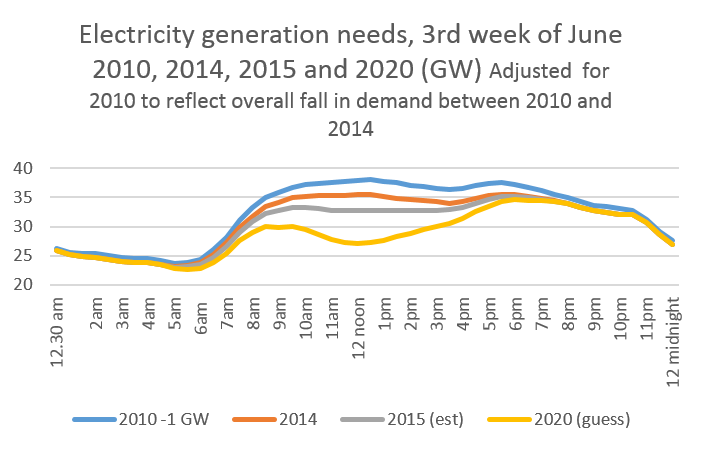
On the sunny Saturday afternoon UK electricity production fell to just over 25 GW. In the chart above, I’ve also shown the curve for the same day (this time a Sunday) in 2010, just five years ago. 2015 was a full 8 GW lower, or nearly 25% below the earlier level in the early afternoon

Part of this reduction comes from the general fall in electricity use. In the hours of darkness, this is running at about 3 GW, or the output of four or five gas fired power stations. The gap widens sharply as the sun arrives, with the reduction peaking just after lunchtime. The reason for the additional reduction is quite simply solar PV, which isn’t directly measured but deducts from the demand made on the national grid. With the exception of a few eccentric homeowners, there wasn't any PV in April 2010.

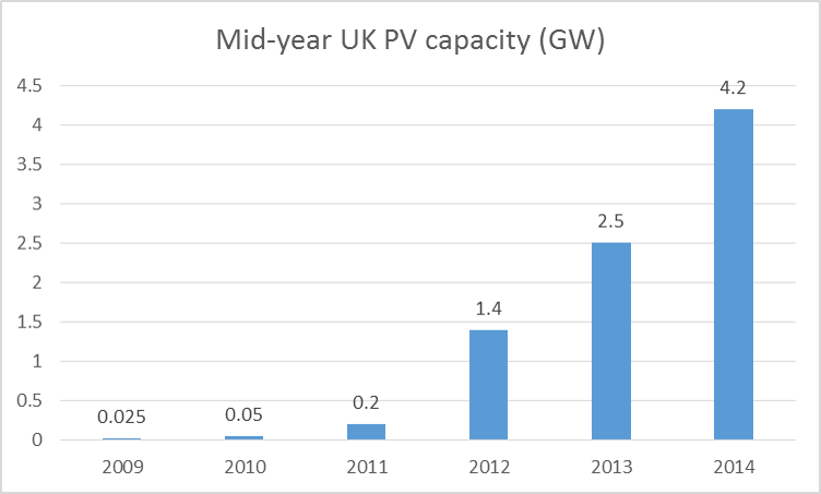
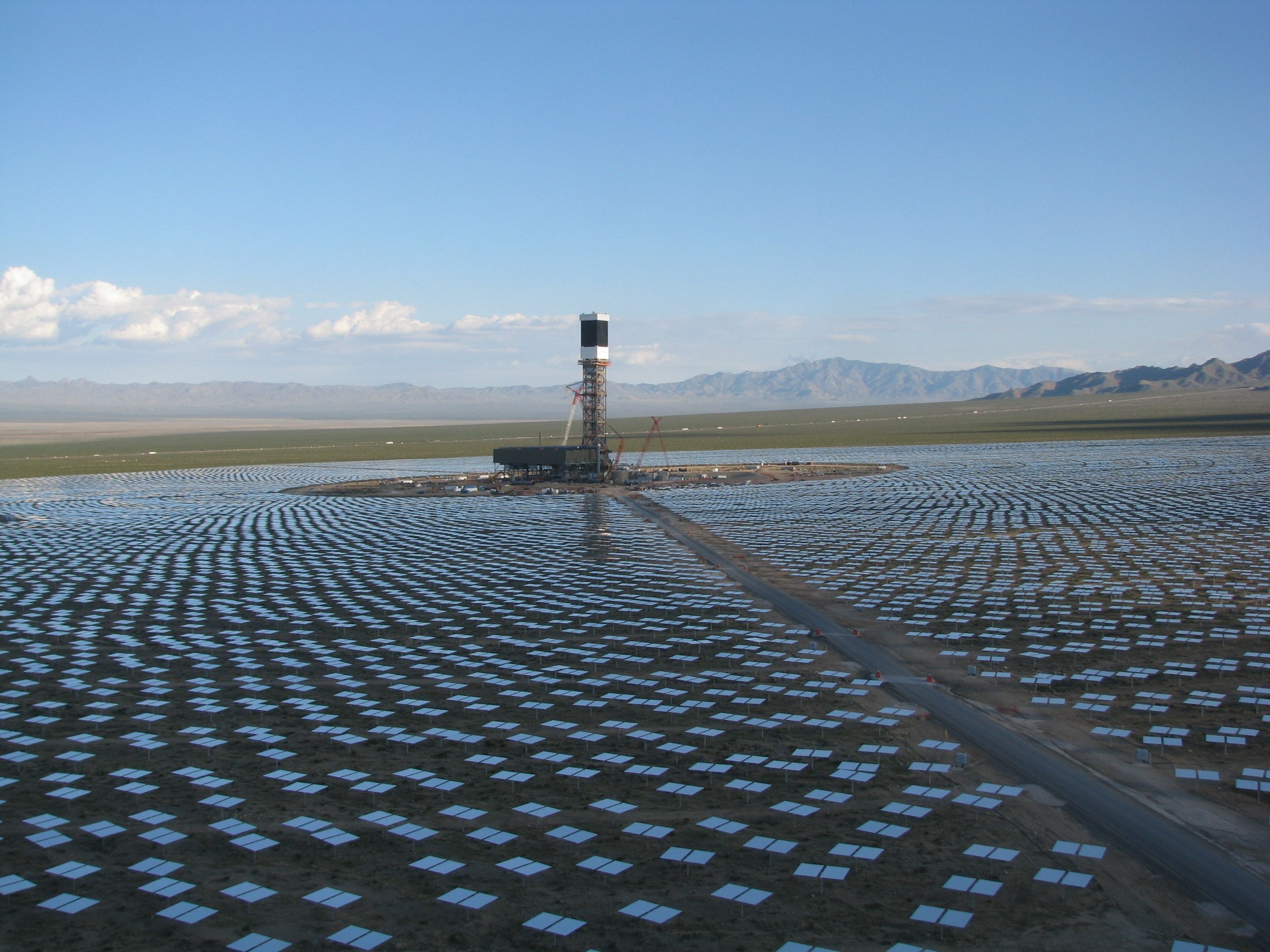
The end of March this year saw a successful scramble to connect many large PV farms around the country. And it really was ‘around the country’. These power plants are now as far north as Anglesey and not just in Cornwall. This splurge was responsible for adding at least a quarter to the UK’s PV generating capacity

The numbers are still a little soft but we think about 6.5 GW of PV is now operating in the UK. Many of the panels are on houses and school roofs but most are on open ground. As more data comes in, this figure may rise to nearer 7 GW.

On a clear day at around 1.30pm in mid-April, this PV base will produce just less than 5 GW. It won’t be as high as 6.5 GW because of electrical losses and because the sun isn’t quite high enough to give maximum power yet. This 5 GW estimate almost exactly matches the actual reduction we saw on Saturday and gives us the confidence to launch a new service.

Carbon Commentary now has a model which estimates how much solar electricity will be produced for each of the next 120 hours, or a full five days. It works by taking sunshine forecasts from Europe’s leading meteorological agency for each hour across 98 postcode districts in the UK and combining this with a detailed database of where all the UK’s solar roofs and huge farms are. (Thanks in particular to Simon Mallett of www.renewables-map.co.uk for dividing the 550,000+ smaller installations into postcodes).

We can feed this to subscribers each hour, or any other interval you choose. And we can break the figures into postcode areas if this is useful. It will be supplied as an Excel sheet and simple charts and will also be available on a separate web site.

The screenshot below from the electricity market portal shows why you might want to purchase a subscription to this feed.

The industry didn’t predict the surplus of PV gushing onto the network on Saturday. As a result, system prices fell to substantially less than zero in early afternoon. For more than two hours, users would have been paid large sums to take electricity. If you had known that the UK was going to produce 5 GW of solar electricity, rather more than the figure predicted by the other forecaster currently available, that inversion wouldn’t have been such a surprise.

Please contact me, Chris Goodall, at chris@carboncommentary.com or +44 7767 386696 if you’d like a one month trial subscription of the beta version of our new 5 day forecast. ,


Batteries - where PV was five years ago

Batteries are improving fast. A new article in Nature Climate Change suggests that the cheapest lithium ion batteries (the sort that powers your phone and your Tesla) are now costing little more than $250 a kilowatt hour, down from at least three times this level five years ago. By the end of this year, some have recently suggested that the cost may be as low as $150/kWh, although this is not shown in the chart below. This would imply that a battery pack in a car with 200 miles range might cost as little as $8,000/£5,500.

 Source: Nykvist and Nillson, Nature Climate Change, March 25th 2015


Source: Nykvist and Nillson, Nature Climate Change, March 25th 2015

Even more significantly for the battery industry, this price would mean that electricity storage would fall in price to less than the cost of building rarely used ‘peaker’ power plants to meet occasional spikes in electricity demand. In other words batteries look as they will soon be the cheapest way of smoothing out the peaks and troughs in daily electricity markets.

Lithium ion batteries may be the right choice for use in cars and other applications where space needs and weight are important considerations. In other circumstances, different battery technologies may well dominate. The Californian company Imergy has just announced a deal to sell 1,000 30 kW/120 kWh systems for rural electrification projects in India in combination with SunEdison, a solar PV provider.

Imergy provides a vanadium flow cell battery which beats lithium ion on longevity, ease of use and safety. The company promises an almost infinite number of daily cycles of filling and emptying with electricity and very high levels of reliability. What about cost? Imergy has said it hopes to get to $300/kWh but the Indian deal is not yet at that price.

An Imergy 30 kW/120 kWh battery. About 6m long

An Imergy 30 kW/120 kWh battery. About 6m long

Like many other battery start-ups, Imergy’s cost improvements come from reductions in the cost of making the cells. Instead of using very expensive newly mined vanadium, Imergy is extracting the element from steel slag and other waste products. The company’s claim is that this reduces the cost of vanadium by 40%, making a substantial difference in the total cost of producing the battery.

Other young companies are promising equally striking costs. Eos Energy Storage caught attention by saying its containerised zinc hybrid cathode batteries are costing around $160/ kWh already. Eos says it reaches this extraordinarily low figure by using low cost chemicals and very simple manufacturing processes.

An illustration of the inside of an EOS 1 MWh containerised battery

An illustration of the inside of an EOS 1 MWh containerised battery

Sakti3 hasn’t been so free with its cost estimates but does promise a power density of over 1,000 watt hours per litre of battery capacity. This is over twice what Tesla is currently achieving and suggests that the company might have costs already below $200/kWh. The CEO recently claimed to Scientific American that her company would ‘eventually’ hit $100/kWh. At that price, electric vehicles would probably be as cheap as petrol engine cars to build. At that’s before including the lower cost of refuelling with electrons rather than oil. (Dyson recently invested in this company).

Alevo, a Swiss/US company claiming to have raised over $1bn in funding, has just launched a containerised battery system that will sit on the edge of electric grids, helping to stabilise the frequency of the alternating current. It recently announced sales of 200 MWh of capacity to a company providing support to grid operators across the US. Commentators talk of this company arriving at $100/kWh within a few years.

Several Alevo batteries in standard containers

Several Alevo batteries in standard containers

In time, we’ll see many of the claims from battery companies evaporate. The batteries may be more expensive, less easy to maintain and have shorter lives than their developers claim. But across the world the improvements in cost and performance in a wide variety of different companies suggest that battery costs, for both large scale containerised solutions and for electric cars, will continue to fall sharply.

The implications of this cannot be overestimated. In reliably sunny countries, it means that ‘solar+storage’ will become the lowest cost source of energy. National distribution grids may never be built. In countries with large numbers of personal cars, the switch to electric vehicles will speed up. Batteries will also provide much of the need for flexibility in adjusting supply of electricity to demand during the course of the day.

Cost reductions will encourage the growth of battery systems on domestic and factory premises, particularly in countries with big gaps between the price homeowners pay for electricity and what they get when they export power back into the grid. The need for ‘peaker’ power plants that work a few hundred hours a year will decline. The whole electricity grid will become more manageable.

How far are we away from large stationary batteries being financially viable in the UK? Let’s take the Imergy 30 kW/120 kWh hour system as a case study and assume it is priced at $300 a kWh. The unit therefore costs about £36,000 or £24,000.

In the UK’s recent capacity auction, an Imergy battery could have earned just under £600 a year for being ready to provide power at peak time. It could also be used to buy electricity at the daily minimum price of around 3p a kWh and sell it at the typical maximum of 7p or so. Assuming a round trip efficiency of 75%, that’s a profit of around £1,000 a year. In addition, if the battery was sited appropriately it could make money from grid frequency stabilisation payments and from reducing the payments for peak needs for large users. These numbers will all tend to get bigger as grid decarbonisation proceeds. There’s no goldmine here but returns of 10% a year look possible as long as Imergy’s promises of very low maintenance bills are delivered. Not exciting, but good money in a period of low to negative interest rates.

Even people in the energy industry in the UK still don’t understand how fast battery costs are falling and how quickly energy storage will become a new ‘asset class’ for return-hungry capital to invest in. We’re roughly where solar PV was five years ago just as the steepest decline in panel manufacturing costs started.

Batteries don’t solve the need for seasonal storage in high latitude countries – that requires a ‘power-to-gas’ solution – but within a decade they will have radically changed how the UK and other countries provide daily stability to the electricity  grid. In sunny countries, they will be life-changing for a billion people.


The effect of the eclipse on solar PV output

Bjorn Graabek kindly sent me the this chart of the effect of the eclipse on the output from his PV system near Wokingham. He indicates that it was cloudy this morning.

Bjorn Graabek 6 kW PV on 20th March, the day of the eclipse.

Bjorn Graabek 6 kW PV on 20th March, the day of the eclipse.

In North Wales it was very clear but I didn't  have the wit to record the output from our PV system minute by minute. However the 2.5 kW installation (SE facing) was producing about 1.2 kW at 8.45 and this fell to just over 100 watts at 9.30, a fall of over 90%. It then rapidly rose to about 1.4 kW at 10.15. 

Someone forgot to tell the National Grid about the solar eclipse

The UK will experience a sharp reduction in sunlight on Friday morning, 20th March as a result of the 80% solar eclipse. This will reduce the power coming into the electricity grid from solar PV by at least an equivalent percentage. However the forecasters at the UK National Grid don’t seem to have been reading the newspapers. The chart below shows the published forecast for solar PV output for the 19th, 20th and 21st March. (1)

Source: National Grid

Source: National Grid

At the time of the peak eclipse, about 9.30am, solar output is expected to be higher than the two adjoining days. There’s no sign of even the smallest dent as the nation goes into twilight for a couple of hours.

I hope someone has remembered to tell the people in the National Grid control room in Wokingham.

Contrast this with the forecast for solar in Germany in the chart below.

Germany has about 6 times as much PV as the UK. The challenges posed by the fall in PV output as the eclipse starts are regarded as tricky but manageable. At  peak – if it is sunny – the German electricity network would be losing 400 MW of PV-generated power every 60 seconds. To compensate for this means turning on a new 1GW power station every two and a half minutes over a period of a half hour or so. If Germany succeeds in dealing with the eclipse it will help show that variations in PV output - even extremely rapid changes - can be handled by a modern electricity network.


(1) http://www2.nationalgrid.com/UK/Industry-information/Electricity-transmission-operational-data/Data-explorer/. Look for DemandData_Update.

No need for panic this year over electricity supply

The UK passed through winter (defined as December to February) without coming close to running out of electricity. The nervousness of autumn 2014 turned out to be unjustified.

At 5.30pm on the chilly evening of January 19th electricity generation hit a peak of 53.3 GW. National Grid had forecast peak generation during a cold spell as likely to hit 55.0 GW. So, as is now increasingly normal, electricity demand was running one or two gigawatts below expected levels. And there was probably another four or so gigawatts of supply available even if demand had reached the figure National Grid had predicted.

How was peak demand actually met in the early evening of January 19th? The tables below give the details. In the first, I’ve written down the amount of generating capacity that the National Grid thought would be operating during the winter, plus its estimate of the percentage that would actually be available at the moment of peak need. (The remainder would be out of action for maintenance and repair).

Table 1

Source: National Grid Winter Outlook

These numbers suggest an expected peak availability of 57.1 GW, plus whatever the wind was providing and also what could be purchased from France and the Netherlands via the interconnector cables. The total - excluding wind - was about 59.6 GW if the estimates of availability were correct and both two international connections were delivering their full capacity. (As it turns out, at the point of peak demand, wind was barely turning the UK’s turbines).

The distribution of supply at the moment of peak need was as follows. 

Table 2

Source: National Grid Winter Outlook, BM Reports

Source: National Grid Winter Outlook, BM Reports

Nuclear was slightly over-providing compared to the projected availability of supply. (This was very unusual; most of the winter nuclear has under-performed as a result of minor outages at many of the stations and, on average, nuclear has produced much less than expected). Gas and coal stations were generating about  91% of the National Grid had projected as being available at the moment of peak demand. 

The most obvious indicator that peak demand was easy to meet was the low utilisation of open cycle gas turbines (in effect, jet engines used only to provide peak power) and oil-fired power stations (expensive to run so generally also only turned on at moments of maximum demand). Oil-fired capacity was barely being used and there was half a gigawatt of spare capacity at the OCGT plants. Pumped storage might have provided an extra half a gigawatt of supply if it had been necessary.

The position will get tighter in future years as fossil fuel power stations close. Longannet, the UK’s second most polluting electricity generator, is said to be considering shutting within a year as a result of high charges to connect to the National Grid. But the slow fall in electricity demand, and the increased emphasis on ensuring that demand can be reduced at peak times means that the years to 2020 might well be survivable without blackouts.


Will the Californian Duck make it to Britain in summer 2015?

Electricity generation in California in spring used to reach a small peak around 1pm and then remain fairly flat until late afternoon. Then it rose to its early evening peak.  The growth of solar PV has changed this; demand stops rising about 11am and then falls sharply as solar kicks in, reducing the need for conventional generation. The shape of the electricity demand curve now resembles a bird seen sideways. Unlikely humourists at the state Grid called this the ‘Californian Duck’. In the chart below the projected total generation demand in 2020 rises from 12 GW at 3pm to over twice this amount within a few hours. Not easy for a grid operator to manage.

Source: CaISO

Part of the reason for the Duck is the relative lack of export capacity from the Californian grid. In Germany, the Duck is not as obvious because electricity markets dump the surplus PV power into adjoining markets. Britain is, like California, poorly connected to other countries. As solar grows in the UK, will we see Ducks here?

The analysis

Part 1: how has PV grown in the UK?

I looked at the reports that give the data on how much PV is installed in the UK. This shows that the total capacity at the end of June 2014 was about 4.2 GW, up from 2.5 GW a year earlier.

Source: DECC Solar Deployment report

Source: DECC Solar Deployment report

By the end of 2014, the UK had about 5.0 GW capacity. The rise is continuing as solar farms race to complete projects before the end of the current subsidy scheme. During the second half of 2014, about 2.6 GW of new large scale PV got planning permission but was not completed by the end of December. However most of this planned capacity will be built before the end of March.

I estimate that we’ll see about another 2 GW of solar farms and a continuing growth in smaller scale PV installed under Feed in Tariffs by mid-year. So by June I think we’ll have about 7.3 GW of PV on roofs and on the ground (about 20% of the German figure, by the way).

Part 2: did we see a Duck in summer 2014?

a.       Nobody measures the output of solar PV installations in the UK. Roofs and farms are all sited on branches of the main high voltage electricity grid and not on the trunk network. This means that electricity from PV is not  seen by the grid  as power generation but as a reduction in demand for electricity from the big power stations (and those big wind farms that are connected to the trunk network).

b.      Large amounts of PV capacity on the branches of the UK electricity distribution network will therefore result in lower measured electricity generation on sunny days in summer.

c.       By how much does PV reduce generation? I looked at the impact of one week of very sunny days in high summer 2014 and compared it to the same week in 2010, before the PV boom started. How did I work out which 2014 week to use? I looked at the daily outputs for a Newquay PV installation in Cornwall (1) and the publicly  available figures for Westmill solar farm in Oxfordshire (2). In both cases this week in mid-June was the sunniest of the summer so I selected this one.

Let your imagination range free and you can see the beginnings of a bird-like shape in the UK data. More of a Heron than a Duck, but the rapid growth of PV is clearly affecting mid-day electricity generation. The picture is complicated by the general fall in overall electricity use – which is typically down about 1 GW across the entire day, but one sunny  week in June 2014 saw fossil fuel generation typically fall by over 3.1 GW between 12 and 2pm compared to 2010. On the very sunniest days across the country it would actually have fallen more.

The first chart below is the actual generation required in 2010 and 2014 to meet demand. The 2014 line is lower across the day, partly because of solar and partly because UK demand for power is generally  falling.

Source: Elexon

Source: Elexon

The next chart adjusts 2010 to take 1.0 GW off demand during the whole 24 hours to reflect the fall in overall electricity demand. Now the effect of the PV in 2014 between early morning and late afternoon can be seen much more clearly. There’s a 2.1 GW gap between the lines at around midday.

Part 2: will we see Ducks with a clearer shape in 2015? And beyond?

By June 2015, PV will have grown about 75% compared to the figure a year earlier. And the increase actual in peak generation will be even greater. We know, of course, that all the new big farms turning on at the moment are south facing and in good(ish) locations whereas many domestic PV sites are not optimally aligned, are not always in southerly locations, are sometimes shaded and are often not wired as well as they might be. So the actual increase in real capacity may be 80% or more.

What will the Duck look like in June 2015 if the same amount of sun is recorded as in June 2014? (I’m assuming no further decline in underlying energy consumption although we know that this is still occurring). The chart below adjusts the amount of generation to reflect the higher PV installed capacity. The gap is now estimated at almost 4 GW at midday for the average sunny week in June. Some days it will be more than this.

We don’t know how fast PV will continue to grow. A new Conservative government is likely to severely restrain the growth of ground-mounted in large commercial farms but may continue to accept roof PV and smaller solar farms, particularly if community owned. Solar PV already makes decent financial sense if the owner is thereby reducing purchases of electricity and the advantages will get more obvious as technology improves.

Only about 3% of UK houses will have solar by mid 2015 and the scope for increasing this is obvious. Many local authorities and housing associations now seen the financial logic of putting PV on rented properties. For example, the city of Plymouth is currently raising money from local residents to install PV on its social housing and provided Feed in Tariffs continue, other municipalities will follow.

By 2020, I assume 13.5 GW of solar power, (just over a third of current German capacity). This is what the profile will look like then, assuming no further fall in overall energy consumption. It still looks more like a Heron carefully watching water (and fish) falling over a weir than a Duck. Nevertheless the midday plateau has gone, to be replaced by a steep dent during a typical sunny summer week.


(1) Fans of good data will really cherish and admire the Newquay site at  http://www.newquayweather.com/.

(2) Westmill makes its weekly output figures available at  http://www.westmillsolar.coop/projects.asp


IPPR wrong to wind up the wind power haters.

IPPR is wrong about medium-sized wind turbines when it claims a ‘subsidy loophole’ is damaging the confidence in UK clean energy. The problem is not the dishonesty of manufacturers, the mendacity of installers or the gullibility of government. The real issue is the cliff-edge nature of wind FiTs.

If I install a handsome EWT 500 kW turbine in my field today, I get paid 13.34p for each kilowatt hour of electricity it produces. If, instead, I put a 501 kW machine there, I would get 7.24p, only 55% as much. Instead of getting a gross income of about £300,000 for my electricity from a windy site, the return would fall to about £165,000.

Feed-in tariffs (as at February 2015)

Up to 100 kW 16.00 pence

101-500 kW 13.34 pence

501 kW+ 7.24

Unsurprisingly, farmers and wind turbine manufacturers noticed this when the feed in tariffs arrived five years ago. Under 500 kW and you got paid almost twice as much as just over 500 kW. So a larger wind turbine costs more but produces a much lower income.

A phrase I heard a lot at the time was ‘the 500 kW sweet spot’. If you could get planning permission for a 500 kW turbine on a coastal hill top you would get an extraordinarily attractive financial return. At the higher feed in tariff rates then available, payback could be as short as two years.

If my memory is correct, the only problem was that there wasn’t a 500 kW turbine on the market. There were smaller machines at around 300 kW and much larger turbines. The race was on to turn an existing design into one that could exactly hit the sweet spot. The mid-sized Dutch manufacturer EWT was one of the first to market with a variant of its 900 kW turbine with its power capped at 500 kW. And it is now capturing a large fraction of the sales of turbines put on British farms.

Despite what the press is saying today, the 500 kW version isn’t the same as the 900 kW machine and doesn’t typically produce as much power. The cut-in wind speed when the blades start moving is lower and the smaller turbine reaches maximum output at a much lower wind speed. At a wind speed of 10 metres/second (20 miles an hour or so) the bigger machine produces about 20% more output. If you were paid the same price for producing electricity, you might well choose the larger turbine. But you don’t because the subsidy is much, much lower.

IPPR gets rather heated about how wicked this is. But let’s put this in context. The total number of machines that have been tuned down to fit just under the arbitrary 500 kW limit is probably about 100 (source IPPR). The net impact is probably about 30,000 MWh a year of diminished production (what these 100 turbines would have produced if they were rated at the original manufacturer’s specification). This about 0.01% of UK electricity output.

The answer to the problem is not what IPPR proposes, which is to award subsidies based on rotor size. That would introduce another set of incentives to tinker with turbine designs to look for the sweet spot. The right thing to do is to adjust the feed in tariff rates so there isn’t a cliff edge at 500 kW. The sensible structure of rates is one which mirrors the underlying costs of turbine and, importantly, turbine installation. This will trend downwards at quite a steep rate to 200 kw or so, and then drop more slowly as the benefits of increasing scale grow smaller. This is all that need to happen. We can then call an end to the pumped-up panic in the tabloid press about the problem.


Opposition to new energy technologies among different age groups

Policy in the UK tends to be determined not by the strength of support for a measure, but by the absence of active opposition to it. More precisely, the amount of forceful and focused opposition by people in the second half of their lives. These are the voters at elections.

This week’s poll of attitudes towards energy sources shows the correlation clearly. Less than 5% of UK respondents aged 16-44 are opposed to onshore wind. 20% of those over 65 are, and their views are increasingly winning the day. Even if approved at local level, wind farms are now routinely turned down by central government even though general electoral support for wind shows no decline. Several dozen developments have been blocked by Eric Pickles in the last year.

But in this latest survey, 68% of people over 16 either ‘supported’ or ‘strongly supported’ onshore wind. Another 22% had no view for or against. Any notion that onshore wind is unpopular with the electorate is simply wrong.

The position is even clearer with solar PV, another form of renewable energy facing rising resistance from planning committees and from central government. Only 2% of those 16-44 oppose this technology, compared to 10% of those over 65. And, as with wind, there is no sign whatsoever of rising general opposition to PV in this survey. 81% of the UK adult population support the use of solar PV as an energy source.

However any glib thesis that the attitudes of stroppy pensioners now dominate the policy-making process turns out to be wrong. More people over 65 oppose fracking for shale gas than onshore wind but their views have made little headway in central government even though support for fracking is tending to fall amongst the population as a whole.

The same is true for nuclear energy. Older fewer people are slightly less likely to dislike this form of electricity generation than younger groups but, even still, more oppose nuclear than oppose onshore wind. It is the 45-54 year olds who most actively reject nuclear power. They were growing up when Chernobyl happened and the sharp difference in their attitudes shows the influence of a single nuclear accident. Perhaps the slight bump in opposition to nuclear among 16-24 year olds also reflects Fukushima, an event that may have occurred at the moment when their attitudes were being set?

A look at the table below does force a question into the front of mind. Why is an elected government so actively fighting technologies that have large-scale popular support but backing those with so much more opposition? 

Source: DECC Public Attitudes tracker wave 12, February 2015

Source: DECC Public Attitudes tracker wave 12, February 2015


Does decreasing energy demand really cost 10 times as much as increasing energy supply?

Energy efficiency suddenly doesn’t seem to be  such a cheap alternative to building more power stations. In a small auction concluded in the last few days, DECC agreed to pay organisations to reduce their peak late afternoon electricity demand. Chains of shops such as Dixons, council buildings and industrial companies promised to cut winter electricity use in 2015/16 and will receive over £200 a peak kilowatt saved between 4 and 8pm.  It looks as though most of the savings are going to be gained by switching to LEDs from less efficient forms of lighting.

This scheme was the reverse of the capacity auction concluded a couple of months ago. In that process, DECC committed to paying £19 a kilowatt to electricity generators in return for a promise to operate their plants over the winter. In other words, energy demand reduction is costing the government over ten times more than keeping generator online.

Both auctions are distorted. The generation auction was horribly flawed by the inclusion of plants that would stay open anyway (such as nuclear) and therefore offered very low prices. The latest energy efficiency auction is the first-of-a-kind and participants were probably a little wary of the cost of upgrading their lighting to LED. Nevertheless, the unfortunate headline conclusion is that cutting energy demand is currently an order of magnitude more expensive than increasing supply.

But should it really have cost over £228 to achieve a kilowatt of demand reduction?

Go into your kitchen. If your home is typical, it probably has about 200 watts of halogen bulbs in it. Scattered around the house might be another 200 watts or so of the little hot lamps like the ones above the cooker. Replacing just the ten or so bulbs in the kitchen with ten LEDs (a plug-and-play switch) and the cost will be about £80. (The colour of the light isn’t quite the same but the difference between halogen light and ‘very warm’ LED is now small).

Your switch will save about £15 a year in electricity and perhaps £5 in halogen purchase costs because they blow far more often than LEDs. Total benefit £20 compared to a cost of £80. So payback will be just four years in a domestic house, and much less in a shop or other commercial premises where the lights are often on all the time.

Isn’t a four year payback good enough? Do you – or Dixons or Leicestershire County Council - really need a further financial incentive to make the move to LEDs? However if you had banded together with your neighbours and sensibly entered the auction then you personally would have been paid about £35, meaning that the net cost of new LEDs would have been £45 and your payback would now be about two years. That looks far too generous to me.

So £228/kW isn’t really the price of energy efficiency. Despite today’s warped result, the replacement of halogen bulbs by LEDs is now financially rational for almost everybody without any subsidy. And the net impact on demand of just replacing domestic halogens is large;  probably 3-4 GW, or around 7% of UK peak demand. If we are serious about energy efficiency, we need a national programme that encourages us to throw away those dreadfully inefficient halogen bulbs in our kitchens and bathrooms. Give me £228 a kilowatt and I’ll switch all the neighbours for you, DECC

Is cutting energy demand really 10 times as expensive as increasing energy supply?

Energy efficiency suddenly doesn’t seem to be  such a cheap alternative to building more power stations. In a small auction concluded in the last few days, DECC agreed to pay organisations to reduce their peak late afternoon electricity demand. Chains of shops such as Dixons, council buildings and industrial companies promised to cut winter electricity use in 2015/16 and will receive over £200 a peak kilowatt saved between 4 and 8pm.  It looks as though most of the savings are going to be gained by switching to LEDs from less efficient forms of lighting.

This scheme was the reverse of the capacity auction concluded a couple of months ago. In that process, DECC committed to paying £19 a kilowatt to electricity generators in return for a promise to operate their plants over the winter. In other words, energy demand reduction is costing the government over ten times more than keeping generator online.

Both auctions are distorted. The generation auction was horribly flawed by the inclusion of plants that would stay open anyway (such as nuclear) and therefore offered very low prices. The latest energy efficiency auction is the first-of-a-kind and participants were probably a little wary of how much upgrading their lighting to LED is going to cost. Nevertheless, the unfortunate headline conclusion is that cutting energy demand is currently an order of magnitude more expensive than increasing supply.

Should it really have cost over £228 to achieve a kilowatt of demand reduction?

Go into your kitchen. If your home is typical, it probably has about 200 watts of halogen bulbs in it. Scattered around the house might be another 200 watts or so of the little hot lamps like the ones above the cooker. Replacing just the ten or so bulbs in the kitchen with ten LEDs (a plug-and-play switch) and the cost will be about £80. (The colour of the light isn’t quite the same but the difference between halogen light and ‘very warm’ LED is now small).

Your switch will save about £15 a year in electricity and perhaps £5 in halogen purchase costs because they blow far more often than LEDs. Total benefit £20 compared to a cost of £80. So payback will be just four years in a domestic house, and much less in a shop or other commercial premises where the lights are often on all the time.

Isn’t a four year payback good enough? Do you – or Dixons or Leicestershire County Council - really need a further financial incentive to make the move to LEDs? However if you had banded together with your neighbours and sensibly entered the auction then you personally would have been paid about £35, meaning that the net cost of new LEDs would have been £45 and your payback would now be about two years. That looks far too generous to me.

So £228/kW isn’t really the price of energy efficiency. Despite today’s warped result, the replacement of halogen bulbs by LEDs is now financially rational for almost everybody without any subsidy. And the net impact on peak demand of just replacing domestic halogens is probably 3-4 GW, or around 7% of UK peak demand. If we are serious about energy efficiency, we need a national programme that encourages us to throw away those dreadfully inefficient halogen bulbs in our kitchens and bathrooms. Give me £228 a kilowatt and I’ll switch all the neighbours for you, DECC.

Wind power costs nothing: the subsidies are matched by the reduction in wholesale electricity prices (amended in response to comment, 3rd February 2015)

In a comment  below this article, 'jjk' asks a very good question. He expresses it politely but I can be more blunt. If wind is providing a large percentage of total power, it will probably be when the demand for power is low at night. How do I know, he asks, that the effect I observe isn't simply a reflection of the fact that high percentage wind tends to occur at low demand moments, when the price tends to be low anyway?

I wish I'd thought of this before because I think 'jjk's suspicion may be partly correct. If, instead of looking at the percentage of demand provided by wind, I examine the correlation between the absolute amount of wind power in each half hour (MW not percentages) and the National Grid's buying price (the 'System Buy Price), the correlation is less clear-cut, though it still exists.

In other words when there isn't much wind, the average price that National Grid has to pay to buy electricity is higher (£54.50 per megawatt hour) than when the wind is strong (£49.90 per megawatt hour). Closer examination of the results also shows (not noted in the table above) that at the very highest levels of wind output the price tends to rise slightly. 

When there is less than 500 MW of wind, the price averages £55.8, about £3.1 more than the average price in the table above. This contrasts with the £7 difference I estimate in the main body of the article

You can argue that this calculation is in fact too harsh for a reason that works in the opposite direction to 'jjk's hypothesis. High levels of wind output tend to occur in the winter, when the price of power is typically higher. So I think the table above probably sets a lower limit on the impact of wind on power prices.

On average, I think we can say, wind makes a difference to UK power prices for immediate delivery of somewhere between £3.1 and £7 per megawatt hour. Even at the lower level this washes away a large fraction of the consumer subsidy for wind.

Original article follows

You can argue that the subsidy for wind power in the UK costs the country almost nothing. The reason is that when the wind blows, wholesale electricity prices are lower than they would otherwise be. On the typical day when wind is producing about 7% of the UK’s electricity, the market price of power is about £7 per MWh less than when the air is completely still.

If, on average, wind power depresses the wholesale price of electricity by £7 for each megawatt hour consumed in the UK, the total impact over the year is about £2.3bn. [1] The total subsidy for renewable electricity paid by electricity consumers this year is capped at £3.3bn. This includes solar and other technologies such as landfill gas, not just wind. The subsidy cost for wind - about £2-£2.5bn - may well be less than the downward impact wind has on electricity prices. The net impact on consumers may therefore be close to zero. In effect, the whole burden of wind subsidy falls on the fossil fuel generators because they obtain lower prices than they otherwise would. 

There's one obvious objection to this glib analysis: most electricity isn't traded just before it is needed. Much of the power that drives your home or office has been bought or sold months, or perhaps years, in advance. However, in the long run lower prices for immediate delivery seep through to the wider market. If you were an electricity retailer and noticed that power traded at perhaps £45/MWh just before it was needed, would you buy electricity months in advance at a higher level? 

How do I get to the conclusion that wind depresses prices by an average of £7/MWh? Every half hour, National Grid has to balance the electricity market by buying or selling electricity. Total generation must match total demand, including losses in transmission, or otherwise the voltage on the UK network would move outside the strict limits that are set. The price that National Grid pays or the price it receives in the open market is recorded.[2] 

Also recorded each half hour is the amount of wind power that is generated by the major wind farms as well as the output of all other power stations. We can easily calculate the percentage of total generation that is provided by wind farms, offshore and onshore. Then I drew a graph that compares the price the National Grid paid to buy electricity with the percentage of the UK’s power provided by turbines.

This is what the chart looks like for the period between June 2012 and 19th January 2015 (the middle of last week).

Chart 1

Source: Elexon data for System Buy prices June 2012 to 19th January 2015, Elexon data for wind power and total generation

Source: Elexon data for System Buy prices June 2012 to 19th January 2015, Elexon data for wind power and total generation

This graph summarises 45,000 lines of data or records from almost a thousand days. The trend is clear: when the wind is hardly blowing the typical price of power that the National Grid faces is about £58/MWh and it falls as wind power increases. On those relatively few occasions that wind is providing more than 20% of electricity, the price is about half this level. On the average day over the last year, the main wind farms give us about 7% of total power needs. The typical buying price at 7% wind power is £51 per megawatt hour, £7 lower than when the wind isn’t blowing at all.

Has this trend varied year by year? A little, but the basic pattern is the same. When the wind is turning turbine blades, wholesale prices are relatively low. (There are only 19 days data for 2015 so we shouldn’t take much notice of this year’s figures).

Chart 2

Source: Elexon data for System Buy prices June 2012 to 19th January 2015, Elexon data for wind power and total generation

Source: Elexon data for System Buy prices June 2012 to 19th January 2015, Elexon data for wind power and total generation

As the number of wind turbines rises, we’ll see more and more days when this source of power rises to 20% or more of total UK generation. If current trends persist, this will take the price of power down to £30 or below. This is, of course, is exactly the phenomenon we see in Germany today, with prices often going close to zero or below on high wind days.

If the numbers in this note are true, they suggest that the subsidy paid to wind is balanced by a lower wholesale price in the electricity market. That’s the good news for consumers, and largely reflects the balance of supply and demand in the UK electricity pool. More wind means fewer high cost generators have to be incentivised to enter the market by greater than average power prices.

However the effect of this shift in the relationship of supply and demand had profound consequences for the profitability of fossil fuel generators. At the moment low power prices mean that many gas-fired power stations aren’t covering their full costs. And, as a natural result, few investors will want to build new fossil fuel plants. This is no bad thing, you might say, but it does mean that without massive intervention – in effect a renationalisation of energy generation  or a guaranteed price for electricity – the rising number of wind turbines will inevitably destroy fossil fuel generation and eventually produce a highly unstable electricity market. This sounds an obvious point but it seems ignored by policymakers (and indeed by protagonists of renewable power).

Note about method

National Grid Buy and Sell prices are not precisely the same as 'market' prices. Each half hour, the Grid works out what demand is likely to be and what each generator has said it will produce. Then it estimates whether the whole UK system is likely to be in deficit or surplus of power. If the position is a deficit, it buys additional electricity to balance supply and demand. If there's a surplus, it does the opposite. When it is buying, it directly sees the prices but it doesn't exactly know what it would get if it were selling electricity. So it uses an estimate from the electricity  market.

In a separate analysis, I have also looked at the System Sell price and the impact of different levels of wind generation. The curve is the same. When the wind isn't blowing, prices are about twice the level when wind is generating 20% of the UK's need. And, perhaps importantly, when wind generation rises above about 12% of UK generation, the price that National Grid obtains for the surplus electricity begins to fall sharply. We've seen, for example, several instances in the last few weeks of near-zero selling prices. In other words, in order to get someone to buy greater volumes of power National Grid had to accept very low prices indeed. 


[1] Assumes total UK net generation plus imports less exports equals about 330 TWh.

[2] These are called the System Sell and System Buy Prices or SSP and SBP. 

Wind doesn't cost anything: the subsidies are balanced by the impact on wholesale prices

As the number of wind turbines rise, we’ll see more and more days when this source of power rises to 20% or more of total UK generation. If current trends persist, this will take the price of power down to £30 or below. This is, of course, is exactly the phenomenon we see in Germany today, with prices often going close to zero or below on high wind days.

If the numbers in this note are true, they suggest that the subsidy paid to wind is balanced by a lower wholesale price in the electricity market. That’s the good news for consumers, and largely reflects the balance of supply and demand in the UK electricity pool. More wind means fewer high cost generators have to be incentivised to enter the market by greater than average power prices.

However the effect of this shift in the relationship of supply and demand had profound consequences for the profitability of fossil fuel generators. At the moment low power prices mean that many gas-fired power stations aren’t covering their full costs. And, as a natural result, few investors will want to build new fossil fuel plants. This is no bad thing, you might say, but it does mean that without massive intervention – in effect a renationalisation of energy generation  or a guaranteed price for electricity – the rising number of wind turbines will inevitably destroy fossil fuel generation and eventually produce a highly unstable electricity market. This sounds an obvious point but it seems ignored by policymakers (and indeed by protagonists of renewable power).

Note about method

National Grid Buy and Sell prices are not precisely the same as 'market' prices. Each half hour, the Grid works out what demand is likely to be and what each generator has said it will produce. Then it estimates whether the whole UK system is likely to be in deficit or surplus of power. If the position is a deficit, it buys additional electricity to balance supply and demand. If there's a surplus, it does the opposite. When it is buying, it directly sees the prices but it doesn't exactly know what it would get if it were selling electricity. So it uses an estimate from the electricity  market.

In a separate analysis, I have also looked at the System Sell price and the impact of different levels of wind generation. The curve is the same. When the wind isn't blowing, prices are about twice the level when wind is generating 20% of the UK's need. And, perhaps importantly, when wind generation rises above about 12% of UK generation, the price that National Grid obtains for the surplus electricity begins to fall sharply. We've seen, for example, several instances in the last few weeks of near-zero selling prices. In other words, in order to get someone to buy greater volumes of power National Grid had to accept very low prices indeed. 


[1] Assumes total UK net generation plus imports less exports equals about 330 TWh.

[2] These are called the System Sell and System Buy Prices or SSP and SBP. 

The 'hog cycle' will eventually mean a much higher price for oil

If, like me, you learned your economics in the 1970s, you know about the ‘hog cycle’. When pork prices fall, farmers decide to raise fewer piglets because their business is unprofitable. A year or so later, there’s a shortage of pork and price rise again. Agricultural commodities, particularly those with long gaps between planting and harvesting are subject to regular and broadly predictable swings in price. (Today's economists, who are taught that rational expectations mean that farmers will predict the eventual rise in price, seem never to be taught about the hog cycle because it now disturbs the standard economic model). 

I suspect we are seeing a hog cycle in crude oil. The current low prices will stifle investment, unproductive fields will be shut and exploration will atrophy. The logical and entirely forecastable result will be a sharp rise in the cost of crude when the slow decline of output from existing fields ends inexorably in demand exceeding supply, perhaps in three or four years time.

Of  course this is a not a new idea. The economist Paul Krugman said exactly the same in 2001 as the oil price slide from $30 to $17 a barrel. (Recommended reading). And he was right. As we know, by early 2014 the price was over $100. They’re not fools, these Saudis, they are simply trying to recreate the hog cycle for the oil market again. 

Despite protestations, multinationals don't yet understand the pace of energy technology

(This post was republished on The Ecologist site on January 23rd 2015)

The World Economic Forum (WEF) report on electricity generation makes depressing reading. Perhaps the pessimism about new technologies is predictable given that Davos represents large companies, not the innovative companies at frontier of energy transformation. Even so, to say that renewable power sources, excluding hydro, are projected to generate less than a quarter of OECD electricity by 2040 is a strikingly conservative. (The percentage is probably about 8% today).

Part of their pessimism seems to derive from a very outdated view of the economics of solar power. Take a look at the chart below. It shows WEF’s estimates for the costs of electricity generation now and in the future. The line at the top, starting off the scale, is solar PV. A megawatt hour is said to cost well over $200 in 2016 (about £130). Even by 2030 it’ll be over $110.

From the 2015 WEF report

From the 2015 WEF report

I think the people in Davos may have been imbibing too much of the local homebrew. Today, in overcast Britain, groups of installers are racing to put panels on the ground as fast as they can across the southern counties to ensure that they get the current subsidy rates. The price they get for a medium-sized commercial field? A subsidy of about $100 a megawatt hour (6.38 pence per kilowatt hour) plus the wholesale price of electricity. Let’s call that $70 a megawatt hour in addition. So even in one of the least attractive parts of the world, PV is already cheaper than WEF says, and by a large margin.

More tellingly, one of the latest auctions for installing PV, in Dubai in November last year, produced a figure of about $65 a megawatt hour. That is, an installation firm promised to install a large PV farm if it was paid less than a third of the price that WEF says is the underlying cost of solar in 2016. Prices being paid today are below the costs of PV that Davos assumes in 2040. 

Open a newspaper in most parts of the world today, and you’ll see optimistic references to the prospect of ‘grid parity’ for the best suited renewable in the local market, whether it is biomass, onshore wind, storage or PV. A business-oriented organisation like WEF should spend more time in the outside world, sensing the excitement about the rates of progress of low-carbon technologies rather than unquestioningly repeating the five year old wisdom of its leading sponsors.

Perhaps most surprisingly, WEF’s cost figures are approximately 50% higher than those produced by the International Energy Agency, long a sceptic about the progress of PV. And its figures for onshore wind are equally wrong. By now, I would have thought that at least parts of big business would have recognised the inevitability of the transition to renewables (with storage) and begun to look at how it could profitably participate.


Addendum: a couple of quibbles about the WEF report

None of the projections, estimates or calculations in the report are given a source. We cannot check their accuracy or even the provenance of their figures. I’m sure that the writers of the document have tried to use reasonable data. But the report is stacked full of statements made without any support or justification, many of which look highly contentious. We are expected to believe, for example, that ‘wholesale electricity prices are expected to continue to rise by 57% in the EU’ between now and 2040 at the same as retail prices are expected to stay the same. It doesn’t need an economist to say that such a combination is impossible.  

My confidence in the report’s recommendations was further shaken by WEF’s assertion that the EU had wasted $100bn by siting wind and PV in the wrong countries. ‘It is obvious to most European citizens that southern Europe has the lion’s share of the solar irradiation while northern Europe has the wind’, the report writes, before concluding that Germany has installed too much PV and Spain too much wind.

2013 estimates from the IEA suggest that the average productivity of a Spanish turbine was 26.9% of its maximum capacity, but only 18.5% in Germany. Spain’s wind turbines are almost 50% more productive than Germany’s. In fact Spain managed slightly more than the worldwide average and was only just below the UK or Denmark in average output.

Actually, it isn’t that ‘northern Europe has the wind’ but rather that westerly coasts have high wind speeds, making Spain and Portugal’s Atlantic turbines better than almost any inshore areas in northern Europe. There’s a second reason why Spain should have wind turbines: wind speeds are relatively poorly correlated with the winds in northern Europe. For a more secure European supply, turbines in Spain have a high value, particularly when interconnection with France is improved.

 And in the case of Germany, which does have much lower output from PV than Spain, the argument that it should have left the solar revolution to its southern neighbours is a remarkably ahistorical conclusion. Without Germany’s very costly support of PV a decade ago we would not currently be looking at grid parity for solar across much of the world.


Climate change won't kill the petrol car. Urban pollution and falling battery costs will

Almost the world’s new cars will be electric in 20 years, whatever happens to the price of oil.

Queen Victoria was also worried about climate change. Her Majesty drove an electric car.

Queen Victoria was also worried about climate change. Her Majesty drove an electric car.

A couple of weeks ago an owner of the Nissan electric Leaf spoke of her affection for her car. In the morning she goes outside and gets into the vehicle. Despite the low temperatures, it is already warm and the windows are free of ice. She drives silently and smoothly to work and once there plugs it into a free charging point and hasn’t even had to pay for the petrol. At the end of the day, she steps out of the office and walks the short distance back to her fully replenished car. Like many others employers, her place of work has given privileged electric commuters parking places closer to the main building.

Another friend is in a different class of electric car owner. He has a new Tesla and took me for a ride a few weeks ago. At first one assumes this is just another well-padded luxury car. As he eased the vehicle out of the driveway he needed to take as much care as anybody else to avoid running into small children or loosely driven delivery vans. Things changed as he hit the open road. Although the pitch of the electric motor barely changed, the speed increased sharply. ‘No other car’, my friend said, ‘has acceleration as fast - except a Bugatti Vitesse’.

I didn’t have the knowledge to question him. A later look confirmed that the Vitesse can manage a maximum of about 1.4g (1.4 times the acceleration of a body under the influence of the earth’s gravity at sea level without air resistance) and his Tesla could match it. The difference is the price. The Bugatti will take €2m off your bank balance. The electric equivalent costs about £85,000. Not that anybody notices, but the Bugatti also has CO2 emissions of about four times the average new car in the UK at well over 500 grams per kilometre, even when driven below the speed limit.

Another person I know really wants an electric car. He drives hundreds of miles a day in his London taxi and pays for the petrol himself. Since much of his day is driving in slow moving traffic, his stop-start driving makes his engine extremely thirsty. He dreads the daily stop at the petrol station.

These three case histories illustrate the reasons why electric cars are now unstoppable. Whether it is middle aged speed fans, careful commuters or cab drivers, battery-powered vehicles deliver a mixture of comfort, acceleration and cheapness to drive that will eventually appeal to almost all types of motorists. Add increasing range, and within a decade there won’t be a single reason to spend money on an internal combustion engine. A century or more ago, the first motor cars were often battery powered. It’s taken a long time but electricity will end up as the eventual victor, powering all the light vehicles on the road.

Two things will push the internal combustion engine into oblivion. Neither are what one might have expected five years ago when the renaissance of the electric car was just beginning. The first is the growing concern – almost panic – about the impact of nitrous oxide and tiny particle pollution in urban streets, mostly coming from diesel engines that for decades were encouraged by governments looking to reduce greenhouse gas pollution.

It took a while for politicians to accept the truth of this conclusion but London’s one mile long Oxford Street is possibly the most dangerous road in the western world. Every year pedestrians get run over as they step into the paths of buses. Far more lethal is the invisible but more pervasive effect of nitrous oxide on the health of pedestrians, residents and drivers. Latest estimates suggest 25,000 people die from the effects of traffic pollution in the UK, perhaps fifteen times the numbers killed in traffic accidents.

Policymakers spend weeks and months in massive international conferences on greenhouse gas reduction. Little happens. But most weeks in the last year a major city has taken its own independent decision to put the brakes on internal combustion engines because of urban pollution. And, as usual unnoticed by the West, China is moving as fast as anywhere.

A few weeks ago, Shenzhen put in place a policy that means that 20,000 of the cars bought by its residents this year will be battery powered. That’s more than the whole of the UK last year, even though Britain’s electric car sales quadrupled in 2014. Other Chinese cities have instigated similar rules.

In Europe, Paris mayor Anne Hidalgo has decreed that some of the key routes in the city will be open only to electric cars by 2020. Boris Johnson’s response to the growing threat of massive EU fines has been to enact rules that from 2018 effectively ban all new taxis that aren’t electric. In Rome, new rules block all but electric cars on Sundays in the city centre. This is an unstoppable move: pollution fears will push the internal combustion engine out of cities within a decade or so.

Of course the other force at work is the declining price of electric cars. The underlying competitiveness of these vehicles has been long disguised by the shockingly high price of batteries. Although an electric vehicle is far simpler and cheaper to build than its petrol equivalent, all this advantage was swallowed by the cost of the power pack sitting under the driver’s feet. There’s no engine, powertrain, coolant system, lubrication or gearbox to worry about. Just a surprisingly small motor and two axles. Insurances and maintenance costs should be lower as well.

When the history of the battle against greenhouse gases is written in a century’s time, two groups will have their own chapters: the German politicians who decided to heavily subsidise solar power ten years ago, bringing PV today to approximate cost parity with fossil fuels in sunny countries, and Elon Musk and his engineers at Tesla. And the Tesla chapter won’t be about the car, but rather about the way in which Musk’s investment in lithium ion battery storage pushed the price down to levels that made electric cars competitive with petrol. Power packs coming out of his ‘gigafactories’ will priced at figures possibly as low as $100 per kilowatt hour, down from $250 at the moment.

A kilowatt hour in a well-engineered electric car might give four miles of driving. So a battery pack with a range of 200 miles will cost little more than $5,000 or so if Musk’s dream is realised. (This is also roughly the target of GM’s newly announced electric Bolt). Combined with fast chargers that are springing up on motorways around the world that can fully charge a vehicle like this in an hour or so, the barriers to the adoption of electric cars will disappear. To misuse an expression, batteries will be at ‘grid parity’, much like PV in the south west of the US. Needs for subsidy will disappear, complicated government rules will be avoided. We won’t even need a carbon tax.

One last point. Many people are questioning the future of the electric car because of the precipitate fall in the price of crude. Take a look at the comparison below. Even at £1.10 a litre, petrol is about twice the price of electricity per mile travelled in an equivalent battery car. A good electric vehicle turns over 80% of the energy in its power pack into motion. A petrol car manages about 25% on a good day. Electric cars are simply more energy efficient. It doesn’t matter much what happens to the price of fossil fuels.

In the table, I assume a figure of 9kWh per litre of conventional petrol and a car that consumes 1 litre of petrol per 12 miles, a figure that is slightly better than the average of UK cars sold in late 2014. (Source: SMMT, New Car CO2 report 2014, extrapolated to late 2014 using Chart 3 in that report).

*Domestic electricity is about this price in the UK, and this number will fall alongside petrol costs over the next months.

In a book I wrote seven years ago I foolishly called the early end of the internal combustion engine. (As well as raving wildly about wave power and ethanol from trees). Tesla’s early cars were just appearing and the absurdly ugly G-Wiz was creeping onto London streets encouraged by the first free electric chargers. Now, some years later, I think that the momentum behind electric cars cannot be stopped. And it isn’t worries about  climate change that are driving the switch to electrons for motive power; it is clear air and the attractions - financial and otherwise - of the cars themselves.


The UK capacity auction: a backdoor way of staving off the utility death spiral

(This article was carried by the Guardian web site on 24.12.2014).

A mantra is inscribed on the walls of the UK Treasury. It reads ‘No subsidy without additionality’. In layperson’s language, this strange phrase means that the only justifiable purpose of handing a business a cheque is to get it to do something it wouldn’t otherwise do.

This golden rule was spectacularly flouted in the UK electricity capacity auction that was concluded last week. A billion pounds will be handed to generators in 2018 in return for doing precisely what they would have done anyway. Negligible amounts of new electricity generating capacity was drawn into the market and existing plants will not change their behaviour. Later in this article I’m going to look briefly at two successful participants in the auction – the pumped storage reservoirs and the nuclear fleet – to show why this is so.

The capacity auction got few headlines in newspapers. It sounds technical, abstruse and probably a nasty mixture of economics and physics. Actually, it was quite simple. All the electricity generators in the UK, plus quite a lot of owners of generating capacity that nobody quite knew existed, got together to offer to promise to keep their equipment working over the 2018/19 financial year.

The government wanted commitments from about 50 gigawatts of power generation (about the maximum demand likely to be placed on the National Grid in the winter of 2018/19) that the plants would be available during a ‘stress event’, or the couple of hours on a mid-December early evening when the lights might otherwise go out. Having got us all worried whether enough generating capacity will be available in the UK to meet peak demands later in the decade, the auction drew bids from far more generators than were actually needed.

Each generator, including all the nuclear power stations and the gas and coal station, put in its figure for the minimum price it would accept and these bids were ranked from zero upwards. The government looked at the price that was offered by the generator that just pushed the auction over its target of 49 gigawatts and agreed to pay that price to all the bidders. This was around £19 per kilowatt of capacity. In other words, if you have a 100 kW diesel generator at a factory, you will get a fee of £1,900 a year to guarantee that the generator will be available at all times. If it actually produced any power, it would in addition get paid at prevailing market rates for that electricity. Failure to respond to the call for power would cause the diesel generator to lose some (but not a lot) of its payment.

The supply and demand curves in the UK electricity capacity auction of December 2014. The generators are put in ascending order of their bids up to nearly 70 GW of capacity. Source: DECC report  on the operation of the auction.

The supply and demand curves in the UK electricity capacity auction of December 2014. The generators are put in ascending order of their bids up to nearly 70 GW of capacity. Source: DECC report  on the operation of the auction.

When DECC first had the idea for a capacity auction, observers hummed with sympathetic approval. It sounds a very good way of keeping the lights on and incentivising new supply. If investors thought that they’d get a guaranteed yearly payments for a new gas turbine plant, they’d be more likely to stump up the cash to build the generating station. 

Unfortunately the plan failed. Only a tiny amount of new capacity ‘won’ in the auction. When the full history is written, it’ll be seen that the failure occurred because, perhaps paradoxically, the price was too low. £19 a kilowatt a year may mean that consumers will have to pay an extra billion pounds for their electricity but it isn’t enough to get shareholders to stump up, for example, £800m or so for a new 1 gigawatt power station, earning about £19m a year from the capacity auction.

And why was the price so low? The reason is that existing power plants can easily offer to cover 49 gigawatts of need. Because these plants won’t actually have to do much - if anything - beyond their normal activities to guarantee to produce power at times when electricity is in shortest supply, they didn’t actually need any incentive. In fact, about 30 gigawatts of electricity generation was offered for virtually nothing. (But the rules of the auction said that the price that they will actually be paid is the price offered by the last winning bidder. This is a conventional feature of auctions).

Consider two important sources of electricity at the times of greatest demand at 5pm on mid-winter weekday evening: nuclear and pumped storage reservoirs. EdF put in bids to the capacity auction offering 7.9 gigawatts of power. (I mustn’t digress but I don’t think that EdF has actually delivered 7.9 gigawatts from its nuclear power stations at any stage of the winter so far, so its ability to deliver on the commitment must be questioned). Nuclear power station are meant to run all the time. It costs money to shut them down or run at a reduced load. No operator would ever voluntarily not have its nuclear stations working. There was no point whatsoever in allowing these power plants into the capacity auction and paying them about £150m a year to carry on doing what they want to do anyway.

Pumped storage plants, principally the fabulous Dinorwig plant in north Wales, present an almost equivalent absurdity. The role of Dinorwig is to buy electricity when it is cheap at 4.30 am, use it to pump water up hill and sell it when it is expensive at 4.30 pm by letting flow downhill through turbines. This is largely what the plant does every day of the year. Yet it is now being paid extra to perform what it is already very heavily financially incentivised to do.

In the case of Dinorwig’s owners, GdF Suez, the extra booty is about £35m a year. This is on top of the reported profits for last year of well over £100m for the mainstream operation of the plant. A plant, incidentally, that was built with state (CEGB) money initially and then sold at what must now seem a knockdown price in the flurry of privatisation twenty five years ago.

In all probability, Dinorwig and its three smaller cousins will not adjust their business tactics one iota as a result of the extra profitability they have been gifted by the capacity auction. So the UK has not gained any security of supply. And, we should add, the penalty for not being to deliver power at a ‘stress event’ in the early evening in December is just one month’s capacity payment of about £1.60 a kilowatt. Should Dinorwig’s owners spot a price spike that they can sell their power into for several hours, thus losing the capacity to provide electricity for a ‘stress event’ later in the same day, they may well choose to do so and pay the penalty.

This leads us to the most fundamental failure of the capacity auction; the almost complete absence of new electricity generation that has been successful in getting extra money to enter the UK electricity market. One obvious example is the proposed new pumped storage plant called Quarry Battery, located not far from Dinorwig in North Wales, which backed out of the auction before it finished.

Quarry Battery, which will cycle water between two old slate quarries at very different heights on a mountain, is a small (50 megawatt) generator that is exactly the type of new capacity the UK needs. For this plant, £19 a kilowatt probably isn’t enough. It has to raise private finance of over £160m and the annual capacity payment of about £1m would not make much difference to its cash flows, particularly since the 2018/19 auction would have meant a costly speeding up of its construction. The capacity auction has simply added to the income of existing generators, without pulling any new storage plants into the market. This is despite repeated assurances by government that enabling new storage to be constructed was a principal aim of the capacity auction.

Over on the continent observers frequently say we are watching ‘the utility death spiral’. As renewables gain in importance, power stations using fossil fuels are working fewer and fewer hours each year. The old generation companies are losing money. New coal and gas plants are almost impossible to finance. Eventually the old utilities will die. In the UK it looks as though the major generators have staved off the death spiral a little by capturing another billion pounds from consumers. That billion could have gone into energy storage units, power to gas facilities or renewable generators, such as anaerobic digestion plants, that can modulate their output to help match supply and demand, thus easing the transition away from carbon-based fuels. Unfortunately, the auction just bought off the large generators instead. 

Food consumption is falling in the UK, fastest among the very poor

(The research in the second half of this post was used as the basis for an article in The Independent of 28th December 2014) 

Recent reports have commented on the quite rapid fall in energy use in the UK, even in a period of economic growth. In ‘Peak Stuff’ I advanced the suggestion that all developed societies will eventually use fewer material resources and energy. I hypothesised that the UK had already begun to ‘dematerialise’ and its demand for energy, for minerals and for food had actually started to fall in the early part of the last decade.

The evidence in support of ‘Peak Stuff’ in respect to food, as well as energy, is now very strong indeed. The latest edition of the long running official survey of food purchasing suggests that average consumption of calories from all types of food and drink fell another 0.7% in 2013 and is now about 9% below the level of the early years of this century. People in the UK are unambiguously eating less food than they used to. To make the obvious point, as the economy has begun to recover, food consumption hasn’t gone up, any more than energy use has increased. Environmentalists who call for an end to growth are pushing an out-of-date thesis; increased economist prosperity isn’t incompatible with a decent world for all 10bn to live in.

Chart 1

 Source: Family Food ONS, 2014


Source: Family Food ONS, 2014

Chart 1 gives the average calorific value of food purchases per person per day from 2001/2 until 2013. Survey of the calorific value of people’s food have been going on for much longer and we have reasonable, but incomplete, UK data from about 1945. The early surveys only measured food bought for home consumption and excluded meals out, as well as confectionery and alcohol.

Chart 2 (copied directly from Family Food, 2014)

Nevertheless, the overall pattern is very clear: people in the 1950s ate much more food than we do today. The chart below suggests that average calorie intake from food eaten in the home (and excluding external purchases of food, alcoholic drink and confectionery) was over 2600 a day until the mid-1960s. The comparable figure today is less than 1900. The higher figure a generation ago is unsurprising because jobs much more frequently involved manual labour, homes were not centrally heated (raising the metabolic rate needed to keep warm) and individuals had much less access to cars for their transport needs.

Food production, manufacture and distribution probably accounts for about 20% of the global warming footprint of a developed economy, with the single most important contribution arising from the manufacture and use of nitrogenous fertilisers. We might hypothesise that the slow decline of per capita consumption is tending to reduce the impact of agriculture on the ecosystem.

But to get closer to certainty, we need to be sure that the reduction in the overall amount being eaten is not counterbalanced by a rise in the consumption of the most resource-intensive food, beef and other meats. If meat eating were going up sharply it might more than balance the cut in average calorie intakes because it is so much more ecologically damaging that other forms of food production.

Chart 3

Is meat-eating going up? No, and the fall is as fast as overall food purchases. Meat eating fell 10% in the period from 2001/2 to 2013. These figures are expressed in grams of food purchased per week rather than calories.

UK data on falling food consumption always surprises people because of its apparent conflict with rising obesity. Most of us assume that we are typically consuming far more food than we actually need and, as a direct result, people’s weight is continuing to increase. This may still be true but the rate of increase seems to be levelling off.

Chart 4

What else does the latest official survey in Family Food show? Some of the conclusions are extremely surprising. Although overall energy intake, averaging around 2192 calories per person including children, is about 5% higher than the amount that would leave people neither losing nor gaining weight, the pattern among different demographic segments is strikingly diverse. The top conclusions are

·         Poorer people are now eating much less than richer groups. In 2001/2, average energy intakes didn’t vary very much between income groups. The poorer half of the population had calorie consumption 99% of the richer half. By 2013, that had changed. The poorer 50% now eat significantly less than the wealthier half. In 2001/2 the difference between the average food intake in the poorer and richer halves was 27 calories. In the most recent year it was 165.

·         The greatest difference is between the bottom and the top 10%. In 2001/2, the poorest decile had a calorie intake of 97% of the richest decile. In 2013, this had fallen to 87%.

·         This wouldn’t matter very much if everybody still had enough to eat. But by 2013, the poorest decile’s food intake was less than 86% of what it was in 2001/2, meaning that the people in this group are not eating enough – on average – to maintain their weight. The government says that the average person (this mixes young and old, male and female so is only an approximate measure) should have an intake of about 2080 calories. The poorest 10% now only get 1997 calories, or 4% less than typically required to maintain weight.

·         By contrast, the top decile eat 110% of what is needed to keep weight constant.

Chart 5

Deciles.png

To summarise, poorer people used to eat almost as much as richer groups. This is no longer the case. Although the numbers aren’t entirely consistent from year to year, we appear to have seen a significant relative and absolute fall in the food consumption of the less well off. Perhaps this is because of rising food prices, perhaps because of falling incomes. The percentage of their income that the poorest decile use to buy food has barely changed at around 16%. This is, of course, a much higher percentage than for richer groups.

Also striking is the swing in food consumption between young and old.

·         In households headed by a person under 30, the average calorie intake is now less than 1750, including food eaten away from home. This far less than is likely to be needed to maintain of the average person in that household.

·         The average calorie intake of people in this group has fallen by over 22% since 2001/2, much faster than the 9% cut among the population as a whole. We cannot know for sure whether this is because of choice or because of a shortage of income. But this age group has seen the greatest contraction in income over the last decade or so and it is not unreasonable to suggest that falling incomes are meaning some young people do not have enough cash to eat as much as they need. 

·         Contrast this with the experience of household headed by someone from 65-74. People in this group are eating an average of 2600 calories, greatly in excess of what they need for a stable weight. And this may be related to the fact that this demographic segment has experienced the greatest increase in income over the last decade or so.

·         People in households headed by someone over 75 are actually eating more than they did in 2001/2 and their consumption is now also well above the recommended level.

Consumption is swinging away from the younger and poorer groups and towards the older and richer.

How does these cuts of the data affect the ‘Peak Stuff’ hypothesis? The obvious riposte is to say that food consumption is falling because of declining disposable income. As (if?) the economy returns to providing rising living standards for people, food intake will start rising again. My response is to say that a) all income groups are cutting their calories, not just people who are income constrained and b) calories consumption has been trending downwards for fifty years or more, through GNP growth and GNP stagnation.

What about the marked difference in calorie trends between young and old? Here I’d say that although much of this bifurcation seems to be do with income differentials (with the old substantially increasing their share of the income cake over the last decade) it probably also reflects a change in food culture. Perhaps the young don’t binge: the data shows their food and their alcohol consumption falling sharply. Whether the Peak Stuff theory is right or wrong, young British people are certainly acting as though material consumption is less important to them than in the past.

Crossing the void: robotic insulation in the gap under older houses

Old houses often have very cold floors. Most homes built before 1914 have uninsulated floorboards and under these boards is usually a void into which cold air flows through ‘airbricks’ in the walls of the building. Suspended floorboards help keep old houses free of damp but they leak large amounts of heat. 

The slow flow of colder air into the ground floor rooms from the void under the house not only cools the downstairs rooms but adds to the sensation of cold discomfort in winter. The gentle internal breeze carries heat away from the unlucky occupants. Since the temperature of the feet is lower than that of the head,  people have a sensation of particular cold. Better floor insulation and reduced drafts would make a big difference to the perceived warmth of the older homes.

What we can we do to achieve this? Applying a clear sealant to the gaps between the boards can assist in reducing in the air flow and it slightly improves the insulation. But a significant change requires that the homeowner takes up the floor boards and applies an insulating backing, then replacing them all. This is difficult and disruptive and few people do it.

Things may get bettter. A new London company has developed Q-Bot, a robotic machine that can get into the void through the airbricks, carry out a thorough survey and then apply a coating to the underside of the boards. Results from the first trial of Q-Bot have been impressive with occupants recording a very much improved level of comfort in their homes.

The robot working underneath a London home

The robot working underneath a London home

Described as a ‘miniature JCB’, Q-Bot is said to be ‘highly manoeuvrable, capable of pulling heavy loads and .. designed to operate in tight spaces and harsh environments. The robot can be folded to fit through restricted openings, such as a core hole, air vent or access hatch, and then remotely deployed to carry out the mission’. Q-Bot is a lovely piece of engineering, robust and intelligent. The inventors even claim that in most cases, the skills of the robot mean that insulating the floorboards of a home can be done when the occupants are out. Q-Bot gets into the void through an airbrick, does all its surveying and then applies the insulation without noise or damage.


The visual results of Q-Bot survey

The visual results of Q-Bot survey

The developers of Q-Bot have their eyes on the 6 million or so homes in the UK build before the First World War. Most of these  - about 4m – are in the hands of owner occupiers, some of whom will pay well to improve the sense of warmth of their homes in winter. Social housing providers– with perhaps 1m homes of this age – will see the Q-Bot as a useful means of reducing the fuel bills of tenants and upgrading the properties. Government schemes imposed on the energy companies, such as ECO, have produced vociferous complaints from the utilities that they are running out of houses to improve. Q-Bot is the least disruptive technology to employ and the target houses are easy to identify and to treat. I suspect that industry enthusiasm for this rugged robot will grow.

What do the economics look like? These machines are expensive to make and will be leased to companies that deploy them for insulation purposes. Q-Bot’s makers gave me a quote of approximately £1,500 to £2,500 for each property that their robot treats. These numbers seem high and I suspect the cost will have to come down. But let’s consider whether today’s quote makes sense financially.

How much is the average pre-1914 home likely to save? A UK home typically loses about ten per cent of its heat through the floor. This is the green slice in the chart below.  Much of this loss – perhaps 80% - will be saved by really good insulation. A more significant heat loss is from what the Domestic Energy Fact File calls ‘ventilation’ and we usually term draughts. The brown slice shows that about a quarter of all heat is lost through draughts.

 (The chart measures the loss of the average house in watts of energy for each degree of temperature difference between the outside and interior of the house. The figure is a total of 290 watts per degree, meaning that a house that is ten degrees warmer than the exterior loses 2900 watts or almost 3 kilowatts of energy to the outside world. That’s 3 kilowatt hours an hour).

Heat losses from the average house in watts per degree of temperature difference

Source: The truly compendious DECC Domestic Energy Fact File, table 6n

Source: The truly compendious DECC Domestic Energy Fact File, table 6n

Older houses shed more energy than newer buildings. The average heat loss for each square metre of space in a pre-1914 house is about 35% above the UK average, meaning that the boiler has to work that much harder to keep the temperature up. Some of this extra heat requirement comes from the poor floor insulation compared to modern homes.

It’s  only a guess, but I suspect that really good floor treatment might save 20% of the total heating bill, including both the insulation and draughtproofing  elements. For a detached Victorian house this might mean 5,000 kilowatt hours a year, or about £200 in saved gas costs. For a smaller terrace, the figure is probably half this, or around £100. These figures aren’t overwhelming compared to the costs of installation, but occupiers will also get the improved sense of comfort. 

And, second, compared to the costs and benefits of other expensive measures, such as double glazing or external wall insulation, better floor insulation is cheap, non-intrusive and visually acceptable. For example, the UK’s truly remarkable refusal to allow visible double glazing in the ‘conservation areas’ of many towns and cities means that Q-Bot is especially valuable.

Q-Bot’s owners are currently raising £400,000 in new shares to fund the further commercial development of the company.