Will the switch to an energy system dominated by solar PV cost the world money?

A research paper by Chris Goodall

Will the switch to an energy system dominated by solar PV cost the world money? (Link to PDF)

Abstract

What follows is a thought experiment. I compare two scenarios to decide which will cost more. In one, fossil fuels continue to provide most of the world’s power and solar photovoltaics do not provide any more electricity than at present. In the second, solar PV grows very rapidly and provides the world with all its energy, not just electricity, by 2041. Each year, the amount of cash spent on fossil fuel energy each year is reduced by this switch. The experiment tries to answer the question ‘which scenario costs more?’.[1] Is decarbonisation costly, or financially beneficial?

For the first scenario, I estimate the total cost of wholesale oil, gas and coal from now until 2041. In the second, I add the total amount of capital invested in solar to the gradually lowering expenditure on fossil fuels, as a result of increased PV, to get an estimate of total expenditures, running and capital, on energy. With these figures I can provide an estimate of whether a fast switch to solar will cut the world’s expenditure on energy or not. As far as I know, no-one else has ever done this calculation.

The comparison shows that if the world makes a sustained push for growth of solar photovoltaics the total global cost of energy between now and 2041, including all the capital spent on PV, will be slightly less than if the globe continues to use fossil fuels. As time passes after 2041, the balance will swing even further in favour of PV because solar panels already installed will continue to provide near-free electricity for many years whereas fossil fuels will, in contrast, cost money.[2]

The critical assumptions going in to this analysis are a) that PV continues to grow at an average of 40% a year and b) that the rate of cost reduction of solar energy remains at 20% for every doubling of accumulated production and, of course, that fossil fuel prices remain at the February 2016 level. Any rise from today’s depressed levels will increase the benefit of the switch.

The experiment also assumes that one terawatt of fossil fuels needs one terawatt of PV power to replace it. This may be unfair to PV because it delivers a high quality energy (electricity) whereas most of the energy value in, say, coal, is lost in the power station in the process of conversion to electricity. Nevertheless, for the reasons given in the paper, I thought it appropriately conservative to assume that the amount of PV electricity needed is the same as the gross energy value of all the fossil fuels used.

The idea that solar PV could replace all use of fossil fuels sometimes seems absurd. What will happen at night or in mid-winter in high latitudes? But, as is increasingly clear, demand response will cut night demand, overnight storage will be provided by batteries and longer term buffers will come through the conversion of solar electricity to renewable gases and liquid fuels.

Reactions to this draft will be most gratefully received.

[1] I use PV as the main competitor to fossil fuels because I believe photovoltaics will become very clearly the cheapest and easiest way to generate electricity within a few years. But the arguments in this paper could also be made for wind energy. Or PV and wind could be combined to create the energy transition.

[2] I am very deeply indebted to Professor Nick Jelley of Oxford University for his mathematical work modelling PV growth and creating the ‘S’ curve. This thought experiment would have been wholly impossible without his help. Errors are mine, of course.


What the oil companies think about the divestment movement

A couple of weeks ago, 300 academics from Oxford and Cambridge issued a statement asking their universities to work with the fossil fuel divestment movement. Energy scientists such as Sir David MacKay joined professors from across the full range of subjects to ask for ‘morally sound’ investment policies.

Last Friday, a very senior executive from one of the world’s largest oil companies participated in an open and good humoured discussion with undergraduates at one of our leading universities  in a meeting convened under ‘Chatham House’ rules. I was present. The executive, who I will call Harold Schreiber, said that the divestment movement was ‘anti-industry, emotional and populist’. He said that the role of the ‘energy producers (is) to produce energy’ and that those who worried about climate change should focus their attention on the consumers of energy, not those who extract it. Schreiber said that oil companies will not respond to outside media pressure but that ‘constructive engagement’ might be more effective. He based this opinion on what he saw as the positive effect of those oil companies that remained in South Africa during the apartheid years working to build the country’s energy system and, in Schreiber’s words, ‘helping to avoid violence’.

Whether or not the divestment movement succeeded the world would continue to burn large quantities of fossil fuels for the rest of the century, he continued. About 80% of energy needs are met from carbon-based fuels today and in his assessment that number would still be about 25% by 2100. Oil would have to be extracted and burnt in large amounts, although its role will diminish beyond 2030.

Some of his company’s scenarios for the future suggested that it might be possible to get to ‘net zero’ emissions by the end of the century but these were not necessarily the most likely. Moreover, they would require technologies that extracted CO2 from the atmosphere. He referenced work at MIT that showed that the best the world could expect is a temperature rise of about 3 degrees above pre-industrial levels, well above the figure of less than 2 degrees agreed in the Paris conference. He implied that he regretted this probable failure but that the energy companies are not to blame. Governments and energy users are responsible.

Faster change is hugely difficult, he implied. One example was the UK’s poorly insulated housing. Although it may be possible to reduce heat losses in homes, people would need ‘softening up’ for a long time before they agreed to have contractors in their homes for six months of insulation work. More generally around the world, people need proper energy infrastructure to live decent lives and the anti-fossil fuel activists don’t understand that this cannot be provided by ‘iPhone apps’ or other digital tools.

1.3 billion people have no access to electricity at all and these people require the mainstream energy companies to provide them with the means to obtain a reliable energy supply. A decent standard of living demands steel for buildings and the anti-fossil fuel movement has no idea how this might be provided without coal in blast furnaces. Transport needs liquid fuels and no-one, he said, knew how this would be provided without oil from the ground.

As well as criticising the divestment movement for its anti-commercial and antagonistic attitudes, Mr Schreiber said that politicians were making huge mistakes. The UK’s decision to abandon Carbon Capture and Storage (CCS) was ‘frankly stupid’. Obama was wrong to block the Keystone XL pipeline. Sensible policy-making is ‘paralysed’ at the Federal level. More generally, politicians around the world ‘have to reach beyond grandstanding’ and take decisions that are ‘rational’, not driven by attempts to gather short-term popularity by appeasing climate activists.

When questioned on why the major oil companies operated in countries with poor human rights records, he asked whether the audience would rather the energy extraction in these countries was carried out by small private companies or businesses like his employer’s, which are subject to high levels of scrutiny and requirements for transparency.

In summary Schreiber suggested that companies such as his are the servants of the international economy, not its masters. The role of the international oil company is to organise the efficient deployment of capital for the production of inexpensive energy, not to drive the low-carbon future. He said that ‘we are only in the foothills of the move away from fossil fuels’ and his company would continue to invest heavily in oil and gas exploration rather than renewables.

After listening to Schreiber I went away to look at the latest accounts of some of the major energy companies. They show, of course, reduced profitability in the face of declining energy prices. Nevertheless, the divestment movement has a steep hill to climb. Few, if any, oil majors  have any need for new outside capital in the next few years. It might make sense for the financial health of pension and endowment funds to get out of fossil fuels but selling oil shares to another investor (‘divesting’) will have no direct impact whatsoever on the speed of the energy transition.

I think it may be more important to continue asking oil companies the question ‘is drilling for hydrocarbons the most productive use of your huge resources of available capital’? To suggest an answer, I looked specifically at Shell’s worldwide accounts because these have just been published. Excluding its new acquisition, BG, the company spent about $29bn on its exploration and production activities last year. That money enabled the company to just about stand still in terms of the total amount of energy to which it has access in its proven oil and gas fields. It produced 1.1 billion barrels of oil from reserves that dipped slightly to about 11.7 billion barrels. (This is a complex area; Shell has to write down its reserves estimates to reflect that portion of its portfolio that is no longer economic to operate because of low oil prices).

So, very roughly, $29bn is the amount of money Shell needs to invest in order to continue producing 3 million barrels of oil a day (1.1 billion barrels a year). This money could instead either be returned to shareholders or invested in renewable energy technologies. Mr Schreiber said that at the start of the discussion that the role of the energy producer was to produce energy. In the case of Shell, as one example of this, is the $29bn going to produce more energy if it is invested in oil exploration and production or, for example, in solar PV?

The numbers are relatively easy to calculate. Shell’s yearly production of oil has an energy content of about 1,800 terawatt hours. That is, very approximately, the same as the UK’s total consumption of energy from all sources. How much energy would Shell’s $29bn produce if it were invested in solar PV farms? Assuming a 22% capacity factor (much better than the UK but below the average in the US), an installed cost of $1 a watt and a 35 year panel life, the number comes out just ahead of the energy value of the oil that Shell produces each year. In other words, if Shell really sees its role as producing the energy the world needs, then its $29bn would be better going into exploiting solar energy rather than drilling wells and building pipelines. Rather than trying to destroy Shell, one of the world’s most efficient allocators of energy capital, we need to persuade it to divert its considerable skills towards the renewable economy.

Or take BP. In the UK alone the company spends about £175m on energy R&D. This compares to DECC's boast of putting about £100m into clean energy research as year, of which half is devoted to nuclear. Were a oil major to divert its efforts away from fossil fuels and towards the next generation of energy sources, the skill and knowledge in the private sector could make a dramatic difference to the speed of the switch to low-carbon sources.

I made this point clumsily to Mr Schreiber after the discussion. Wouldn’t his company’s exceptional skills and resources also be better directed towards – for example – using solar energy to make renewable liquid fuels, an endeavour Bill Gates sees as one of the most productive areas for new capital going into energy? Schreiber disagreed, saying that this area involved a lot of difficult science not within his company’s area of current competence.

Nevertheless Harold Schreiber knows there is an energy transition happening. Renewable sources of energy will eventually become very cheap and strand the existing assets of the major oil companies. Even the CEO of Shell said in September last year that solar would be the ‘dominant backbone’ of the energy system.

This may suggest that outsiders, such as Oxbridge academics mentioned in the first paragraph, need to engage with the oil company to show how they should redirect themselves - and their huge resources of capital - towards those energy sources that are going to be cheaper than oil. PV already produces more energy per dollar invested than oil. Shouldn’t Schreiber’s company be moving as fast as it can into exploitation of the sun’s energy? Won’t shareholders’ interests be best served by a rapid redirection of the company toward the most productive new sources of energy, rather than drilling for ever more recalcitrant sources of oil?


The vital role of time of use electricity pricing in the energy transition

Wadebridge in Cornwall is the centre of the first UK pilot of daytime cheap prices for electricity. This summer, 240 households will be paying a tariff of 5p a kilowatt hour during the 10am to 4pm period. Outside that time slot, the rate rises to 18p, almost four times as much. In winter, the price reverts to 13.4p across the full 24 hours.

This scheme is offered by innovative electricity retailer Tempus with the participation of the very effective Wadebridge community renewables group. The rapid increase in the generation of solar and wind electricity around the world is driving many similar ‘time of use’ tariffs in places such as Hawaii and California. Mostly these are compulsory, not a voluntary decision as in Wadebridge. In Cornwall specifically the electricity network is struggling because of the strict limits placed by the distribution grid on solar power exports to the rest of the UK and time dependent pricing is a highly important innovation.

Oahu, the most populated of the Hawaiian islands, has a peak late afternoon price about three times the price at midday. New rates such as these often reflect increasing surpluses of power in peak sunshine, which is not well aligned to the maximum need for air conditioning around 5pm, after the sun has begun to fall. In Ontario, peak prices are about twice off peak tariffs. California has now mandated time of use tariffs, likely to be about 15 cents a kilowatt hour for off peak and 37 cents for peak early evening times.

The aim of these time of use pricing schemes is to push electricity consumption into the periods of low tariffs and to minimise the amount used at times when supply isn’t bolstered by sun or wind. As solar grows from its current 2% share of world electricity supply, we can expect more and more use of pricing variations to mould power demand to align better with power production.

Time of use pricing has the vital secondary role of encouraging the purchase of domestic battery systems that take in power at cheap rates and provide it when the household needs it later in the day. As batteries become cheaper, we’ll increasing numbers of people use them to enable the purchase of cheap solar or wind electricity.

Do the new Wadebridge prices make sense from a householder’s point of view without a battery? Not unless the home can shift a reasonable amount of its consumption into the six hour low rate time slot.  With average domestic UK electricity usage patterns, the cost of the Wadebridge tariff would be about 109 pence per day during the summer, compared to 104 pence on the standard Tempus tariff. (Unusually, the Tempus ratecard has no fixed daily charge so although its standard tariff looks expensive at 13.4p per kilowatt hour, it is broadly comparable to the Cornish prices of the big electricity retailers, which might include a 25p daily fee).

The  Wadebridge summer tariff will save a customer money if the household switches about one tenth of its total consumption into the off peak period. That would probably be achieved by only running the dishwasher, iron and washing machine in the cheap rate period, something not easy for working families but perfectly possible for people at home all day.

In the future, of course, all the appliances in the home will be controllable from a phone app, meaning that machines could be turned on and off as electricity prices changed. Or all of main appliances could use switches that turn them on and off automatically as electricity availability changes. The French electronic controls giant Schneider is partnering California demand response company OhmConnect to do this. The promise is that households will get paid cash for allowing instant switch on and off.

The OhmConnect proposition isn’t exactly a time of use tariff. It isn’t aimed at systematically shifting demand from one time of the day to another. Instead it is a way of instantly cutting electricity use at times of grid stress, such as when a power station ceases to operate without warning.

One trial in London that raised prices to almost four times average levels for one hour periods of grid emergency (with notification by text message) in return for lower prices at other times enabled most participants to save money. More generally, it will only be politically possible to introduce demand moulding price structures for electricity if most consumers and businesses benefit financially. This should be perfectly possible simply because matching supply and demand will also save the utility companies money and stop needless investment in new generating stations that might work less than a hundred hours a year.

However a UK tariff that cut prices when the sun was shining or wind blowing is not yet likely to make a home battery financially logical, even if the ratecard operated all year, not just in summer as it does in Wadebridge. If the householder bought a 8 kilowatt hour battery, and used it to store electricity bought at 5p a kilowatt hour so as to avoid paying 13.p a kilowatt hour, the value might be almost £250 a year. The cost of the best battery and home control system is likely to be over £10,000 at the moment, bought from market leader Sonnen, a German company rapidly developing into Hawaii and California. That’s a forty year payback on a battery that will last about ten. But battery prices are going to continue falling rapidly for the next few decades. Home battery systems will make financial sense soon.


UK renewables generation up 31% in 2015

I compared 2015’s UK electricity production with that of 2014. Total generation was down 2.1% including estimated production from solar PV and smaller scale wind farms.

The percentage supplied by gas, oil and coal fell from 58.7% of the total to 52.1%. Especially carbon-intensive open cycle gas turbines (OCGT) and oil fell from 0.004% of all generation to 0.003%. This will surprise anti-renewables campaigners who often focus on the supposed need for wind and solar to be continuously backed up by OCGT power stations.

Coal’s share fell from its 2014 share of 30.9% to 24.3%. In the windy month of December 2015, electricity produced from coal was only just less than electricity generated by wind and solar. For a short period on June 6th 2015, wind and solar produced a new record of about 40% of all UK generation.

Wind and solar (including all smaller scale wind farms) rose from 10.2% to 13.1% of all generation, a rise of 29%. Of this total, solar PV increased from 1.1% to 2.5%, more than doubling in the year.

‘Other’, a category dominated by the biomass plants at Drax, was up from 2.4% of all generation in 2014 to 3.7% in 2015.

Nuclear had a good year in 2014, reaching 21.5% of all production, up from the figure of 19.1% in 2014 when several power stations had unexpected maintenance outages.

Pumped storage, imports and hydro produced about 10% of all electricity both in 2014 and in 2015.

In summary, renewables (wind, solar, hydro and ‘other’) produced 18.2% of all UK electricity in 2015, up from 13.9%. This represents a rise of 31% in the share of total generation.


Source: Elexon and National Grid’s Demand Data forecasts for embedded wind and solar. Please ask if you'd like data on other aspects of the 2015 figures.


'Peak Stuff': a response to George Monbiot

One strand of environmentalism is always eager to see economic growth as inherently unsustainable. It says that all increases in income result in a greater use of the earth’s resources. That line of thinking was clearly represented in George Monbiot’s article yesterday. ‘Production appears to be indistinguishable from destruction’, he wrote gloomily.

He quoted me agreeing with him. Actually, I didn’t. What I said to George was that as countries take off into economic growth, they use vastly more steel, concrete and aluminium to build the infrastructure to house their people and give them transport and other basics of life. Once that period of explosive expansion of resource use is over, a country’s economic growth stops needing ever increasing tonnes of materials. Nations such as Japan and the UK, for example, have seen major cuts in the minerals and fuels that they need. Broadly speaking, for example, once an economy reaches a total level of about 10 tonnes of steel per person it has provided for society’s needs. At the other extreme, even food consumption is tending to fall in the richer economies. (Yes, British people are eating much less than they did).

It’s not just me saying this. UK government data shows a reduction in material use from about 12 tonnes a year per person to around 9 tonnes from 2000 to 2013.

The paper which George uses to buttress his antagonism to economic growth uses a simple method to show that although rich countries are indeed using fewer resources this fall is more than made up by increases in the weight of materials embodied in imports.

There is a single overwhelming reason for this: Chinese urbanisation. In 2008, the last year of the research, China was in headlong growth. Ten of millions of people were moving to cities every year. 10 billion tonnes, or about 15% of the world’s total use of physical materials – fuels, minerals, foods – was being used to build the houses and roads China needed to provide for its people. We tend not to recognise the extraordinary pace of the development China has undergone. Even now, the country is using about 25 times as much cement as America. In 2014 it produced half of the world’s entire production of steel.

In the latter part of the last decade, Chinese exports represented about 50% of its entire economy. The researchers on whom George relies make the crucial assumption that 50% of the steel and concrete used to create new Chinese infrastructure in 2008 should therefore be allocated to exports. All the goods imported into the UK from China bear their share of this embodied allocation.

The argument between George and me therefore comes down to this question. How much of the Chinese investment in steel and concrete, the overwhelmingly dominant materials used in urban growth, should properly be assigned to exports? The inner accountant in me says it is absurd that Chinese exports of consumer electronics in any one year should bear the environmental costs of the growth of cities in that country. China was building up an infrastructure that will last for many decades.

The right calculation to make is to spread the tonnage of construction materials over their period of use, perhaps sixty or more years. But in George’s world the materials used in the building of a flat for a manager at a Foxconn electronics factory should be loaded into the environmental cost of the computer in the year of its construction. In my opinion, this assumption is simply wrong.

Developed economies have almost certainly passed the point of peak use of materials. Even Chinese growth is also slowing. Its steel production grew 3 fold between 2000 and 2014 but it has now peaked and the industry has huge excess capacity. That is why the world steel price has collapsed, putting UK plants at risk.

The world has huge environmental problems. But economic growth in developed economies does not exacerbate them. It makes them easier to solve. 

Do less developed countries need fossil fuels to grow? The case of India

Commentators eager to arrest the move towards renewable energy are facing increasing difficulties finding arguments for the continued use of fossil fuel. The latest attempt to justify the use of carbon fuels is that 'otherwise people in poorer countries will never get electricity'. Coal is vital, they say, for the alleviation of the conditions of life in less developed countries. I have just finished a draft of a book chapter on the growth of solar around the world. The very unpolished extract below is largely based on an exceptional piece of work by KPMG India on the likely evolution of the costs of solar versus coal in that country. I think their conclusion - essentially that solar is already competitive with coal even after including distribution charges and grid integration costs, and will become much cheaper in future - is an effective response to the 'coal alleviates poverty' meme. 

*****

'Governments are increasingly using open auctions as the means by which they attract developers into building solar farms. Each participant offers an electricity price, expressed in cents per kilowatt hour, for power from individual locations. The past year (2015) has seen a sharp decline in the prices bid into these auctions everywhere around the world.

India is a good example as it begins its drive to get electricity to all its huge population. In 2014 developers offered to build solar farms for payments of an average of about 7 rupees per kilowatt hour. (That around 10 US cents, or 7 pence at current exchange rates). Three state auctions in the third quarter of 2015 in Madhya Pradesh, Telangana and Punjab saw offers of just over 5 rupees (5 pence). The Indian press openly speculated that these offers were too low to be profitable for their developers. But in November 2015 another round of tenders in Andhra Pradesh in south east India resulted in a low bid of 4.63 rupees (about 4.6 pence per kilowatt hour). This was for sites totalling 500 MW and was won by the US company SunEdison, the world’s largest renewable energy developer.  It currently claims to be installing 4 gigawatts of capacity a year around the world. In the face of this evidence of expertise from the bidder, this time the scepticism about the viability of the price was more muted.

Just before the Andhra Pradesh auction was completed, accountants India KPMG released a detailed report on the state of PV in their country. ‘We see solar power becoming a mainstay of our energy landscape in the next decade’, they wrote. As we all tend to be, they were still cautious about future solar PV bids. KPMG’S best guess for auction prices was 4.20 rupees per kilowatt hour (about 4.2 pence) by 2020, only about 10% more than the SunEdison November 2015 bid. 

What matters most in India is how well these numbers compare to electricity from inexpensive locally-mined coal. KPMG says that the current cost of power from this source is about 4.46 rupees per kilowatt hour, about 4% below the November 2015 record low bid in Andhya Pradesh. But in a power station using some imported coal, the accountants calculate, the cost would be higher than solar. In India, PV is now directly competitive with some coal power stations and by 2020 it will be 10% cheaper, KPMG conclude. They predict that the raw cost of solar electricity from big solar farms will be 3.5 to 3.7 rupees by 2025. (Around 3.6 pence). If history is any guide, they are being pessimistic.

All figures are per kilowatt hour.

2014 bids 7 rps

3rd q 2015

5.09 rps Punjab

5.17 rps Telagana

5.05 rps Madhya Pradesh

November 2015

Andhra Pradesh 4.63

For comparison

Electricity from Local coal 4.46 raps

Electricity at coastal coal plants using imported coal 4.76 raps

These numbers are not complete. We also need to include the cost of getting the electricity to the final consumer. In many countries this penalises solar but not so in India, says KPMG. Many of the coal plants are hundreds of kilometres away from the centres of electricity demand so the relative attractiveness of solar is improved when electricity distribution costs (‘network charges’) are fully included. In fact when the accountants have fully loaded the costs PV ends up as very slightly cheaper than using lndian-mined coal. And, of course, this advantage will grow as solar gets cheaper.

You are entitled to respond by saying that PV only produces electricity, even in the sunniest parts of India for an average of 12 hours a day. When people want light to read, cook or study, it isn’t available. (Solving this problem is what much of the rest of the book is about). But what we may not have known is that almost 20% of all Indian electricity demand at the moment is used for pumping water for irrigation. This can easily be carried out solely in the daytime.

At the moment PV only provides a tiny fraction of Indian electricity. But it will grow rapidly with strong backing from the Modi government and from the favourable underlying economics. As in other countries around the world, it will then start to become increasingly costly to run the grid to cope with the unpredictability and diurnal variability of solar power. More PV means more batteries to help stabilise the voltage of the grid, for example, in the event of unexpectedly high or low sunshine.

And, very sensibly, KPMG also includes a cost for the financial impact of coal fired power plants working fewer and fewer hours as solar soars. This is a real financial burden because running the fixed costs of these power stations will be spread across a smaller electricity output.

By 2025, what are the impacts of these charges, usually known as ‘grid integration’ costs, once PV has become a really significant portion of all electricity production? KPMG thinks the figure for India will be about 1.2 rupees (1.2 pence) per kilowatt hour. This is roughly in line with estimates for other countries. Even after including this figure, PV is still cheaper than coal in 2025 and then provides 12.5% of all Indian electricity from about 166 GW of installed capacity.

Most of the KPMG work is focused on the finances of building ground-mounted solar farms for large-scale production. But it also looks at two specific applications: driving agricultural pumping operations (a task often performed by highly polluting diesel generating sets at the moment) and, second, what the accountants call the ‘Solar House’. What do they mean by this?

The concept of the ‘Solar House’ refers to the condition when the entire power needs of a household can be met by rooftop and on-site solar panels, which combined with energy storage, can potentially make the household completely independent of the grid. This can happen when technology will bring the cost of solar power and storage systems to below the cost of power delivered by the grid. This event has the potential to change the dynamics of the power utility-customer relationship(s) forever.

They go on to get really excited about Solar Houses. When have you ever seen accountants write like this before?

The achievement of the ‘Solar House’ is expected to be a landmark in mankind’s efforts to access energy. The ‘Solar House’ will help India leapfrog technologies in the area of supplying uninterrupted 24x7 energy to its citizens. When the conditions for the ‘Solar House’ are achieved, (it) can override all barriers.

KPMG expects 20% of Indian houses to have PV by 2024/25. The authors make the point that once residential batteries have come down in price sufficiently, householders have a clear and unambiguous reason to switch to solar. It will be cheaper than being connected to what may be an unreliable and possibly expensive grid.

And, as we may be seeing in other countries already, once households drift away from being connected, or even if they simply use far less electricity because of the PV on their roofs, the costs of the distribution network need to be spread ever more thickly on those that remain. That further increases the incentive on those people remaining on the grid to switch to PV.'

(From The Switch, a book about the global transition to solar power, to be published in June 2016 by Profile Books). 


Never let the facts get in the way of a good hypothesis

(By Mark Lynas and Chris Goodall. Published on the Guardian website on 12th November 2015)

Our green obsession with windmills is bringing Britain's electricity system to its knees, if Tory press commentators writing about last week's short-term grid problems are to be believed. In the Times, Matt Ridley demanded an electricity policy "rethink", blaming the "emergency" squarely on the fact that "the wind was not blowing on a mild autumn day".

Over at the Telegraph, in a column headlined 'The obsession with global warming will put the lights out all over Britain', Charles Moore observed that "there was almost no wind" during the day in question, noting without irony in his climate denialist piece that it was nonetheless "very warm for the time of year".

Not to be outdone, Peter Hitchens thundered in the Mail on Sunday that the "pseudo-scientific dogma" of climate science is turning the UK into the Soviet Union, complete with accompanying (intellectual) gulags, and that because of "warmists armed with windmills" (to quote from the headline) "we came within inches of major power blackouts".

It all sounds very worrying, and no doubt the rising tide of elite Tory opposition to Britain's decarbonisation policies will be noted in both Downing Street and by ministers at DECC. There's only one problem: it isn't true. The reality is that last Wednesday's brief 'notification of inadequate system margin' (NISM) had nothing to do with wind power, as any of the writers quoted above could have discovered had they taken the trouble to call National Grid and ask.

We did so, and with the Grid's help pieced together the following sequence of events. During Wednesday morning last week, the National Grid experienced what it told us were "multiple failures" of coal and gas-fired power stations. Though the Grid won't reveal which plants were affected, other sources report that there were at least three major power plant failures, including the Fiddlers Ferry coal plant in Cheshire.

At 1.30 in the afternoon, the National Grid, anticipating a shortfall for ater that day, issued its NISM calling for additional generation of 500MW to be offered to cover peak demand between 4.30 and 6.30pm that evening. (500MW is about 1% of peak UK demand for the time of year, so hardly a huge amount.) Don't panic said the Grid, the NISM "is part of our standard toolkit for balancing supply and demand and is not an indication there is an immediate risk of disruption to supply or blackouts".

What happened next was equally non-dramatic. The electricity market responded to the request and more plant was brought online. 40MW of demand was also offloaded, thanks to a rudimentary smart grid system where big electricity users are paid to switch off at critical periods.

Ridley and other commentators breathlessly reported that prices reached a whopping "£2,500 a megawatt-hour - 40 times the normal price". This is true, but the £2,500 offered was to a single generator, and only for 70 minutes of production of 147MW.

Satisfied that sufficient margin had been restored, National Grid cancelled its NISM at 5.45pm, stating unambiguously once again that the "issuing of a NISM does not mean we were at risk of blackouts".

Note that none of this is about wind. As a spokesperson told us, "our weather forecasts are very accurate". Grid managers therefore had plenty of warning that Wednesday was likely to see very little wind generation, and planned accordingly. Yes, wind is intermittent - but that does not mean it is unpredictable.

This saga showed not that wind is driving the UK towards blackouts, but that reliance on a small number of large generators - coal, gas or nuclear - carries the risk of inadquate margin if more than one of these big plants fails at the same time. Wind, being composed of lots of smaller generators, cannot by definition all fail unexpectedly together.

This is pretty much the opposite of the conclusion reached by the Tory commentariat, which hates wind turbines spoiling views in the Shires and takes any opportunity to criticise renewables and oppose climate change action. Let's at least hope that the Government listens to National Grid's version of the story, not the misinformation peddled in the Tory press.

An unnoted reversal by the Committee on Climate Change of the costs of PV and nuclear

Last week the Committee on Climate Change brought out new figures for its estimates of the 2020 and 2030 costs of nuclear and solar energy.  The last time it produced numbers was in August 2011, just over four years ago. Given the huge differences between today and 2011, we shouldn’t be surprised that the CCC didn’t remind us of its earlier estimates. Or actually even mention the 2011 report.  But because it has almost doubled its estimates for nuclear costs and more than halved them for PV, the changes need widespread discussion. 

Estimates of costs per kilowatt hour for large scale ground-mounted PV

Source: CCC 2011 and 2015

Source: CCC 2011 and 2015

For 2020, the CCC has reduced its cost forecasts by almost half ( in the case of the 'low' estimates) and almost two thirds (the 'high' estimates). For PV in 2030, the low estimate has been cut by about 30% but the high estimate has gone by two thirds . The reason may be that its 'high' 2011 figure for 2040 is about twice the underlying cost of PV today.

Like almost everybody (including me) the CCC got its 2011 estimates for PV cost declines hopelessly, embarrassingly, laughably, wrong. There’s no shame in this and little point in trying to disguise it. Actually, it would be better to tell everybody and get a discussion going on why the 2011 figures turned out to so inaccurate.

Just in case nobody else wants to do this, I’ll try to start that discussion. The 2011 figures were derived from a really detailed piece of work from Mott MacDonald, the engineering consultancy. This research postulated a learning rate for PV of 22%. This means that every time the accumulated total global installations of PV double, the cost falls by 22%. Mott Macdonald made its forecasts using this number but assumed that there would only be 1.46 doublings by 2020 and 3.79 by 2040.

Those rates of growth probably looked ambitious at the time the work was done. As it turns out, the world has already seen about two and a half times more PV on the ground than Mott MacDonald forecast for 2020. This has driven costs down through learning effects. As importantly, the rates of interest charged by financiers are lower than projected. In capital intensive projects such as PV, this has a striking effect.

Nuclear

In 2011, the CCC projected nuclear costs of between 4.4 and 7.7 pence per kilowatt hour by 2020. These numbers were projected to fall to between 4.0 and 7.6 pence by 2030.

Unlike PV, nuclear estimates have sharply risen. Last week the CCC suggested figures for 2025, half way between 2020 and 2030. The low estimate was 7.8 pence, almost double the midpoint of the previous 2020/2030 figures. The high estimate is 10.2 pence, about 30% higher than in 2011 and far more than PV today.

Obvious conclusions

Expectations of PV costs have fallen precipitously since 2011. Nuclear’s have spiked. Nuclear is now - according to the CCC – more expensive than solar. I am sad that the CCC, a body with intellectual integrity, didn’t point this out.

I’ll also say that if cost trends continue, the CCC’s new figures for solar costs in 2020 and, particularly, in 2030 are far too conservative. There is overwhelming evidence that the learning curve in PV is continuing. A fall from 8.4p to 6.4p suggests little more than one doubling in accumulated total installations between 2020 and 2030. I’d be amazed if there were less than five accumulated doublings in this period, suggesting a resulting cost figure of less than half the CCC’s 2040 number. 

DECC breaks National Statistics rules in order to hide its errors measuring PV

(I wrote to the UK Statistics Authority about the problems identified in this note. The Authority replied to me today (20.11.2015), saying it had asked DECC to use the correction mark where it had made changes in its statistics and also to make it possible for researchers to check how numbers had changed in running data sources such as the Renewable Energy Planning Database. DECC admitted its failure to properly identify its statistical changes in PV penetration because of an 'oversight'). 

The UK solar industry has been crushed and widespread bankruptcies have resulted. Part of the reason for the slaughter of PV seems to have been a perception in the Treasury that DECC had lost the ability to measure retrospectively the amount of photovoltaic capacity that has been installed, let alone control the future growth. For example, between June and September 2015, DECC increased its estimate of the UK’s installed PV capacity as of March 2015 by 1.2 GW, or over 15%. The yearly subsidy implication of this single error is almost £100m. So the Treasury was probably right to be concerned.

I looked today at DECC’s main publications that cover solar. There are at least four.[1] They show a consistent pattern of reacting to the problems measuring solar growth by blocking public data and refusing to tell researchers when substantial statistical revisions have been made. DECC has systematically broken many of the rules governing the release of government statistics over the last six months in order to disguise its failure to keep up with the growth of PV.

DECC has erred in four key respects

1)      Its publications have systematically underestimated solar growth over the last year (in retrospect, not just in prospect)

2)      DECC’s various publications today continue to publish very different figures about the amount of solar PV in the UK. Given that these estimates come from the same central statistical team, this is almost impossible to comprehend.

3)      The department has reacted to its failures by amending its previous estimates across its main databases. However it has broken Office for National Statistics rules by failing to note that it has made these retrospective revisions. Someone looking at current research will not be able to see that the numbers for previous months and years have been changed. 

4)      It has simply blocked access to previous published editions of two key data sources. Anyone seeking to look at previous editions of these databases is automatically redirected to the most recent report and cannot see the original data. Once again, this is a serious offence against National Statistics rules.

All these changes appear to have taken place within the last six months. At the beginning of 2015, DECC was aware that the reduction in subsidies for big solar farms in April 2015 would produce a rush to complete projects. It failed to realise just how much capacity would be installed. Despite spending significant sums on private sector suppliers of information, it had little idea of how much new capacity would actually be connected. Its database of planning permissions was incomplete. So it has acted to reduce the access of outsiders to its key data.

I’ll expand upon these points.

1, Systematic understatement of growth. In June 2014, Energy Trends estimated that the UK had 6.8 GW of installed solar (large fields and small roofs) as at the end of March 2015 when subsidies were severely cut back for new installations. In September 2015, this figure was raised to 8.0 GW. We can all understand how this mistake was made. DECC doesn’t give permission for farms to be built, nor are developers obliged tell it of completions so it is reliant on collecting data from 3rd parties. (By the way, I think the UK is the only large country in Europe not to have a comprehensive central database of solar installations). Ofgem - which handles the admission to the ROC subsidy scheme - is laggardly and uncommunicative about the applications it has received for subsidies. Although the dramatic March 2015 failure follows multiple upward revisions to solar PV estimates over the last few years for this reason, DECC’s error is excusable; it simply doesn’t have access to the stream of information necessary to monitor whether an individual farm is completed or not.

2, The variation in the simultaneous estimates of different government statistical reports is much less easy to understand. Energy Trends now says 8.3 GW for June 2015. Solar Photovoltaics Deployment, another Department publication, says 7.8 GW for the same date, a difference of 0.5 GW, or a difference in cost of up to £40m a year. The Renewable Energy Planning Database gives a figure of about 5 GW. This number is so wrong that I believe I must have misunderstood it.

3, I can readily understand the first two problems but I am very shocked by the latter two. Perhaps you will see these latter two statistical failures as largely technical but I think they seriously erode good government.

Point 3 is this: when the UK government publishes a statistic that it subsequently amends, it commits to publicising that revision by marking the new number with an (r) mark. This says that the figure is different from what was previously published. In the case of the solar estimates, DECC continued to tag its revisions properly until the numbers of Quarter 1 2014. These particular numbers were revised upwards for four successive quarters from September 2014 to June 2015 and each revision is marked. But none of the much more important revisions to quarterly estimates since the figures for Quarter 1 2014 have been tagged.  A user will not know the numbers have been changed by DECC.

For example, the shift upwards from 6.8 GW to 8.0 GW for March 2015 figures is untagged. And neither are any of the revisions to PV data over the past year. Without serious research, no-one can know how serious the errors in retrospective estimates have been.

This is what DECC says about correcting statistics.

Data that has been revised will be indicated by an ‘r’; the ‘r’ marker will be used whenever data has been revised from that published, either in printed form or on the Internet.

When it comes to PV, this has simply stopped happening, across all the many databases. I believe DECC has systematically broken the rules set by the independent Office for National Statistics.

4, Perhaps we can even comprehend point 3. No civil service statistician will want to flag errors of the size and expense of March 2015. It will have been easy to forget to make it clear to readers that the numbers have been changed. There is no such excuse for point 4, the removal of previous data series from the internet.

Until recently, if I visited the DECC site I could see the monthly evolution of the series it publishes called Solar Deployment Trends. I could compare the estimates of July 2015 and August 2015 for the amounts of PV in, for example, April 2015.

No more. Although these databases are still written down on the long list of DECC’s published statistics, the Internet links have been killed. Anyone clicking on the item is now redirected to the most recent estimates. The file has gone from the web. The government is now making it impossible for researchers and journalists to see what it said were the figures for installed PV just a month ago. Simply put, this is a reversal of all recent government policies on open data.

I know why DECC has done this. The figures in this particular database were often highly – and obviously – inaccurate. (For example, I wrote to DECC in April asking for an explanation of a 1 GW apparent inconsistency. Almost a month later I got an explanation which avoided the issue).

Similarly, the government no longer allows access to past editions of the Renewable Energy Planning Database, possibly the most flawed government data series I have ever seen, despite being assembled at considerable expense by an outside company.

As I wrote earlier, perhaps my concerns are inconsequential. What does it matter if the government is cagey about its past errors of estimation and removes the most obviously flawed reports?

I think the effect on energy policy, and on the process of government more widely, is potentially highly detrimental. The last year or so has shown that solar PV can be installed in huge volume in the UK at a speed that is almost uncontrollably fast. Massive forecasting errors were made – by almost everybody.[2] (My own flawed estimate for www.solarforecast.co.uk was that at end March 2015 UK solar capacity was less than 7.3 GW, a mistake of about 1.0 GW).

During a trade show in Beijing earlier this month, China is reported to have an announced a doubling of its targets for PV in 2020. The country now aims for 150 GW of solar within five years, up from a previous target of 75 GW. The lesson of last year is that the UK could easily have achieved a similar ambition, pro-rata to population. Instead, we try to hide the evidence of how unexpectedly successful we were, largely because the measurement errors are embarrassing and destroyed DECC’s credibility in the eyes of the rest of government. Much of the rest of the world has pretty much decided that solar PV will be the basis of national energy systems just as the UK throws tens of thousands of skilled solar installers into unemployment.


[1] Digest of UK Energy Statistics, Energy Trends, Solar Photovoltaics Deployment and Renewable Energy Planning Database.

[2] Some solar experts, such as Ray Noble, were much more accurate.

The Switch

This is the talk I give about the topics in my  book The Switch, to be published by Profile Books in late spring 2016. If I finish it on time.

In this presentation, I look at the probable future cost trends in solar  PV, showing that this technology is likely to be the cheapest way of delivering energy almost everywhere within ten years. The problem is obvious: how do we supply energy when the sun isn't shining? I briefly look at the many alternative ways of supplementing and complementing PV around the world, hoping to show that storage and new technologies, such as Power2Gas, are capable of providing power when PV cannot. 

VW and fossil fuel divestment

By Mike Berners-Lee and Chris Goodall

VWs diesel cars emit a much larger amount of nitrogen oxides (NOx) and fine particulates than regulators thought. Greenpeace estimates that an extra 60,000 to 24,000 tonnes of NOx have been emitted each year from 11m vehicles sold around the world. NOx and fine particulates have severe impacts on human health and are responsible for many early deaths each year.

We can put a crude financial figure on the impact of the loss of life. Roughly speaking, we think that VW’s actions resulted in costs of between £21 and £90bn for NOx pollution alone. The larger figure is greater than the stock market value of the entire company. VW would therefore be worthless if called upon to pay the full price for its actions.

Our calculation is based on three separate numbers. All are approximate and can be argued over. But we thought it might be helpful to do the arithmetic nevertheless. These numbers only estimate the social cost of early deaths, not the full burden of ill health, from NOx pollution.

1.       The World Health Organisation estimates that each 1000 tonnes of NOx emitted to the atmosphere costs about 70 lives. The total number of lives lost annually from the additional NOx from VW cars is thus estimated to be between 4,000 and 17,000. (These are numbers provided by Greenpeace).

2.       A UK academic study suggests that those dying early as a result of particulate pollution lose an average of over 11 years of life. If NOx early deaths are comparable this would mean that up to 200,000 total years of life are being lost annually because of the extra NOx pollution VW caused.[1]

3.       NICE, the UK government body responsible for deciding whether life-prolonging drugs are worth the cost, suggests that a year of extra life can be valued at up to £30,000. Depending on circumstances, NICE will agree that drugs costing at least £20,000, and sometimes as much as £30,000, can be bought by the NHS. Other countries, such as the US, use higher numbers for the value of a year of life.[2]

Simple multiplication of these three numbers gives a figure of between £1.4bn and £6.0bn a year. The typical VW car will be used for about 15 years, implying that the total cost to world health from VW’s higher-than-stated pollution from its 11m cars is between £21bn and £90bn. Before the revelations, VW was valued at about £50bn by the stock market.

Diesel cars have been favoured by governments because of their lower CO2 emissions than their petrol equivalents. Diesel’s advantage over petrol saves about 0.5 tonnes of CO2 per year. When economists put an environmental cost on a tonne of CO2, they often use a figure of about £50 a tonne of CO2. Diesel’s better carbon emissions performance therefore has a value of around £25 a year per car. For the 11m affected diesel cars the CO2 saving over the 15 year life of the vehicle will be worth about £4.1bn, a small fraction of the extra cost imposed by the worse NOx pollution.

To us, this seems an interesting illustration of how current pollution costs may bring about faster action on fossil fuels than the longer-run but equally serious threat from climate change.

Unless NOx performance of diesel cars can be substantially improved, petrol cars are better, even taking into account the increased CO2 emissions. Electric cars are, of course, very much better both from CO2 and NOx perspectives. Proper accounting for the costs of pollution will take an inevitable and predictable toll on companies reliant on fossil fuels, directly or indirectly.

A pension fund manager recently said to one of us that she is resisting calls to divest shareholdings in businesses like VW linked to the fossil fuel economy. Her justification was that the risk of an unexpected deterioration in value was no different to other reputational or brand risks faced by companies in her portfolios. The potential cost of fossil fuel involvement is equivalent, she said, to the possibility of damage to a company’s value from its exposure, for example, to child labour accusations or to evidence of regulatory corruption.

We disagree; the ‘carbon risk’ is a systematic, visible and large threat to major companies around the world. Only today, National Grid is saying as clearly as it can that the future of electricity supply is based around solar power. No pension fund trustee can legitimately ignore the increasingly obvious likelihood of a rapid destruction of shareholder value as the world speeds up the switch away from coal, oil and even gas. The death of the carbon economy is not a Black Swan event. It is an entirely predictable and inevitable development.

Mike Berners-Lee is an authority on carbon footprinting and is a director of Small World Consulting

[1] https://www.gov.uk/government/uploads/system/uploads/attachment_data/file/304641/COMEAP_mortality_effects_of_long_term_exposure.pdf. Paragraph 18 of the Excutive Summary

[2] http://www.bbc.com/news/health-28983924. This is a more detailed assessment than we can find on the NICE website.

Correct figures for the current cost of renewables versus Hinkley

George Osborne went to China and offered loan guarantees for the building of Hinkley Point. Details are unclear but it looks as though Chinese power companies will now not bear the full cost of overruns. As is common, risk has been socialised and profit privatised.

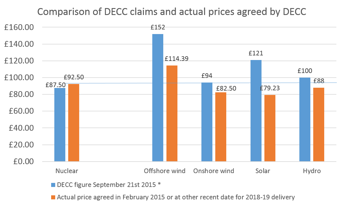
DECC and the Treasury want us to believe that Hinkley remains a good deal for the British taxpayer. They attempted successfully to get the BBC to republish a chart showing the relative costs of various types of low carbon electricity sources. The numbers DECC used were wrong, both for nuclear and for renewables. DECC should not have issued this chart and the BBC should not have published it without checking.

Here is a table showing the real costs today paid for new renewables projects under the Contracts for Difference scheme for renewables. (The nuclear price guarantees are the essentially the same as the CfD scheme).

Prices paid per megawatt hour

 *Estimated by me by measuring the position on the bar chart. No figures provided.

**Solar PV for delivery 2016/17.

*** Hydo price under ROC scheme in England and Wales. Scotland is less.

Nowhere on the chart does it point out that Nuclear will get the subsidy for 35 years while all other electricity sources get CfDs for only 15 years.

You will notice that instead of Nuclear being relatively cheap, as the government pretends, it is actually more expensive than Onshore Wind, Solar PV and Hydro. And that is even before the huge difference in subsidy periods is factored in. Of vital importance,  it also before the continuing expected decrease in Solar PV, Onshore and Offshore Wind costs. At current rates of progress, Solar PV will be at grid parity in the UK before Hinkley ever sends its first electron out. In other words, Solar PV will almost certainly be less than half the cost of Hinkley.


Why Hinkley Point is a bad idea, even if you believe in nuclear

(This was a research note prepared as part of the preparation for an article written by George Monbiot, Mark Lynas and me and published on the Guardian web site. Full article here. )

The revival of the nuclear industry in Europe started in the frozen winter months of 2005 on an island off the Finnish coast. Alongside two existing nuclear plants, the ground was prepared for a new power station to be built to the latest design. Completion was scheduled for about four years later in the first half of 2009,

Construction went wrong from the start. The numbers of workers on the site ballooned, peaking at almost five thousand people from all around northern Europe. As time passed, the completion date was pushed back. In early 2009, the plant was supposed to start in 2012. By 2010, the date was late 2013. The press releases carrying details of delays came out with predictable regularity. Today, the latest estimate is that the power station will begin generating electricity at the end of 2018, almost fourteen years from the first shovels in the ground. Ten years after the start, a project that was meant to take about fifty months is still forty months away from completion.

The owner is suing the contractor for nearly €3bn and the contractor counter-claims for even more. Costs are probably quadruple what was expected when construction started. This new nuclear power station has nearly bankrupted Areva, the French nuclear construction company running the site.

There’s one other nuclear construction project going on in Europe and it uses exactly the same design as in Finland. This time it’s on the Normandy coast and is under the direct control of EdF, the French company behind the proposed nuclear plant at Hinkley Point in Somerset. Work was begun at the Normandy power station in late 2007 with completion promised at the start of 2012. Press releases with wording eerily similar to the Finnish texts come out almost as frequently. Each time EdF claims rapid progress on the site while pushing back the finish date a few more months. Full power from the plant is now expected in 2019, twelve years after the start of the project. Costs are over three times what was predicted in 2007.

EdF is the only company in Europe that still believes that the design it is using in Normandy -  and prospectively at Hinkley Point - can provide electricity at a reasonable price. Other major international businesses have quietly slunk away from nuclear. Siemens withdrew from the Finnish project as soon as it could, the huge Italian utility ENEL withdrew from the Normandy plant in 2012 (as well as from a commitment to the other five reactors it had intended to build in partnership with EdF) and British Gas owner Centrica wisely withdrew from the Hinkley Point consortium in early 2013.

EdF soldiers on. It now says that Hinkley will start sometime ‘after 2023’. Given that the Finnish and Normandy plants will take at least twelve and fourteen years respectively the lack of specificity is understandable.

Why has this new design of nuclear power station proved so difficult to build? Tony Roulstone, who runs the Master’s programme in Nuclear Engineering at Cambridge University, gave his view in a public lecture late last year. This type of new power station was ‘unconstructable’, he said, adding a comment that the Hinkley Point design was like ‘building a cathedral within a cathedral’. Huge numbers of inexperienced workers were crowded into a limited area, each unsure of exactly what they were doing or how it fitted into the master plan. The power station is over-complex and construction is unmanageable, he concluded.

Just for interest, we looked at exactly how long a cathedral might take to construct. Salisbury Cathedral, one of the biggest, took forty six years to complete in the thirteenth century. Hinkley Point probably isn’t going to take as long as this, but the difference is less than you might imagine.

Despite the evidence from other countries and the views of an increasing number of experts like Tony Roulstone, the government ploughs on with its unquestioning support for the EdF plan. And unfortunately, the main competing design also vying for permission to construct nuclear plants in the UK is also experiencing huge construction problems in China and the US. Electricity consumers in the state of Georgia have just had another 6% added to their bills to pay for the delays in the completion of the power station at Vogtle. As in Finland, the contractors and the owner are scrapping over who is to blame for the overruns.

All this might be acceptable if this generation of new nuclear plants was eventually going to reduce the costs of the transition to a fossil-free future. The chances of this look remote in the extreme. Hinkley will be paid at least double the current wholesale price of electricity if it is ever completed. This means it will receive a subsidy from UK electricity bill payers of about £1.1bn a year, more than the total cost of the Feed-In Tariffs for PV and wind that the government recently curtailed because of a shortage of money. This subsidy will continue for thirty five years, far longer than the support for any other technology. The UK is saddling itself with a billion pound burden each year for more than a generation. If the project takes until 2025 to finish, a baby borne today will be forty five years old when the subsidy ceases.

Against our pessimism the government argues that Hinkley Point is needed because of its ability to deliver large amounts of power reliably every hour of the day. Other technologies such as PV and wind cannot offer this security. Today, that conclusion is correct. But with sufficient R&D and government encouragement, by the time Hinkley is ready the problems of storage of energy will be solved.

Other countries – less bewitched by the allure of nuclear – are making fast progress on the road to energy systems that can cope well with daily, and seasonal, swings in power production from renewables. And in many parts of the world, solar and wind are now costing little more than half what the UK government is promising EdF for its risky Somerset plan. Solar, in particular, is now priced at less than a quarter of five years ago and the cost reductions are continuing. Construction is 50 times faster; a large solar farm takes 12 weeks to build compared to the 12 years for the Normandy reactor.

UK Government R&D support for all alternative energy technologies is probably running at about £250m a year, a quarter of what will be spent on eventually subsidising Hinkley Point. The rational choice today is for the UK to back away from this generation of nuclear power and invest properly both in next generation of atomic energy and in renewable energy technologies that can shift the UK rapidly to a green future.


The UK needs 300,000 new houses a year. 'Pre-fabs' are the only way of achieving this.

The UK government recently abandoned the long-standing target that all new homes should be zero-carbon. Its justification was that high insulation standards raise the cost of houses and makes the current shortage more difficult to alleviate. And this was before we faced the need to admit many tens of thousands of refugees.

The government’s policy change is silly. I’ve written here before about how improving energy efficiency in existing houses is usually very expensive. By contrast, better standards in new houses are easy to achieve. It makes no sense to compromise building standard improvements. But the government’s mind is made up. So what should we do now?

The first priority is completely clear: we need to stop building new homes on muddy building sites using construction techniques unchanged since 1350. Instead, we should shift to modular, pre-fabricated housing, built in factories and only assembled on-site. For the first time, we’re seeing small, relatively cheap and comfortable tiny homes designed to be manufactured precisely. Precise measurements – impossible in homes constructed on building sites – mean better air-tightness and improved insulation. You get near zero-carbon performance at virtually no incremental cost.

The last time the UK faced a desperate housing shortage similar to today was in 1945. About 150,000 ‘pre-fabs’ were built and many stayed in place long after their design life of 20 years. Some suffered from damp, but there’s no reason why today’s pre-fabs should experience this problem. Factory-made  are built successfully around the world; the UK is an outlier in using medieval construction techniques. The Huf House, a range of prestige German manufactured houses, sells for millions of Euros across Europe.

Here are five different designs developed by companies in the UK over the last few years. In my view, they all look good. However you may disagree and think that new homes should mimic the look of houses around them. I want to suggest in response that these modern houses are relatively cheap, use little energy, are massively easy to plonk down on concrete piles and, vitally, can provide people who would otherwise be in squalid rented accommodation with a decent place to live. In my view, this outweigh visual objections. Good housing for all has to be the UK’s top priority, not the maintenance of some particular look to a street or neighbourhood. Aesthetic consistency is an unaffordable luxury if we are to succeed in building hundreds of thousands more houses a year.

Here’s the first design. Green Unit, based near Oxford, makes an elegant curved house that is light and warm. I’ve been in one and even the smallest variant would be a lovely place for two people to live. The company says the Unit has a design life of over 40 years. The price is about £120,000 for living space of 80 square metres. (This is before land costs but including site preparation).

Source: www.greenunit.co,uk

Source: www.greenunit.co,uk

Dwelle comes from Manchester. 45 square metres of space, including two double bedrooms, will cost around £100,000 excluding the price of the land. 45 square metres isn’t huge but this is enough for a small family if space is well configured. For comparison, the average new home being built in the UK at the moment is about 85 square metres in size.

Source: www.dwelle.co.uk

Source: www.dwelle.co.uk

Y Cube is the new design from Richard Rogers’ studio. It seems to be mostly sited in urban locations, such as a Merton in London. This house is designed around a target cost of about £1,400 a square metre, perhaps two thirds of what a conventional small semi would cost. There’s criticism of some of its more untraditional aspects. But the views of the people who have moved in carry more weight with me. They seem to like their homes a lot.

Source:www.ymcalsw.org/ycube

Source:www.ymcalsw.org/ycube

QB2 is the innovative tiny house from Mike Page at the University of Hertfordshire. Attracting wide interest from TV programmes and newspapers, this accommodation uses a very small 4 metres by 3 metres footprint. It can go in many suburban gardens.  Heating and lighting will be very low cost indeed. At around £45,000, this is expensive per square metre of living space, but it works super-efficiently as a dwelling for young people who might otherwise be trapped in their parents’ home.

Source:http://www.cubeproject.org.uk/

Source:http://www.cubeproject.org.uk/

Lastly, here’s something that looks more like a standard home. The WeeHouse provides a two bedroom home of 68 square metres for £99,000. At less than £1,500 per square metre, this is well under the cost of a traditionally constructed house.

Source:theweehousecompany.co.uk

Source:theweehousecompany.co.uk

None of these houses get rid of the appalling constraint on housing developments provided by the restrictive planning laws, the high price of land or the dead hand of large developers.

So my proposal is this. We should accept that the UK needs to build housing on greenfield sites and give these homes planning permission for 20 years in areas currently not zoned for housing. We might also insist that they are all screened by fast growing trees or other vegetation so their visual impact is limited. We should also allow unlimited use of gardens for single story buildings without requiring planning permission. Third, we should encourage ‘self-build’, allowing individuals to buy the kits of the houses above and construct them themselves. QB2, for example, makes this perfectly possible.

Lastly, of course, we need to get local authorities to allow these homes to be plonked pretty much anywhere there is space in urban areas. There’ll be no garden but this is a small cost to getting people off the streets. Without the need for soil remediation, which is a big costof brownfield housing development, a large number of smallish areas within cities become much more available for housing.

None of this would be popular but I cannot see any alternative. 


Even the laggardly IEA admits solar PV is now competitive, having fallen in cost 75% in five years

The International Energy Agency published a report today (August 31st 2015) that focuses on the rapid decline in the cost of renewable energy. More precisely, it says that electricity costs from wind and solar have plunged, a word rarely used by international civil servants. On good sites around the world, renewables are now cheaper than fossil fuels.

Bizarrely, the IEA says that new nuclear is also inexpensive, a conclusion strikingly at variance with the rampant inflation in construction costs around the world. It may be that the absurd optimism over nuclear is influenced by the joint author of this report, the Nuclear Energy Agency.  (The cost estimate of $50 a megawatt hour is one third of what Hinkley C will be paid).

This note looks at how today’s figures compare with the last edition of this report. It'll be no surprise that expected solar PV costs are now little more than a quarter of the figure of just five years ago. We are living through a truly remarkable decline in the costs of PV, driven by the huge increases in the volumes of solar panels being installed.

The 2010 report

In 2010 the IEA said that solar costs ‘could drop 70% from the current $4,000-6,000 per kilowatt down to $1,200-1,800 by 2030’. It targeted reductions of ‘at least 40%’ by 2015 and 50% by 2020. These apparently aggressive assumptions presupposed ‘rapid deployment driven by strong policy action’.

Five years later, the IEA says that solar PV costs in the most competitive country (Germany) are now $1,200 per kilowatt for large-scale installations. In other words, costs have already fallen to the level that the Agency said ‘could’ be achieved in 2030 under very favourable conditions. What the IEA said would take 20 years actually took 5. Solar farms installed in low cost areas are now half the price that the IEA’s 2010 estimates suggested might be possible.  

The lower capital costs have fed through to reduced electricity production charges. In a very good location, the 2010 IEA report said it would cost $215 to generate a megawatt hour. (This figure is calculated by working out how much electricity is going to be produced over the life of the panels and spreading the full cost of this installation over this total).  This calculation used a cost of capital of 5% a year, which adds to the implicit price of electricity produced.

By 2015, the combination of a lower interest rate and reduced capital costs had cut that the cost of electricity to a low of $54 per megawatt hour in the US, parts of which have some of the best sun in the world. That’s a reduction of very nearly three quarters in five years, or 32% a year compounded. Although German installation costs are lower than in the US, better solar radiation more than makes up for this, leaving the cost per megawatt hour lower in places like Texas and Arizona.

Does the $54 figure correspond to the offers that solar farm owners make to electricity buyers? Yes, in parts of the US recent agreements between solar and utilities have been lower than $60 a megawatt hour, even after adjusting for the subsidies received by the PV industry.

What other technologies have ever achieved this rate of improvement? The early semiconductor industry achieved compounded rates of improvement of at least 35%. The cost of DNA sequencing has fallen by 90% since 2010, a rate equivalent to over 60% improvement a year. But apart from these two outliers virtually no technology has got better faster than solar PV. Importantly, although some experts suggest that semiconductors might now be approaching the limits of improvement, the scope for better PV is nowhere near exploited. The reduction in the costs of generating electricity from solar panels sitting in fields will continue for many more years.

Is PV competitive with fossil fuel technologies yet?

Where does this leave PV in relation to competing ways of generating electric power? The IEA doesn’t make comparisons easy because it uses a high interest rate of 10% in its own charts. Renewable technologies such as PV usually have high installation costs and low running costs whereas fossil fuel plants are cheaper to build but more costly to run. If interest rates are as high as 10%, this penalises those types of generating plant which need more upfront money to build.

At a 10% rate, PV in the best countries produces electricity at around $100 a megawatt hour, even when penalised by high interest. This compares with about $70 for the cheapest gas and just over $80 for new coal plants. This comparison makes solar PV still not quite competitive with fossil fuels.

Look at the numbers using a lower (and more realistic) interest rate and the picture changes markedly. In the chart below, the cost of PV in the US is lower than gas as long as the interest rate used is below about 4%. Is this a reasonable rate to use? Yes; new PV developments are now routinely financed at lower rates than this around the world.

The picture is even clearer in China, where gas for electricity production is much more expensive than in the US. There, PV beats gas at all interest rates. The significance of this probably hasn’t been fully realised.

It’s also striking that the in the five year period in which solar PV costs have fallen dramatically, most of the competing technologies for generating power - gas, coal and nuclear – have seen increases. The minimum cost for electricity from a new coal power station was put at below $40 a megawatt hour in 2010 and is now over $80. The same figures for gas are $45 rising to $70.

Nuclear costs are also assumed to have risen, although the people at the IEA still think it is possible to build a nuclear power station to deliver electricity at around $50 a megawatt hour with a 10% interest rate. Have they spent the last five years on the Philae comet or somewhere equally remote from Planet Earth? For a realistic comparison, the strike price actually agreed for Hinkley C is around $150 a megawatt hour, or three times as much as the IEA hypothesises. Other nuclear power stations currently in construction are similarly priced at multiples of what the IEA says is possible. But, for completeness, one does need to say that the IEA does conclude that nuclear is cheaper than PV at all levels of interest rate. However their data seems remarkably, almost absurdly, divorced from reality.

What about wind? The IEA says that onshore wind has reduced in cost by about 30% since 2010. In the best US locations the figures for wind are now as low as $33 a megawatt hour, down from $48 in 2010 if we use a 3% interest rate. At the moment, wind can be cheaper than PV. But its cost is falling much more slowly than PV. If current trends continue, PV will cut below wind within three years and the difference will then continue to widen.  

Or perhaps not. The foolish policy changes of the UK government may be mirrored around the world. It is the sheer volume of PV being installed that is crashing the price of solar. We need this hell-for-leather growth to continue for a few more years, supported where necessary by tax and regulatory support. Although PV is almost certainly cheaper than any other technology in the Middle East, much of the Indian subcontinent, parts of Africa and Latin America, large rich countries need to play their part in keeping global demand for panels surging. If a few more countries act precipitately like the UK, which during the first quarter of this year was probably accounting for 20% of global panel sales but now almost zero, then the rate of PV price decline will inevitably tail off. This is in nobody’s interest (except the fossil fuel companies).


Has the growth in PV caused the UK electricity network to become unmanageable?

Is the growth of PV and wind making it more difficult to manage the UK electricity system and ensure that supply matches demand? Many people think so. In this article I look at one piece of contrary evidence that suggests that balancing the electricity grid was no more demanding this summer than last year, despite the huge growth in solar power.

This summer actually saw a sharp fall in the number of times coal and gas power plants had to sharply adjust their output to balance the varying output of intermittent renewables. If solar and wind growth had been causing problems balancing the electricity grid we would have expected the reverse. This is just one piece of data in a very complex area, but it is very good news for renewables.

The analysis

The growth of PV in the last year (and, to a much lesser extent, unmeasured small scale wind power) has reduced the demand for electricity generation over the sunniest portion of the year. I’ve looked that the three month period from 9th May to 8th August and compared this year and last. All my data is taking from the Elexon portal.

This year, average electricity demand peaked at around 33.3 GW (33,300 MW) at 18.00 during this 92 day period, over two and a half GW, or about 8%, lower than in 2014. Some of that difference arises from the gradual fall in overall electricity use. Much comes from the striking jump in PV production this year.

The chart below shows the amount of electricity being produced by fossil fuel plants, big wind farms, biomass, hydro, imports and pumped storage every half hour (1-48) for the 3 month period from May 9th to August 8th. It  excludes PV and small wind because these outputs are not measured centrally and are seen as net reductions in the electricity  generation required by the major generators.

This chart demonstrates that – on average – the amount of variation in electricity production over the course of the day is actually lower than it was last year. The typical peak is just over 10 GW higher than the half hour of lowest demand whereas in 2014 the average daily variation was over 12 GW. Everything else being equal, this would make the UK electricity network easier to manage because the need to ramp up and down gas and coal plants will be less.

Looking specifically at fossil fuel plants, their electricity production was substantially lower in 2015 than last year. As we’d expect, fossil fuel plants have born the full reduction in demand for electricity.

Nothing surprising thus far. However two of the readers of this blog have written emails suggesting that National Grid has been finding it much harder to manage the stability of the UK network this summer, perhaps as a result of the unexpectedly large addition to PV capacity. Solar is, of course, highly variable during each 24 hour period and is also somewhat unpredictable (particularly for non-users of SolarForecast). National Grid has limited information on what is being produced in large solar farms and none at all about the production from your roof. To keep the UK network stable on a second by second basis requires National Grid to oblige fossil fuel plants (and pumped storage) to adjust their output very quickly, and with little warning.

So the question I asked was this: although on average across the 3 month period the amount of power produced by coal and gas plants was lower than last year, did it have to vary more rapidly during the average day to meet swings in the output of variable renewables? Are gas and coal power stations being asked to increase or cut their output by larger and larger amounts to deal with the intermittency of wind?

The answer seems to be ‘no’.

First, if we plot the average change in required gas and coal plant output in each half hour, the figures do not look very different between 2014 and 2015. As we’d expect, the rate of ramp up in the morning as the nation goes to work look slightly lower. This is because the sun has begun to shine more strongly on to PV panels, choking off the need for more power station output. Between point 14 (7am) and point 20 (10am), the blue line for 2015 is consistently below the 2014 line, but the differences are not great. At the end of the day, as the sun fades, the blue line conversely tends to be above the 2014 figure. Between point 32 (4pm) and point 40 (8pm) the brown line is roughly 100 MW below the blue. 

These are averages for the 92 day period. And they show exactly what we’d expect. But the picture needs to be completed by looking at what happens on individual days. Is the degree of variability greater now? Once again the answer is no. The average movement between the required production from coal and gas power stations in each half hour has actually fallen slightly even as PV has surged. The average change - upward or downward - in fossil output from one half hour to the next has in fact fallen from about 530 MW to about 512 MW.

More importantly, perhaps, the number of times that the required output from fossil fuel plants has had to vary very sharply has also dipped, rather than risen.

Number of times output from fossil fuel power stations was required to RISE by 2 or 3 GW or more in a half hour period*

                                2014       2015

Over 3 GW          24           12

Over 2 GW          150         115

Number of times output from fossil fuel power stations was required to FALL by 2 or 3 GW or more in a half hour period

                            2014      2015

Over 3 GW          0              1

Over 2 GW          37           31

 *Data taken from all half hour periods between 9th May and 8th August.

If anything, it looks as though the period at which power output in the summer** needs to be ramped up fastest – around 7am – now looks easier to manage. The sun is rising at the same time, helping reduce the extra demand by flooding power into the local grids.

The amount of time which the system is trundling along requiring roughly the same amount of power from fossil plants hasn’t changed. The number of half hours in which the upward or downward variation fell between +500 MW and -500 MW was stable at just under 3,000 periods (out of 4,400 or so).

This note has looked at the needs for variability in power output from gas and coal plants. The relatively optimistic finding – that, so far, the system seems to be coping well and is not experiencing problems adjusting output – should not obscure the separate point that renewables are forcing fossil fuel power stations to work fewer and fewer hours per year. Many plants are said to be not profitable. Those of us eager for renewables to grow as fast as possible need to work out how to provide the back up to wind and solar when gas and coal plants have closed because of falling demand.

By the way, I found the results of this analysis surprising. i was expecting evidence of increasing half hourly variability. Please don’t hesitate to write in if you think I’ve done something wrong, or missed a key point. 


** This would be very different in the winter, when the fastest ramp up is around 4.30pm, just at the moment PV output - already low - zero.


Who killed the Green Deal?

Eight months ago Amber Rudd, then a junior minister in DECC, wrote the foreword to the annual report on the Green Deal, the government’s flagship scheme for energy saving that she closed last week. In December of last year she praised the number of energy efficiency measures completed under the policy. More surprisingly in view of last week’s decision to shut the scheme, she wrote ‘We have also proved that Green Deal finance works’.[1]

The evidence suggests otherwise. Under the Green Deal, householders were able to borrow money to carry out efficiency measures such as cavity wall insulation and the installation of new gas boilers. Their loans are repaid by a levy on the electricity bill and this repayment was intended to be less than the savings generated by the home improvement.

Despite Ms Rudd’s confident words, savings from energy efficiency projects in domestic homes do not cover the cost of installation after taking into account interest payments. This is what killed the Green Deal, not the ‘concerns about industry standards’ specified in last week’s announcement. The unavoidable but unfortunate fact is that home insulation improvements do not make financial sense if people have to borrow at commercial rates of interest. Blaming the insulation industry for the failure of the Green Deal is wholly unfair.

Ms Rudd ought to know this. In June this year her own department produced robust statistical assessment of the impact of the most frequent energy saving measures.[2] This analysis demonstrated that the average (median) reduction in energy use was as follows:


Cavity Wall Insulation     - 1200 kWh

Loft insulation                   - 400 kWh

Condensing boiler           - 1300 kWh

Solid wall insulation         - 2200 kWh


The annual cash savings from these four measures at today’s gas prices of about 4p per kWh will be


Cavity Wall Insulation     - £48

Loft insulation                   - £16

Condensing boiler           - £52

Solid wall insulation         - £88

To put these figures into context, it may be helpful to note that the median domestic gas usage in UK homes is about 12,400 kWh, a figure that has fallen by about 30% since 1990.

The small savings observed in real homes contrast sharply with figures routinely used by government and its affiliated bodies. Most relevantly, the Energy Saving Trust, a DECC sponsored body, publishes estimates of the savings from cavity wall installation (CWI) ranging from £90 for a flat to £275 for a detached house, between twice and almost six times as much as actually measured. These unrealistic figures from the EST are routinely used by web sites that householders will consult when thinking about investing in energy saving. I found the EST numbers copied (with proper credit) on the Which?, Money Saving Expert and British Gas web sites, for example.

If you believe the EST figures cavity wall insulation may have appeared to make sense under the Green Deal. For a typical semi-detached house, the savings from this measure are estimated at £160 and the EST says the cost will be less than £500. A Green Deal loan for this amount would have cost about £65 a year, meaning that the insulation savings suggested by the EST would have easily covered the cost.  

However if the real savings are only £48 a year, as specified by the government’s own new research, then the Green Deal loan will cost more each year than the reduction in the gas bill. Borrowing money to fund this improvement makes no financial sense. To be clear, the householder might still want to carry out the extra insulation to improve comfort and increase the speed at which a house warms up. But if she has to borrow money to do the work, the savings wouldn’t be enough to cover the cost.  The equation would be even more unfavourable, in fact much more so, in the case of all other home improvements.

This is what destroyed the Green Deal. It wasn’t stupidity on behalf of householders, rapacious sales tactics, poor performance from the insulation industry or the inadequate marketing of the scheme. Unscrupulous or careless exaggeration of the real savings by the EST combined with a government committed to privatising energy efficiency meant that the Green Deal was doomed from the start. It simply could never achieve what its architects intended.

In January 2014 I wrote a similar article to this one.[3] I showed how early statistical work from DECC had suggested typical savings from cavity wall insulation of around 1,400 kWh a year, slightly more than the new research now suggests is likely. At the time I criticised EST for using savings estimates of ‘up to £140’ for households carrying out this measure. Currently, EST is saying that the owner of detached house can save £275 and semi-detached house £160 from cavity wall insulation.

 In other words in the last 18 months the government’s own continuing research has marked down the average reduction in energy use from installing CWI from 1,400 to 1,200 kWh a year. In the same period the EST, a body charged by government with providing householders with independent advice on energy saving, has increased its estimate of the financial benefit from ‘up to £140’ to a higher level. The Energy Savings Trust needs urgently to be pulled into line.

So what do we do now?

It’s all very well sounding off about the implausibility of all the assumptions behind the Green Deal and the false numbers provided by the EST. What should the UK do now? The problem of the UK’s poor quality housing stock isn’t going to disappear. Carbon emissions from the energy used in domestic heating are still about 25% of the national total. Extra winter deaths, often from respiratory diseases encouraged by low interior temperatures, are running at about 24,000 a year and according to NICE may be trending gradually upwards after falling until about 2005/6.[4] (This last winter may have been particularly bad, although I couldn’t find official numbers).

There's some independent evidence that homes are now heated to lower temperatures in winter. In particular, poorer households seem to be cutting heating use. The government’s data shows that houses occupied by people with total income of less than £15,000 reduced their gas consumption by 4% between 2011 and 2013. But households with an income of over £100,000 increased their gas use by a similar percentage.  Rising rates of excess winter deaths may be related to the tendency of poorer households to run their homes at lower temperatures than they previously did because of concerns over the cost of heating.

A rational society would resolve to do something both about the particular problem of low house temperatures among elderly householders and the more general need to improve the UK housing stock (unique around the world in having a quarter of homes build before 1914). Help for older people living in poorly insulated homes makes clear financial sense in that NHS admissions would fall reducing the huge winter pressures on the service and the extra billions that need to be spent. So the programme of free home improvements for elderly people needs to continue and be hugely expanded. The package called the Energy Company Obligation - severely watered down in recent years – should be extended in its scale and radically simplified. At the moment its complexity, rigidity and general all-round incomprehensibility reduces its effectiveness. I believe that the costs of this programme need to be met by general taxation rather than loaded onto energy bills. Otherwise it will be seen as another example of ‘green crap’ policies used as an excuse to raise utility prices.

My second proposal is similar. We continue to need huge amounts of wall insulation; a third of total heart loss is still through walls. Although perhaps 75% of all cavity walls are now filled, several million remain to be done. More importantly, the UK has made almost no progress in insulating older solid wall properties. This needs to be completed – for free – as a national programme in which installers move from street to street.

Lastly, I still think the easiest target remains draught-proofing. Nearly a quarter of heat is lost through simple gaps in the exterior surfaces of homes, whether around the edge of doors or draughts between the floorboards. That is more than the losses through the fabric of  roofs, floors and doors combined. Draught proofing isn’t glamorous but it might be far more cost effective than insulation. £30 spent by an individual at the local DIY store will be a far better investment than all the measures available on the Green Deal. The tools needed are simple – a heat loss detection device and possibly a smoke pen.

Or a wider programme of careful, meticulous work, carried out by trained people in a national scheme, might cut heating bills by measurable amounts and would substantially improve our sensation of comfort. The perception of warmth is partly driven by the degree of temperature difference in the air around different parts of the body. A room in which air whistles around the ankles will seem colder than the same room with a still atmosphere. This is one of the reasons draught proofing seems to 'work'.

A national programme of getting community organisations to run street-by-street draught proofing, with large prizes for those groups getting the best results (easily measured by pressure testing the houses) could make a substantial difference to carbon emissions, excess winter deaths and home comforts.

I fear that there is no prospect whatsoever of the government pursuing such a programme but to me this is the easiest, cheapest and most inclusive way of improving Britain’s housing stock. It would be perfect constituent of what Labour Party contender Jeremy Corbyn calls 'the people's Quantitative Easing'.

[1] https://www.gov.uk/government/uploads/system/uploads/attachment_data/file/388761/greendealandecoannualreport.pdf

[2] https://www.gov.uk/government/uploads/system/uploads/attachment_data/file/437093/National_Energy_Efficiency_Data-Framework__NEED__Main_Report.pdf

[3] http://www.carboncommentary.com/blog/2014/01/18/actual-energy-savings-from-efficiency-measures-only-half-what-is-officially-claimed

[4] https://www.nice.org.uk/guidance/ng6/chapter/3-Contex
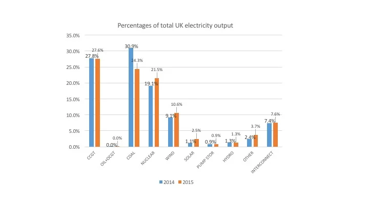
Alternatives to the 'unconstructible' EPR may be almost as bad

The engineering problems of the EPR are well-known. The nuclear power stations being built in Finland and France using this design are well over budget, are failing to meet even frequently revised timetables and are dogged with concerns over construction integrity. Olkiluoto 3 in Finland is now expected to start producing electricity in 2018, thirteen years after work first began on the site. The project will cost many billions of Euros more than first predicted.

Despite these highly visible problems – and the new legal challenge from Austria – EdF still wants to construct Hinkley C using the EPR design. Others have suggested that the alternative contender, Westinghouse’s AP1000 has a better future in the UK. An uncritical article in the Financial Times this week allowed the Westinghouse consortium a chance to expound on the strengths of the AP1000 design which is planned for the Moorside (Sellafield) proposed nuclear site. The head of the UK venture promoting the Westinghouse design said

‘We are using proven technology. The AP1000 has a good record of construction around the world’. [1]

This note suggests that these statements are lamentably false. Unfortunately for those of us who believe new nuclear should be a response to the increasingly urgent need to decarbonise electricity production, Westinghouse is having the same problems with the AP1000 as the unconstructible EPR.

AP1000

The AP 1000 is the next generation design being developed by Westinghouse, a subsidiary of Toshiba. Westinghouse constructs the AP1000 projects in partnership with Chicago Bridge and Iron (CB&I), probably the world’s most experienced builder of large power stations.

The AP1000 is a 1.1 GW plant using a design based on a much smaller power station developed by Westinghouse twenty years ago. One important fact is that no stations using the original design were ever built. However, the advantages of the AP1000 are said to include a relatively simple design, a high level of passive safety and modular construction. Modular construction means that components can be manufactured elsewhere and then shipped to the power station site. However US sites have had 5,000 workers on site at the same time, posing the some of the same huge management challenges that were experienced at the Finnish EPR site.

Four AP1000s are in construction in the US and four in China. The US plants are at two separate sites in the state of Georgia (‘Plant Vogtle’, 2 AP1000s) and South Carolina (‘Summer’, 2 AP1000s). This note briefly looks at the experience in Georgia.

Plant Vogtle

Vogtle 3 and 4 are being built in the same complex as two earlier nuclear power stations. After delays in final design approval, they were finally licenced in February 2012. Near-concurrent construction of the two plants started in May 2013 with completion of the first planned for April 2016. Original estimates for the total price to the utilities buying the power stations were about $14bn (about £9.5bn). The price to be paid was essentially fixed, meaning that most of the construction risk is borne by Westinghouse and CB&I. 

The most recent announcement of construction delays came in February 2015 when the station’s eventual 45% owner (Georgia Power) told the state regulator that the partnership building the station had recently estimated that the eventual completion date for Vogtle 3 would be June 2019. Vogtle 4 will be finished in June 2020. The expected delay for Vogtle 3 is now 39 months, more than doubling the initially expected construction time. The project is not yet half complete.

Although the contract price has not risen significantly because it is largely fixed, the cost to electricity customers in the state of Georgia has increased. This is because the utilities that will eventually own the two new stations have been granted electricity price increases by the state regulator to cover the higher financing costs of Vogtle 3 and 4. The utilities have been paying for individual elements of the two new plants as they are completed. The long delays mean that the interest costs are higher than expected and the regulator has already granted rate increases to compensate the eventual owners. People in Georgia are already paying a supplement of 6% of their bills to finance the new nuclear station.

Although the deal was a fixed price contract, the company buying the largest share of the finished plants is in legal battles over extra costs that the contractors claim that the purchasers should bear.

We can reasonably expect that the cost to construct the stations has also increased. However industry estimates of the eventual final cost to the contractors are vague and imprecise. They currently seem to be around $18bn (around £12bn). This seems low to me, given that the total project is now expected to take more than twice as long as originally expected. CB&I says that Westinghouse will eventually pay most of the overrun costs but we can safely presume that this issue will also end up in court.

Until recently the main buyer, Georgia Power, was reasonably content with the progress of the construction. (It has a difficult line to steer; it cannot be too critical of the contractors because otherwise the regulator that oversees it and grants its rate increases will question why it agreed to build the first new nuclear plant in the US for several decades in the first place). However its 2015 submissions to the Georgia regulator have become increasingly concerned in response to the latest estimates of delay.

Most recently, May 2015 testimony prepared for a hearing has been openly critical of the contractors Westinghouse and CB&I.[2]

In general, the Company, like the other Owners, has been disappointed with the Contractor’s performance under the revised IPS (the project plan).  The Contractor has missed several key milestones since the publication of the revised IPS in January 2015, including several milestones relating to critical-path or near-critical-path activities such as the assembly of CA01 (part of the central reactor), the delivery of shield building panels, and work on concrete outside containment.  The Contractor has also encountered difficulties in ensuring that new vendors produce high-quality, compliant components per the IPS (the project plan) projections.

Georgia Power is now indicating that it has little faith in the contractor’s ability to keep to the new delayed timetable.[3]

The Contractor’s schedule performance on critical path work such as concrete placements to start shield building installation and inside containment installation are challenges to the Contractor’s ability to adhere to the revised IPS.  The Contractor must continue to improve its schedule performance, maintain these improvements, and successfully resolve RCPs/squib valves/CMTs (components with severe quality or delivery problems) in order to complete the Facility by the currently projected substantial completion dates. 

China AP1000s

Cost data from the Chinese construction projects is difficult to find. But they have also experienced significant construction difficulties. Building at Sanmen began construction in August 2009 and was originally expected to be finished by August 2013. As with Vogtle, construction was said to be on schedule a year into the project [4] and even in March 2012 completion was still officially planned for 2013. Recent updates suggests that completion will actually take place in 2016, also a three year delay.[5]

The design used in China is simpler than that used in the US, and it may well be possible for Chinese constructors to build much more quickly and cheaply. However the modifications are unlikely to be acceptable to Western regulators. For example, the power stations are not designed to survive a direct hit from an airliner, a US requirement.


How many of the problems at Vogtle and elsewhere are inherent to the construction of a large third generation nuclear power station and how many simply arise because these are ‘first of a kind’ projects? (Similar 3 year delays have also happened at the other US AP1000 at Summer, where serious cost overruns have also taken place). Will new nuclear projects around the world avoid the major problems that have affected the first eight AP 1000s because the construction companies have learnt how to build these huge projects more efficiently? Or is a safe 3rd generation nuclear power station beyond the capacity of even the most experienced contractors to build to a tight timetable and at a predictable cost? I’m afraid I don’t think the answer is at all clear.

[1] http://www.ft.com/cms/s/0/a95f585a-26e6-11e5-bd83-71cb60e8f08c.html#axzz3g2r677Je

[2] http://www.psc.state.ga.us/factsv2/Document.aspx?documentNumber=158302 page 15

[3] http://www.psc.state.ga.us/factsv2/Document.aspx?documentNumber=158302 page 15

[4] http://www.world-nuclear-news.org/NN-Construction_on_schedule_for_first_Sanmen_unit-2109107.html

[5] http://www.world-nuclear-news.org/NN-Sanmen-2-containment-dome-installed-0707154.html

Food and fuel, not food or fuel

Can we use safely use larger quantities of biomass for energy? The conventional answer is no: humankind already uses too much valuable land for non-food purposes. Using more of the world’s productive acreages to produce wood or other biomass for the generation of electricity or heat will increase global environmental stress and reduce food production.

In a very recent paper, Mike Mason and team give a different answer. They probe the use of otherwise unproductive drylands for growing a class of non-food plants for use in anaerobic digesters (AD).[1] AD produces methane which can burnt to produce electricity. Mason’s conclusion is that the world’s drylands cover about 15% of the world’s land area. Planting of carefully chosen aridity tolerant plants on just 10% of this land could produce as much electricity as natural gas does today. As important, the gas from AD can be burned at night or on cloudy days meaning it is a vital complement to solar PV in tropical countries.

10 month old prickly pear plantation in Kenya

10 month old prickly pear plantation in Kenya

To put Mike Mason’s work in context, I’m going first to look at why wood and plants are usually thought not to be an appropriate replacement for fossil fuels. Put at its crudest, the argument is that burning a tree sends CO2 back into the atmosphere. Replanting a new tree will eventually extract that CO2 again but it might be 60 years before even a fast growing conifer has grown to the same size as the tree that was burnt. So even if we immediately replace every single tree that we use for energy it will be many decades before the world moves back out of ‘carbon debt’.

This may be too crude an analysis. Let’s look at where Drax, the huge power station in Yorkshire that is switching to burning wood pellets, gets its 4m tonnes of fuel from.

1.1m tonnes sawmill residues

1.2m tonnes forest residues

1.0m tonnes woodland thinnings

0.4m tonnes sawmill waste

0.4m tonnes other (straw, miscanthus and other sources)

Total 4.1m tonnes

Drax is very careful. Virtually none of its biomass comes from mature trees cut down solely to keep its giant furnaces burning. The company argues - with much justification in my view - that its purchases are encouraging increased forestation in the southern US, where it sources much of its wood. Removals of wood are running at only about 60% of the natural growth rate in the southern eastern US states.

Nevertheless, Drax’s scale is simply enormous. (It is by far the single most important buyer of wood pellets in Europe, and possibly the world). By one calculation it is using the biological production of over one million hectares of land, or almost as much as the total wooded area of England. (NB Scotland has a lot more). From this, the UK is getting about 3% of its electricity.

If Drax is any example, biomass doesn’t look a good bet as the source of the world’s power in 2050. At root, the reason is that photosynthesis isn’t particularly efficient. We’re lucky to see 1% of the sun’s power turned into burnable carbon in the most efficient plants and trees in well watered zones. Compare this to the 20% of light hitting a good solar panel.

The overall position is far worse than this because much of the world’s area doesn’t support plants. The earth receives about 100,000 TW of energy from the Sun but only about 120 TW is captured by phothosynthesis on land and at sea. Only about half this photosynthesis is carried out by land plants and trees and humankind is currently using about 15 TW in the form of food and other materials.[2] The pessimists in the field think that the ability of humankind to increase this offtake of biomass is very limited. Only a few scientists have previously suggested that more than about 20 TW can be safely abstracted without risk of further environmental stress. Much of the extra 5 TW of photosynthesis will need to be in the form of human and animal food, implying that at most a couple of extra TW might be used to meet human energy needs, such as burning wood in Drax. This is why Mike Mason’s work may turn out to be so important.

Even a couple of TW isn’t negligible. The planet is currently using only about 15 TW and this isn’t ever likely to rise much above 30-40 TW. Nevertheless, as things stand, bioenergy can only provide a fraction of extra energy needs, even under the projections of the most optimistic people in the field.

The work of Mike Mason’s team may change this. In essence, what the group is saying is that we can capture far more energy using photosynthesis than the current research suggests. Agriculturally unproductive drylands, such as in Kenya where the group’s work is largely carried out, can be made photosynthetically useful if the right plants are cultivated and harvested. The paper investigates two types that can capture sunlight well, even in areas with low and highly seasonal rainfall: Euphorbia tirucalli and Opuntia ficus Indica. (The first is usually called Pencil Cactus and the second Prickly Pear).

After harvesting, Mason hypothesises that the best way of extracting the energy and converting it into a useful form is through anaerobic digestion, allowing the plant to rot in a very low oxygen environment, much as grass is broken down in a cow’s stomachs. This produces a biogas that is up to 65% methane, burnable in inexpensive gas engines and turned into electricity. The plants could be combusted but the big advantage of digestion is that the gas produced each day can be stored for burning overnight when PV panels aren’t producing any electricity.

Mason’s team show that it may be possible to generate annual yields of 20 tonnes of dry biomass per hectare using these water efficient plants. That’s about five times the productivity of a hectare of Sitka spruce in the UK.

If Mason is right, cultivating these crops on between 1 and 2% of the world’s land will capture about an extra 1 TW of solar energy without reducing the world’s agricultural production. In fact, he thinks that the by-products of the AD process, including nutrient-rich liquids, can be used to enhance food output. The conflict between food and fuel disappears, he says.

The obvious question to ask Mike Mason is why others haven’t noticed the energy generating capacity of these types of plants before. He’s on record as saying that the reasons include the lack of agricultural interest; these plants have very limited food value and therefore have never been properly cultivated.  

Further experiments to grow and then digest these plants will show whether the results suggested in Mason’s paper can be widely replicated. Do these plants really produce 20 tonnes a hectare on land with low rainfall that is concentrated in a few months of each year? Can they be planted and harvested cheaply? Will the plants be digested properly in AD? Will the impact on food production be as benign as he hopes?

As with so many other apparent breakthroughs, this new approach needs millions of dollars of research money now. Mike Mason had a career as a successful entrepreneur before going into academic work and still keeps his business activities going. There are very few people better qualified to find ways of giving the developing world an extra terawatt of power.


[1] For people who know about  plants, it may be useful  to know that Mason proposes using so-called CAM plants (crassulacean acid metabolism). CAM plants use relatively little water and do not contain much lignin, a molecule that resists breakdown during AD.

[2] The calories actually eaten by the world’s population represent the energy equivalent of no more than about 2TW of this total. Other biomass is wasted, eaten by  grazing  animals or used as fibre or other  materials. 

Air travel makes you happy, says the Airport Commission. That's why we need more runways

The Airport Commission changed its arguments sharply between its 2013 interim report and the final document of today, July 1st. In 2013, the central idea was that Heathrow should be expanded because of a rising need for business air travel. The UK is missing out, the Commission suggested, because Heathrow did not have sufficient capacity to service desirable locations such as the largest Chinese cities. Everthing changed today. Now the core argument is that without Heathrow expansion the UK’s leisure travellers would suffer. The Commission tells us that air travel makes people happy (I am only slightly simplifying the text). Therefore London needs more runways so that we can all fly more.

The purpose of this post is to point to what I think is a serious flaw in the analysis of the impact of air travel on happiness. I apologise for straying into econometrics but since the Commission’s report is likely to result in public policy decisions, I believe it is vital that poor and misleading analytic work is scrutinised.

In summary, I say that the Commission’s econometric work does not show that air travel makes people happy. Rather it demonstrates the wholly unsurprising conclusion that having holidays away from home is associated with a better state of mind and health. There is no legitimate ground for the Davies Commission to justify Heathrow expansion on the basis of improved happiness as a result of more air travel.  (I’ve tried to make the rest of this article as free from econometrics as I can).

Below is a crucial chart that the Commission didn’t include in the interim report but does make an appearance in today’s document. It’s worth a close look. For the first time we see on Airport Commission headed paper an admission that business air travel is falling. It’s lower in terms of millions of passengers than it was in 2000 down from about 31 million trips to around 29 million. Any growth that is coming is from leisure travel, either for holidays or Visiting Friends and Relations (VFR). This conclusion is as true for Heathrow as it is for other London and large regional airports. Heathrow is a leisure airport, partly for UK residents and partly for non-residents passing  through the airport on the way to another destination. 

 Red line - business travel    Pink line - visiting friends and relations (VFR)  Blue line - leisure


Red line - business travel    Pink line - visiting friends and relations (VFR)  Blue line - leisure

Simply put, the notion that business needs more airport runways around London is nonsense. If there is any need for more airport capacity, it arises because of leisure travel. And it is certainly worth pointing out again that many of the leisure travellers that pass through Heathrow are in transit from one non-UK destination to another. They are of no substantial value to the UK economy. Why the people of Richmond or Hounslow should suffer more noise and traffic disruption to allow more non-UK people to fly on holiday elsewhere is an issue that Howard Davies does not address.

By ceasing to stress the business need for Heathrow expansion, the Davies Commission seems to have finally accepted that the arguments for more runways can only be made by reference to the possibility of rising leisure travel, by UK residents and those from abroad. That is why we see the following surprising statements early in the Commission’s final report. (There’s nothing remotely like these comments in the interim version).

‘Leisure flights have a high social value. Empirical analysis focused on passengers travelling on holiday or to visit friends and family has shown how the access to leisure travel affects mental health and wellbeing. The findings demonstrate these patterns of travel are associated with higher levels of life satisfactions, general and mental health, and happiness’.

And so it goes on. Heathrow expansion is justified not by the brutal logic of global economics but by an unusual interest in personal happiness. The Commission pulled in consultants PwC to provide the analysis that back up its assertions that air travel makes us feel good. The consultants trawled through published academic research and analysed three large scale statistical studies of personal happiness.

The academic research is limited and not particularly helpful. PwC writes

‘Most of this literature is based on analysis of surveys of small groups of people with specific characteristics or small samples designed to be representative of large populations . None of the studies has conducted empirical analysis using datasets similar to those we have used in our empirical analysis’

So they move on to their three big statistical studies. The first shows reasonably convincingly that having an annual holiday is associated with greater happiness. Nobody will be surprised. If you don’t have a holiday you are likely to have less control over your life and/or be the kind of person who gets little pleasure from leisure. These are clear predictors of unhappiness.

The second PwC study demonstrates, the consultants say,  that air travel is associated with a higher level of happiness. This is the conclusion that the Davies Commission leaps upon because it supports the case for more London runway capacity. (Here comes the only bit of econometrics in this article, sorry). However, the statistical work that PwC did for the Commission didn’t split up the respondents into those that travelled on holiday by car, train or bus and those that flew. This second study is therefore picking up nothing more or less than the same phenomenon seen in the first study. If you travel abroad you are likely to be doing so because you are going on holiday. In other words, the second report finds the same conclusion as the first; holidays are associated with happiness, not that people like air travel. There can be no conclusion that air travel causes a higher sense of life satisfaction.

The third statistical study confirms the first. People who are able to take holidays tend to be happier than those that do not.

PwC concludes

Our empirical analysis of the UK using three large datasets consistently finds that taking holidays and flights is associated with improvements in health and wellbeing as measured through various indicators of health and wellbeing’.

No it does not. PwCs' empirical analysis shows that people who take holidays are happier. Nothing more and nothing less. For their money PwC should have done better econometrics. And the Davies committee shouldn’t have based their revision to the reason why London needs more airport capacity on such a weak piece of work.

There’s one more comment to make. In addition to the new focus on leisure, the Airport Commission uses its final report to make the case for Heathrow based on the amount of freight coming in to the airport. This argument is almost shockingly lame. The reason Heathrow takes in more freight tonnage than elsewhere is simply that it has far more inbound passenger flights. The freight that arrives in the airport doesn’t come in cargo aircraft but in the holds of long distance passenger flights. And since Heathrow has almost seven times as many long distance passenger flights as Gatwick it is utterly obvious why it brings in more freight.

The truth remains that London doesn’t need more runway capacity and that the pressure for Heathrow expansion is entirely driven by the understandable desire of the owners of the airport to make more money by running more services. Nothing more and nothing less.

If the UK thinks it can meet its carbon budgets for 2050 by expanding the number of airport runways, delusions have set in very deep. Today’s air travel CO2 emissions of around 40 million tonnes a year will use up almost all the UK’s allowance by mid-century. We cannot meet our carbon budgets by continued encouragement of aviation.